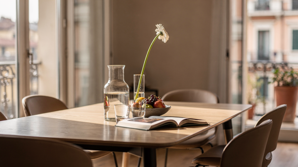
A table never just holds things. In a Milan apartment, it becomes the surface where shape, height, texture, and light meet with intention — a small still life set into daily movement. The goal isn’t to fill every inch, but to compose the objects so the room begins to feel calmer, sharper, and more visually resolved.
Why tables matter so much in a room
Tables are among the first surfaces the eye reads when entering a space. They sit at the center of domestic life, yet they also carry visual weight that can reset the whole room. A table styled with restraint makes an ordinary apartment feel edited; an overworked one can make even a beautiful space read as restless. In Milan, this matters more than sheer quantity. Many homes here already have strong architectural bones — parquet floors, high ceilings, shutters, pale walls, marble, metal, historic moldings — so the table should support that frame, not fight it. The strongest compositions I see are usually controlled, layered, and quietly confident.
The still-life approach: think like an art director
A still life is never a random cluster of objects. It is a controlled composition with clear relationships between forms. When I style a table, I think in the same terms I would use on set:
- Mass — what feels visually heavy
- Height — what lifts the eye
- Texture — what softens or sharpens the scene
- Negative space — what is left empty on purpose
- Direction — where the eye enters and where it exits
A successful composition usually contains contrast. A stone bowl looks stronger next to linen than next to more stone. A low stack of books gains presence when paired with something taller. A glossy surface becomes more interesting when balanced by a matte object. These tensions are what keep a table from feeling static.
Start with the table itself
Before placing a single object, read the table as you would a backdrop in a photograph. Its material, shape, and relationship to light will dictate the composition more than any styling rule.
1. Read the material
A marble table already carries pattern and visual weight, so it asks for fewer objects. A wooden surface tolerates more texture and a warmer palette. Glass-topped tables are visually light, which means the objects on them need stronger silhouettes and clearer spacing — otherwise they seem to float without purpose.
2. Consider the shape
The table’s silhouette sets the rhythm of the arrangement.
- Round table: works best with a central cluster or an off-center grouping.
- Rectangular table: can support two smaller zones or one elongated arrangement.
- Square table: often feels strongest with a diagonal layout or a balanced four-part structure.
- Oval table: suits a soft linear composition with no hard corners.
3. Notice where the light falls
Natural light in Milan changes dramatically over the course of a day. A table near a window can look completely different at eight in the morning than at five in the afternoon. Work with that shift. Matte ceramics, translucent glass, brushed metal, and linen each absorb or reflect daylight differently — so place materials according to how they will behave, not just how they look in one moment.
The basic formula for a composed table
A reliable table still life almost always follows a simple structure: one grounded element, one vertical element, one soft or loose element, and one deliberately empty area. This gives enough variation to feel designed without tipping into clutter.
Example:
- A ceramic bowl anchors the composition.
- A lamp, vase, or candleholder adds height.
- A folded linen napkin, piece of fruit, or small book softens the arrangement.
- Open space lets the objects breathe.
That is the difference between a styled surface and an overloaded one. If every object is competing for attention, nothing feels special.
How to build a table composition step by step
When I edit a table, I follow a sequence rather than randomly moving pieces. It keeps the process fast and prevents the usual mistakes of adding too much or centering everything.
Step 1: Clear the surface completely
Start from zero. Remove everything, then bring back only what supports the scene you want. This reveals the table’s actual proportions and stops default clutter from taking over before you begin.
Step 2: Choose a visual anchor
Every composition needs one object with enough presence to hold the eye. It can be:
- a vase
- a tray
- a stack of books
- a bowl
- a sculptural candleholder
The anchor should feel heavier or more defined than everything else around it.
Step 3: Add height
A table without vertical movement can read as flat. Add one element that pulls the eye upward:
- flowers or branches
- a tall vase
- a lamp
- a bottle
- a taper candle in a holder
Step 4: Add a softer counterpoint
This is where the still life becomes human. Introduce something less rigid — a material or object that relaxes the geometry:
- fabric
- fruit
- a folded magazine
- a smaller vessel
- a casual object with a lived-in feel
Step 5: Step back and edit
This is the most important stage. Remove one item and look again. More often than not, subtraction improves the composition more than addition. If the table still feels right without that object, it didn’t belong.
What works best in a Milan home
Milan interiors reward a palette and material logic that feels architectural rather than decorative. You don’t need to match everything exactly, but you do need a clear visual reason behind what sits together.
Materials that compose well together
| Material | Visual effect | Best use |
|---|---|---|
| Wood | Warm, grounding, domestic | Adds softness to rigid spaces |
| Stone | Heavy, sculptural, calm | Good as an anchor |
| Ceramic | Matte, tactile, understated | Ideal for bowls and vessels |
| Glass | Light, reflective, precise | Useful when the table already feels dense |
| Metal | Sharp, bright, structured | Adds tension and definition |
| Linen | Soft, quiet, flexible | Eases hard surfaces |
The strongest combinations almost always pair one hard material with one soft one. Stone and linen. Wood and glass. Ceramic and metal. These contrasts create depth without visual noise.
Color: how to keep it controlled
A table doesn’t need many colors to feel expressive. In fact, too many colors make the surface look accidental rather than composed.
A practical color rule
Work with three levels of color:
- one base tone
- one supporting tone
- one accent
Example palettes
- cream, walnut, black
- warm gray, stone, olive
- white, terracotta, brass
- beige, graphite, clear glass
In Milan, muted palettes tend to sit more comfortably than bright decorative mixes — especially in apartments with strong daylight or historical architectural detail. A quiet palette lets the shape of the objects do the work.
Styling different types of tables
Every table has a different physical role, so the composition should respond to how that surface is actually used, not just how it looks in a photograph.
Dining table
A dining table has to feel composed and remain usable. Leave enough open surface for meals, work, or conversation.
Good choices:
- a centered bowl
- a low vase
- a runner with one object group
- a pair of candles at one end
Avoid:
- tall arrangements that block sightlines
- too many small objects
- fully symmetrical setups that feel stiff
Coffee table
A coffee table can be more expressive, but it still needs logic. Use a simple structure:
- one stack of books
- one sculptural object
- one small vessel or candle
- a tray to contain loose items
If the table is large, build two zones instead of one dense cluster. If it is small, keep the group compact and leave the edges clear.
Console table
A console table benefits from verticality. It is usually seen against a wall, so it can support more height without blocking the room.
Try:
- a mirror or artwork above it
- one tall vase
- one low object
- one stack or tray
Here, the background matters as much as the objects. The wall becomes part of the composition, so think of it as a canvas, not a neutral backdrop.
Side table
A side table should be edited aggressively. It is too small for a decorative scene that tries to do everything.
Use:
- one lamp
- one book
- one small bowl or cup
That is often enough.
Common mistakes to avoid
Most tables fail not because they lack beautiful objects, but because the composition breaks one of these basic rules.
1. Centering everything automatically
Dead center can make a table look static. A slight shift in position creates better movement and gives the eye a path to follow.
2. Using too many similar objects
Three candles of the same height or five small decorative items can flatten the composition. Variation in height, mass, and texture is what makes a table feel alive.
3. Ignoring scale
A tiny object on a large table can disappear; a huge vase on a small surface can dominate the entire room. Objects need to belong to the table’s size and to the room around it.
4. Forgetting negative space
Empty space is not wasted space. It gives weight to the objects that remain and lets the eye rest between elements.
5. Mixing finishes without control
Too many shiny surfaces can make a table look restless. If everything reflects light, nothing settles. Break the shine with at least one matte or soft material.
A simple checklist before you finish
Before I call a table done, I run through this quick check:
- Does one object clearly lead the composition?
- Is there at least one object with height?
- Is there a balance between hard and soft materials?
- Can the eye rest somewhere?
- Does the table still feel usable?
- Does the arrangement make sense in daylight?
If most answers are yes, the table is likely working.
Styling tables for everyday life, not just photos
A good table should look intentional in real life, not only on camera. That means it has to survive books being moved, cups being added, and the natural drift of daily use. The best arrangements are flexible enough to absorb change.
A few practical habits help:
- keep a tray nearby for quick resets
- choose objects you actually like handling
- rotate flowers, fruit, and books instead of rebuilding from scratch
- avoid fragile compositions on tables you use constantly
- keep one version for weekdays and one for evenings or guests
In a lived-in home, the table should accept change gracefully, not require constant protection.
How to make a table photograph well
If you document your home as a visual journal or simply like photographing your space, the table needs to hold up in a frame as well as in person. Photography makes order visible — or exposes its absence.
What helps:
- soft daylight from the side
- one clear focal point
- not too many reflections
- visible edges of the table
- a mix of vertical and horizontal forms
- a little imperfection, such as a slightly folded cloth or one stem leaning naturally
What hurts:
- clutter at the edges
- harsh overhead light
- too many tiny objects
- compositions that are too symmetrical and flat
If the table reads well in a photo, it usually reads well in the room too.
Quick styling formulas you can use
These starting points are not rigid templates but visual shortcuts I return to when a surface feels unresolved.
Formula 1: Minimal and quiet
- tray
- book
- ceramic bowl
Formula 2: Soft and domestic
- linen cloth
- fruit bowl
- candleholder
- small stack of books
Formula 3: Architectural and sharp
- stone object
- glass vase
- metal lamp
- one empty zone
Formula 4: Warm Milan apartment
- wooden tray
- flowers or branches
- a book with neutral cover
- one brass or bronze accent
Final thought
A table does not need many objects to feel composed. It needs clarity, rhythm, and a reason for each piece to be there. When you treat the surface like a still life, the room gains focus — and even the simplest home starts to feel more deliberate, more lived in, and more visually complete.
FAQ
How many objects should be on a styled table?
Usually three to five is enough. The exact number matters less than the balance between height, texture, and empty space.
Should every table in a room be styled?
No. If every surface is composed, the room can feel heavy. Let one or two tables stay relatively open.
What is the easiest object to start with?
A tray or bowl is the easiest anchor because it immediately creates structure and contains the composition.
Can a table still look styled if it is used every day?
Yes. The key is to build a flexible composition that can be moved quickly without losing its shape.
What is the most common styling mistake?
Adding objects without editing. A table usually improves when one item is removed.