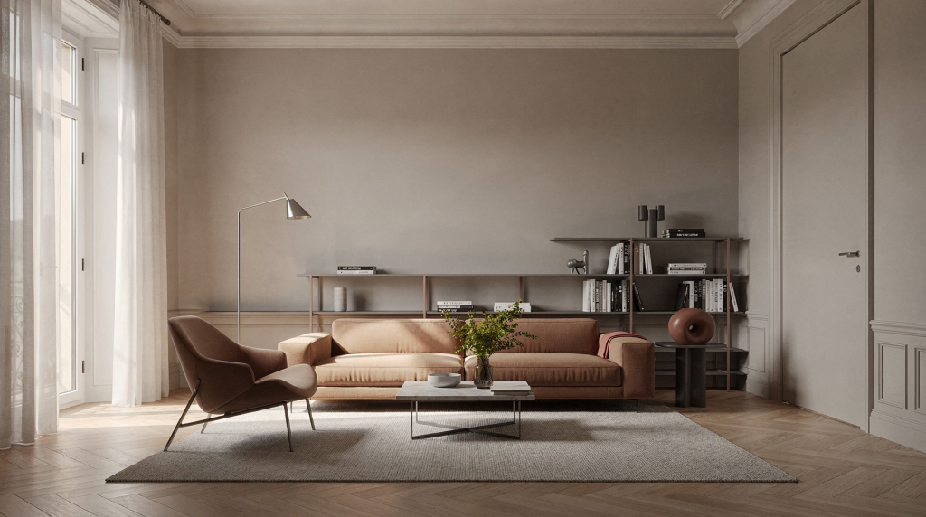
Milanese residential interiors resist a single definition. They emerge from a civic way of dwelling that continually crosses old apartment blocks, bourgeois enfilades, urban villas, postwar social housing, and stripped‑back contemporary conversions. That layering — historical, social, spatial — is precisely why the most compelling rooms in Milan read as composed rather than decorated, and as layered images rather than uniform sets.
For a practice anchored in composition, light, texture, and the quiet drama of domestic imagery, this is the only useful lens: a Milanese home is less a stylistic category than a visual system constructed from proportion, material contrast, and the everyday choreography of living. It is a place where architecture holds the camera, and the objects inside learn how to behave in front of it.
Why Milanese interiors feel distinct
Milan’s residential culture occupies the precise junction where architecture, design, and an almost pragmatic sense of daily life intersect. In practice, this means interiors are typically edited rather than decorated. The space is expected to function well, to hold together in a photograph, and still carry the patina and trace of someone actually inhabiting it. That equilibrium between rigour and ease is rare, and it is the first thing you notice when you walk through a properly resolved room here.
Four qualities recur often enough to become a working framework:
- A clear dialogue between the original structure and the new intervention — not a juxtaposition for its own sake, but a deliberate relationship where the old wall, the original ceiling height, or the worn stone floor is allowed to anchor the contemporary piece. In visual terms, this produces depth; it gives the eye a timeline to travel along.
- A commitment to spatial order over ornament — surfaces are rarely overloaded. Rhythm comes from the spacing of furniture, the pause between volumes, and the negative space that lets each object breathe. Decoration, when it appears, reads as a curated accent rather than a layer of noise.
- A careful, almost editorial handling of light — especially natural light, which is treated as a material to be directed and shaped rather than a fixed condition. The way daylight moves across a plaster wall or falls through a wooden shutter becomes part of the room’s composition, not an afterthought.
- Attention to tactile materials — plaster, wood, stone, metal, linen, and wool are chosen for how they feel against each other in real space and, crucially, for how they register in a photograph. The silvery sheen of an old mirror next to matte wool, or the grain of unpainted oak against smooth marble, creates the kind of visual friction that makes a room feel alive.
This explains why Milan remains such a vital reference for residential design and for anyone who works with domestic imagery. The city approaches the home as both a practical instrument and a composed picture — not one or the other, but both, held in a single frame.
The visual grammar of a Milanese home
Imagine a Milanese interior as a still life backed by architecture. Every object carries weight, yet nothing is meant to feel accidental or arbitrary. The room is composed the way you would light and style a set: with one dominant story, supported by a few perfectly placed secondary elements that the eye discovers only on the second or third reading.
1. Proportion before decoration
The first piece of information to absorb is scale. Milanese rooms become memorable not because they are large or embellished, but because their proportions are respected. A low ceiling isn’t disguised with tricks; it’s left to define the intimate character of the space. A narrow hallway is allowed to feel narrow, so the furniture within it becomes a deliberate, minimal punctuation rather than a crowd. A generous window remains visually open — the view, the light, and the opening itself do the work that a piece of art might do elsewhere.
What this means in practice:
- Let furniture follow the room’s geometry instead of fighting it. A long, rectangular table reads best in a rectangular space; a round pedestal can anchor a square room with high ceilings.
- Resist the urge to fill every perimeter wall. Visual breathing room around a piece often does more for the composition than the piece itself.
- Use fewer, precisely sized elements rather than many small ones. One substantial armchair, positioned well, holds more authority than three diminutive ones scattered across the room.
- Leave clear space around key objects — a dining table, a chest, a lamp — so the eye can land and rest before moving on.
2. Light as a shaping material
In Milanese interiors, natural light isn’t a bonus feature. It’s a design tool as material as plaster or wood. A surface changes identity across a single day: morning light might flatten a textured wall, northern exposure can cool a warm tone into something silvery, and late‑afternoon sun will deepen every grain and shadow. Understanding this behaviour is essential because it determines how the room will read in photographs and in life.
Work with light intentionally:
- Place lighter, reflective, or slightly luminous surfaces — polished stone, a glazed ceramic vase, a pale wool throw — where daylight is scarce, to carry what little light exists further into the room.
- Choose matte, absorbent finishes where glare becomes a problem, especially on large vertical surfaces that catch direct sun. A matte plaster wall in a room with strong south‑east exposure performs better than a glossy one, holding colour without bouncing harsh highlights.
- Test paint, textile, and wood samples at different hours. The grey that looked soft at midday may turn cold and inert under a flat northern sky at dusk.
- Treat window treatments as visual filters, not just privacy screens. A linen curtain scrims the light differently than a slatted wooden shutter; each creates a distinct quality of shadow and diffusion inside the room.
3. Material contrast
Depth in a Milanese room often emerges from the push and pull between hard and soft, rough and smooth. Plaster meets wool, marble meets painted timber, glass meets linen. That controlled friction stops the space from collapsing into visual flatness. It’s the same principle you’d use on a fashion set: a crisp cotton shirt against a textured tweed skirt, or polished leather next to raw silk, creates an image the eye wants to keep exploring.
A reliable working rule:
- Pair one visually calm, even recessive, material with one insistently tactile material. The calm surface sets the stage; the tactile one provides the tension.
- Repeat the same material in at least two places — a stone floor and a stone shelf, the same wood tone on a table top and a door frame — to create coherence without monotony.
- Avoid introducing more than three or four distinct finishes in a single room. Beyond that, the eye loses its anchor and the composition starts to feel busy, regardless of how disciplined the palette might be.
Common Milanese residential typologies
Milan doesn’t offer one domestic model. It offers several, each generating its own interior logic, its own spatial rhythm, and its own set of visual challenges. Recognising these typologies matters because styling choices should never work against the architecture. A room with classical bones requires a completely different visual strategy from a compact postwar flat or an open‑plan contemporary conversion where the concrete shell does half the talking.
| Typology | Visual character | Interior strengths | Typical challenge |
|---|---|---|---|
| Historic apartment | Tall volumes, ornamental detail, thick load‑bearing walls | Strong architectural identity, refined proportions that steer the room naturally | Balancing preservation with contemporary comfort without turning the space into a museum |
| Bourgeois residence | Formal room sequence, generous ceiling heights, symmetrical layout | Inherent elegance, clear sightlines, natural sense of arrival and presence | Avoiding stiffness or a parade‑room atmosphere that leaves no room for daily softness |
| Postwar apartment | More compact floor plan, functional circulation, often smaller windows | Easy to adapt, efficient layout that supports quick, intelligent editing | Preventing a generic, featureless look that relies too heavily on furniture alone |
| Social housing unit | Clear structural logic, often compact and rationally organised | Good bones for a thoughtful, minimalist intervention where every element is justified | Limited natural light or constrained storage that must be solved without clutter |
| Contemporary renovation | Open planning, updated systems, exposed materials like concrete or steel | Flexibility, minimal visual noise, strong envelope to build atmosphere upon | Creating warmth, texture, and character within a shell that can read as stark or impersonal |
How to read a Milanese apartment like an art director
The most effective way to study a residential interior is to slow down and break it into layers, the same way you’d decode an image on set. Start wide, then narrow in. The best rooms feel strong because every layer supports the one above it.
First layer: the envelope
Begin with the physical container. Ask what the room is actually built from.
- Are the walls thick, suggesting depth and old masonry, or light partition panels that define space without weight?
- Do the ceilings soar or compress? A high ceiling calls for a vertical gesture — a pendant lamp, a tall shelving unit — while a low ceiling benefits from horizontal emphasis and lower‑slung furniture.
- Is the floor continuous, running the same material through multiple rooms, or fragmented into zones? Continuity creates calm; fragmentation can be used to delineate function but risks visual noise.
- Do door openings and window frames frame a view beyond, or do they break the space into separate, compressed parts? Each opening is a compositional edge: what it reveals and what it hides shapes the room’s narrative.
Second layer: circulation
Observe the way a body moves through the home. Movement is rarely neutral; it influences where the eye pauses and where it accelerates.
- Is the entrance a deliberate pause — a small hall with a bench, a console, a mirror — or just a passage you rush through? A well‑composed entrance anchors the whole experience of coming home.
- Do doors align to create a long enfilade that pulls the eye through, or do they interrupt the visual line, compartmentalising the space into private moments?
- Is the path between functional zones — kitchen to dining, living to sleeping — clear and logical, or does it require weaving around furniture? Circulation should feel natural, even when the floor plan is tight.
- Does furniture support this movement or obstruct it? A large piece placed too close to a doorway can feel like a visual barrier even if physical passage is still possible.
Third layer: composition
Now treat the room purely as an image. Squint slightly, as you would when checking contrast on a screen. Ask:
- What is the visual anchor — the one element the eye snaps to immediately? It may be a dining table, a painting, a floor lamp. Everything else should orbit it.
- Where does the eye rest first, and where does it travel next? There should be a path: anchor first, secondary point second, and then a softer third resting place.
- Which object carries the most visual weight? Scale, colour, and material density all contribute. A dark, textured piece will always draw the eye more than a pale, smooth one.
- What reads as deliberate and what reads as accidental? If something feels like visual noise, it probably is. A room with authority has very little that appears unintentional.
This layered approach is especially valuable in Milan, where many apartments gain their character from quiet, cumulative choices — the way a door handle aligns with a switch plate, the gap between a sofa and a radiator — rather than from overt architectural drama.
Styling rules that work well in Milanese interiors
These aren’t rules in the rigid sense, but patterns that repeatedly produce strong visual results. They emerge from observation, not theory.
Keep the palette disciplined. A restrained palette makes a room feel more coherent, especially in apartments with strong existing features that already provide plenty of visual information — herringbone floors, decorative cornices, tall panelled doors. By limiting the colour story, you let the architecture speak without shouting over it.
Good starting combinations:
- Warm white, tobacco, charcoal — earthy but crisp; anchors a modern room without feeling cold.
- Stone, sand, olive, dark wood — a tonal range drawn from the landscape outside the city; feels seamless even in an urban apartment.
- Cream, rust, black, muted blue — a slightly more graphic palette where the rust and the black provide punctuation against a soft ground.
Use repetition to create calm. The eye finds reassurance in repetition. Repeat one material, one finish, or one colour in several places, and the room starts to hum with a quiet, underlying order.
Examples:
- The same wood tone appears on shelving, a table surface, and a picture frame — it threads the room together without becoming a theme.
- The same textile family — a raw linen, for instance — runs across curtains, seat cushions, and a bed throw. The room feels connected even when the items are functionally different.
- The same metal finish on lighting and accessories removes visual friction from small, detail‑level decisions.
Edit surface clutter. Many interiors lose their power at the surface level. Every horizontal plane that meets the eye is a potential source of noise.
Check:
- Tabletops — dining, coffee, side. Is there just one deliberate arrangement, or a scattered collection of things that crept in over time?
- Shelves — both open and closed. Open shelving invites editing; too many small objects and the eye can’t settle.
- Window sills — often overlooked, they catch clutter and block the clean line of the opening.
- Entry consoles, bedside surfaces, bathroom countertops. Each small plane either adds to the room’s composure or quietly erodes it.
If an object doesn’t support the room’s use or its visual logic, removing it almost always strengthens the image.
Let one piece lead. A Milanese room frequently reads best when a single element carries the scene’s visual authority. It might be a substantial dining table that anchors the entire space, a chair with a sculptural silhouette, a lamp that throws a particular quality of shadow, a textile with deep texture, or a painting that pulls the palette together. The rest of the room should support that lead element — complementing it rather than competing with it. When everything tries to be the hero, nothing is.
A practical method for styling a room in the Milanese way
This sequence works because it keeps you from rushing into decorative decisions before the spatial structure is settled. It’s the same logic you use on set: build the frame first, then place the elements, then step back and look through the lens.
- Start with the architecture. Identify the strongest fixed elements — the ceiling height, the window position, the way light moves, the floor material — and make them the non‑negotiables. They are the room’s spine.
- Choose a limited palette based on how daylight behaves, the existing floor tone, and the wall colour you cannot change or choose to keep. Let the light dictate whether the palette goes cooler (northern exposure) or warmer (southern or western light).
- Select one dominant material and two supporting materials. This keeps the tactile story tight and prevents finish overload. For example: dominant — warm oak; supporting — ivory plaster and grey‑green linen.
- Place the largest furniture first. The sofa, the dining table, the bed. Their position determines the flow and the sightlines. Get these wrong and every smaller piece will struggle to correct the composition.
- Add only the objects that genuinely improve function or composition. A cushion that finishes the colour balance, a lamp that gives the right pool of light, a textural throw that breaks a flat surface.
- Step back and check balance from two critical viewpoints: the entrance (the first impression) and the main seating point (the lived view). A room often reads differently from each angle; what works from the door may feel unbalanced from the sofa.
- Remove one element before adding another. This final checkpoint prevents the slow creep of accumulation that turns a composed room into a busy one. In Milan, restraint almost always generates more visual authority than accumulation does.
Typical mistakes to avoid
- Using too many finishes in one room — the eye loses its anchor and the space starts to feel restless.
- Choosing furniture without considering scale — a piece that looks right in a showroom can overwhelm or disappear inside the actual room.
- Ignoring the quality of daylight — it alters colour, shadow, and material character; a room styled under artificial light can read completely differently by morning.
- Filling every empty surface — negative space is a compositional tool; removing it flattens the visual rhythm.
- Matching everything too closely — tonal cohesion is useful, but too much uniformity makes a room feel sterile and un-lived-in.
- Treating the room as a showroom instead of a lived space — interiors need evidence of use: a book left on a table, a textile with soft creases, the patina of daily life.
- Adding decorative objects before the spatial plan is right — styling applied too early masks problems that the architecture and furniture placement should have solved first.
One of the most persistent errors is confusing “minimal” with “empty.” A Milanese interior is almost never stripped bare. It is edited — thoughtfully, deliberately — and it needs tension, texture, and visible traces of inhabitation to feel alive. An empty room is just empty; an edited room is precise.
What makes a room photograph well
Since Milanese interiors are often consumed visually — in books, in magazines, on screens — they need to hold up in a photograph as well as they do in life. The connection is direct: a room that photographs well usually has a clear internal hierarchy. The camera rewards order, rhythm, and restraint. It penalises clutter, imbalance, and surfaces that are difficult to read because of harsh or insufficient light.
A simple photography checklist
These are the points I automatically check before lifting a camera:
- Keep the frame clean at the edges. Stray cables, a corner of a radiator, half a stool creeping into the edge — they pull the eye out of the composition and break the quiet authority of the shot.
- Use natural light whenever possible. Daylight gives materials their honest colour and texture. Supplement only when necessary, and then keep the source soft and directional, not flat.
- Avoid overexposing pale surfaces. White walls, light limestone floors, or pale textiles can blow out easily and lose all texture. Underexpose slightly if needed and lift shadows later; it’s easier to recover detail than to invent it.
- Include one element that signals scale. A chair, a doorway, a well‑placed book — something the eye can use as a reference to understand the room’s true size and proportion.
- Show material contrast clearly. Position the camera to capture where rough meets smooth, where matte meets sheen, where textile meets timber. That junction is where visual energy lives.
- Photograph corners, thresholds, and transitions. The edge of a room, the shift from a tiled entry to a wooden floor, the shadow where a wall meets a curtain — these contain just as much information as a wide frontal view.
- Capture the room from more than one height. A low angle can exaggerate ceiling height; a higher one can reveal the flow between furniture groups. Moving the camera up or down changes the story dramatically.
Milanese interior cues to look for in residential walks
If you are building a visual diary of domestic Milan — whether for reference, for a project, or simply out of curiosity — pay attention to the smaller, often overlooked elements that carry the identity of a home. These details are not secondary decoration. They are the silent visual infrastructure that gives a residential interior its local character and, often, its strongest photographs.
- Entry doors and thresholds — the tone of the wood, the patina on the brass handle, the transition from communal stone to private parquet. Every threshold tells a story of arrival.
- Courtyards and internal views — glimpsed through a window, down a corridor, or framed by a doorway; they add depth and a sense of the city beyond.
- Stair landings — with their particular light, their half‑landing window, the worn treads that record years of use.
- Window proportions — tall, narrow casements; wide, horizontal ribbon windows; deep‑set openings that create a thick frame of shadow.
- Old lift cabins and shared corridors — the materiality of the cage, the marble of the communal floor, the softness of the light in a space without direct sun.
- Radiators, shutters, handles — functional hardware that, in Milan, often carries a sculptural quality worth noticing.
- Floor patterns and wall junctions — the grout line of a cement tile floor, the way a timber skirting meets a plaster wall, the delicate shadow of a dado rail.
A simple checklist for evaluating a Milanese-style interior
Use these seven questions as a quick diagnostic — whether you are walking through your own home, assessing a renovation plan, or studying a photographed space.
- Does the room feel proportionally balanced — not just from one angle, but from the doorway and from the primary seating position?
- Is the light working for the materials, or are surfaces reading as flat, grey, or washed out at key times of day?
- Are the finishes limited and coherent, without feeling monotonous or overly matched?
- Does one element lead the composition — an object, a view, a surface — and do the other elements support it?
- Is there enough visual breathing space, or do objects crowd the edges and fill every plane?
- Does the styling support daily life, or would the room collapse into disorder the moment someone actually uses it?
- Would the room still feel strong if three objects were removed? If the answer is no, the composition may be relying on quantity rather than quality.
When most answers lean toward yes, the room is likely working — not as a perfect image, but as a composed, liveable space with real visual authority.
FAQ
What defines a Milanese residential interior?
It’s defined by a set of visual principles — composition, proportion, material contrast, and the ongoing balance between architecture and everyday domestic life — rather than by any fixed decorative style. This is what makes it both difficult to copy and endlessly adaptable.
Is a Milanese interior always minimal?
No. It is usually edited and disciplined in its palette and placement, but it can be warm, classical, richly layered, or sharply contemporary. The common thread is not austerity but intentionality: every element has a reason for being there.
How do you make a small Milan apartment feel more refined?
Work with a restrained palette, improve natural light wherever the architecture allows, reduce visual clutter until the key pieces can breathe, and choose furniture scaled precisely to the room’s dimensions. Resist the impulse to fill; instead, let the space itself be part of the composition.
Which materials work best in Milanese homes?
Plaster, wood, stone, linen, wool, glass, and thoughtfully chosen metals. These materials succeed because they juxtapose smooth and textured, matte and reflective, warm and cool — creating contrast without introducing visual noise.
Why is Milan such an important reference for interiors?
Because the city uniquely merges a deep residential architectural heritage, a living design culture, and a long, almost intuitive tradition of treating domestic space with clarity and respect. It remains one of the richest contexts for studying how interiors are composed, how they age, and how they are photographed and lived in over time.
Conclusion
The visual language of the Milanese residential interior rests on clarity, restraint, and a tactile intelligence that respects both the structure and the life it contains. When a room honours its own proportions, deploys light as a deliberate material, and combines surfaces with a sense of confident contrast, it acquires the quiet, grounded authority that makes Milanese domestic spaces so consistently compelling — not just to inhabit, but to look at and to learn from.
For anyone styling, photographing, or renovating a home here, the aim should not be to reproduce a formula or chase a particular Milanese “look.” The task is more subtle: read the room carefully, recognise what the architecture is already offering, edit with precision, and then let that architecture lead the visual story. The best interiors in this city are never forced; they feel as though they simply arrived, fully formed, out of a long and patient conversation between walls, light, and daily life.