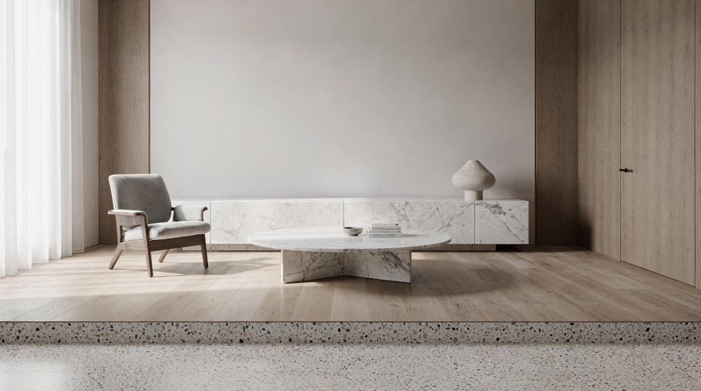
In Milan, material choice is never just decoration. Marble, wood, and terrazzo shape how a room feels, ages, and photographs — especially in apartments where architecture, light, and everyday life are closely connected. I’ve spent years training my eye to read surfaces the way a stylist reads fabric: not for what they claim to be, but for how they hold light, how they interact with the volumes around them, and how they shift in character from morning to evening. These three materials, when used with intention, act as a visual grammar — one gives structure, one gives warmth, and one gives rhythm.
For residential interiors, each does a different job well: marble adds weight and precision, wood brings warmth and human scale, and terrazzo ties surfaces together with pattern and memory. The best rooms in Milan rarely use them as isolated effects; they combine them carefully so each one supports the others, much like a well-composed photograph where every element has a role in the frame.
Why these materials matter in Milanese homes
Milan interiors often balance restraint with tactility. That means materials must do more than look good on a moodboard: they need to handle natural light, frequent use, and the visual rhythm of compact rooms, corridors, courtyards, and living areas. I’ve walked through enough apartments in this city to know that the most memorable spaces are rarely the ones shouting for attention. Instead, they’re the ones where a honed marble threshold catches the afternoon sun just enough to define a transition, or where an oak floor runs through several rooms and quietly unifies them without a single decorative gesture.
Marble, wood, and terrazzo are especially effective because they can appear formal or relaxed depending on finish, proportion, and placement. A polished marble shelf reads differently from a honed stone floor — the first reflects light like a mirror and demands precision around it, the second absorbs light and feels almost textile-like. Oak paneling can feel architectural instead of rustic when it’s used as a continuous plane rather than a decorative insert. Terrazzo can look traditional, graphic, or quietly modern depending on the scale of its aggregate and the contrast between chips and matrix. The key is understanding that these materials are not static; they perform differently under different light conditions and in different spatial contexts.
A simple way to think about each material
| Material | Visual effect | Best use in the home | Main caution |
|---|---|---|---|
| Marble | Precise, cool, reflective | Counters, thresholds, tabletops, bathroom details | Can feel heavy or too formal if overused |
| Wood | Warm, soft, structural | Flooring, cabinetry, wall cladding, furniture | Can become visually flat if tone is too uniform |
| Terrazzo | Speckled, layered, durable | Floors, bathrooms, kitchen splash zones, entryways | Pattern scale must be controlled carefully |
Marble: structure, contrast, and light
Marble works best when it is treated as a surface with presence, not as an ornament. In Milan homes, that usually means using it where a room needs a clear visual anchor: a dining table, a bathroom vanity, a fireplace surround, a kitchen top, or a narrow threshold that marks a transition between spaces. I often think of marble as the punctuation in a room’s composition — it doesn’t need to cover large areas to make an impact; a single well-placed slab can hold the entire visual weight of a corner.
The appeal of marble lies in its variation. Veining, tone, and polish change how it reads under daylight. In a north-facing apartment, a pale marble with subtle grey veining can keep a room from feeling too flat, catching whatever cool light is available and giving it a surface to play on. In a brighter home, a darker stone like a deep green or charcoal marble can add depth without adding clutter, especially when surrounded by matte, light-absorbing materials. The way light moves across a marble surface throughout the day — sharp and high-contrast at noon, softer and more diffused in the late afternoon — is something no photograph ever fully captures, but it’s what makes the material feel alive in a home.
How to use marble well
- Use it in limited but highly visible areas — a single dining table, a vanity top, a fireplace hearth — so it becomes a focal point rather than background noise.
- Pair it with matte surfaces like limewash walls, raw wood, or brushed metal so the reflections don’t overwhelm the room. The contrast between a glossy stone and a soft, light-absorbing surface is what makes both feel more considered.
- Choose the finish carefully: honed for a softer, almost suede-like presence that works beautifully in bathrooms and on floors; polished for sharper contrast and a more formal, reflective quality that suits tabletops and accent pieces.
- Match the stone’s tone to the room’s natural light rather than to a catalog image. A marble that looks warm and golden in a showroom under spotlights can turn cold and grey in a north-east facing Milanese kitchen.
Common mistakes with marble
- Using too many different marbles in one space, which fragments the visual flow and makes the room feel like a sample library.
- Choosing a busy, high-contrast vein pattern for every surface, creating visual competition rather than harmony.
- Combining glossy stone with glossy lacquer and shiny metal, which can feel overworked and reflective to the point of discomfort — the eye has nowhere to rest.
- Forgetting that stone needs visual breathing room around it; a marble element crowded by furniture or competing textures loses its sculptural quality.
A useful rule: marble works best when it is allowed to feel almost architectural. One strong slab or one clear detail usually has more impact than multiple small gestures scattered across a room. Think of it as a single, deliberate brushstroke rather than a pattern.
Wood: the material that makes a room livable
If marble gives a room contour, wood gives it human scale. In residential design, especially in Milan apartments, wood is often what prevents a space from feeling cold or staged. It softens acoustics, frames daily rituals, and creates continuity between rooms. As someone who has spent years working with textiles, I’m particularly sensitive to how wood interacts with other soft materials — how a matte oak floor changes the perceived temperature of a wool rug, or how a walnut shelf can make a linen curtain feel more intentional simply by providing a warm, solid anchor nearby.
Wood is also the most flexible of the three materials. It can appear traditional in parquet, modern in flush cabinetry, or quietly elegant in wall paneling and shelving. Oak has become particularly relevant in recent Milan interiors because it feels lighter and less heavy than darker walnut, while still offering warmth and depth. Its grain is active enough to catch light without dominating, which makes it an excellent background material for rooms that need to accommodate art, textiles, and furniture without visual competition.
Where wood does the most work
- Flooring in living rooms and bedrooms — it sets the visual baseline for the entire space.
- Built-in storage and wardrobes — when flush and handleless, they become architectural planes rather than furniture.
- Kitchen cabinetry — the largest continuous wood surface in most homes, so its tone and grain direction matter enormously.
- Boiserie and wall cladding — can transform a corridor or a bedroom into a more intimate, acoustically softer environment.
- Tables, chairs, and shelving — where the tactile quality of wood is experienced up close every day.
Finishes that matter
Wood is not one material visually. The same species can feel completely different depending on finish, and this choice often matters more than the wood type itself.
- Matte finish: softer, more domestic, better for relaxed rooms. It absorbs light and reduces glare, making spaces feel quieter and more intimate.
- Satin finish: a balanced choice for most homes. It offers a subtle sheen that brings out the grain without becoming reflective, working well in both contemporary and traditional settings.
- Gloss finish: more graphic and reflective, but harder to keep visually calm. It can work on small accent pieces or in very controlled environments, but in a lived-in home it often reads as too polished.
Typing the room by wood tone
| Wood tone | Visual mood | Good for |
|---|---|---|
| Light oak | Airy, contemporary, calm | Small apartments, northern light, clean-lined interiors |
| Honey-toned wood | Warm, familiar, balanced | Living rooms, bedrooms, family spaces |
| Dark walnut | Formal, grounded, rich | Libraries, dining rooms, heritage apartments |
Typical mistakes with wood
- Matching every wood tone too perfectly, which can make the room feel flat and lifeless — a slight variation in tone or grain actually adds depth.
- Using dark wood in a small apartment without enough light or contrast, which can shrink the space visually and feel oppressive.
- Mixing too many different grains and finishes in one space, creating a chaotic surface landscape that confuses the eye.
- Treating wood only as a “warm” material instead of an architectural one — it can define planes, create rhythm, and structure a room just as effectively as stone or plaster.
Wood works especially well when it repeats in a controlled way. A floor, a cabinet, and one shelving system in the same family of tones can establish a visual rhythm without becoming repetitive. The repetition creates a sense of calm, much like a restrained color palette in a fashion collection.
Terrazzo: pattern, memory, and durability
Terrazzo is one of the most practical and expressive materials in residential design. In Milan, it carries both historical and contemporary associations, which makes it useful in homes that want to feel grounded without becoming nostalgic. I’ve always been drawn to terrazzo because it works like a textured fabric — from a distance it reads as a solid tone, but up close it reveals a complex, almost pointillist surface that rewards attention.
Unlike marble, terrazzo is not about singular drama. Its strength is in its aggregate surface: chips of stone, marble, or glass create a field that becomes interesting from a distance and rich up close. It can connect old and new parts of an apartment, or soften the transition between more formal and more functional rooms. In a hallway that links a 19th-century living room to a modern kitchen, a terrazzo floor can act as a visual bridge, its speckled surface absorbing both the ornate and the minimal without conflict.
Why terrazzo works in homes
- It is durable and suitable for heavy traffic — entryways, corridors, and kitchens benefit from its resilience.
- It handles entryways and kitchens well, where water, dirt, and daily wear are inevitable.
- It can unify multiple zones visually, especially in open-plan apartments where different functions need a common ground.
- It introduces texture without relying on color alone; the aggregate does the work, so the overall palette can remain restrained.
Where terrazzo makes sense
- Hallways and entrance floors — the first surface you see and touch, setting the tone for the entire home.
- Bathrooms — on floors and even walls, where its water-resistant nature and tactile quality shine.
- Kitchens — as flooring or a splashback, offering a practical yet visually engaging surface.
- Utility areas that still need visual care — a laundry room or a back entrance can feel considered rather than forgotten.
- Custom furniture tops or plinths — a terrazzo console or a low plinth can become a sculptural element in a living room.
Choosing terrazzo without making the room busy
The key is scale. A terrazzo with small, restrained aggregate will read almost like a solid color with subtle texture, while one with large, high-contrast chips becomes a dominant graphic element. For residential use, smaller and more controlled patterns are usually easier to live with because they don’t compete with furniture, textiles, and art.
Before choosing terrazzo, ask these questions:
- Will the room already have strong veining, bold upholstery, or patterned textiles? If so, a quieter terrazzo is better.
- Is the apartment large enough to hold a visually active floor, or will it overwhelm the space?
- Do the chips echo the room’s palette, or fight it? Ideally, the aggregate should contain at least one color that appears elsewhere in the room.
- Will the surface be seen mostly from afar or at close range? A busy pattern can be exciting up close but exhausting from a distance.
How to combine marble, wood, and terrazzo
The most successful interiors do not give each material equal volume. They assign roles, much like a stylist assigns weight to different garments in an outfit. One material leads, the others support.
- Marble often acts as the accent or point of precision — a single sharp detail that draws the eye.
- Wood usually provides the main background warmth, setting the overall temperature of the space.
- Terrazzo works as the connective tissue, especially on floors and thresholds, linking areas without demanding attention.
This hierarchy keeps a room from feeling like a sample board. It also helps the eye move naturally from one surface to another, creating a visual path through the home.
Three reliable combinations
- Wood floor + marble detail + terrazzo entry
Good for apartments that need a calm living area and a more durable threshold. The wood sets a warm, continuous base; the marble appears as a considered accent (a fireplace surround, a console top); and the terrazzo in the entryway gives the entrance a distinct identity without competing with the living space. - Terrazzo floor + wood cabinetry + marble countertop
Useful in kitchens and compact family homes. The terrazzo floor handles spills and traffic, the wood cabinetry brings warmth and softness to the vertical planes, and the marble countertop provides a precise, durable work surface that elevates the entire room. - Marble bathroom + wood vanity + terrazzo accent
Works well when the bathroom needs to feel both refined and lived in. The marble walls or floor create a clean, luminous envelope; the wood vanity introduces a tactile, warm element at the point of daily use; and a terrazzo accent — perhaps a shelf or a niche — adds texture without overwhelming the space.
A practical method for selecting materials
Before committing to finishes, test them under the real conditions of the apartment. Milan light changes through the day, and that matters more than sample-room lighting. I’ve learned to never trust a material sample seen only under showroom spots; the same stone can look flat at noon and luminous at dusk, and that shift is what you’ll live with.
Step-by-step selection process
- Identify the room’s main function — what happens here, and what surface qualities support that activity?
- Decide which material should be dominant — this will set the visual tone.
- Limit the palette to two or three core surfaces; more than that and the room starts to feel restless.
- View samples in morning light and late afternoon light, placing them on the actual floor or against the actual wall.
- Place samples next to flooring, wall paint, and fabric — see how they interact at the edges.
- Check how the surfaces read at a distance, not only in the hand; step back and squint to see the overall balance.
- Confirm maintenance requirements before finalizing the choice — a beautiful surface that can’t handle daily life will quickly lose its appeal.
Material checklist
- Does the stone work with the apartment’s natural light, or does it fight it?
- Does the wood tone support the room’s scale, or does it make it feel smaller or colder?
- Does the terrazzo pattern disappear into the background when it should, or does it compete with everything else?
- Can the chosen finish handle daily use — water, scratches, heat — without constant anxiety?
- Will the combination still look coherent after furniture, books, and textiles are added, or will it become visually noisy?
Practical maintenance and longevity
Residential design is not only about first impressions. A material only succeeds if it continues to look good after months of use, developing a patina that feels earned rather than neglected. The way a surface ages is part of its visual character, and choosing a material means accepting its future self.
Marble care basics
- Use coasters and trays on tabletop surfaces to prevent etching from acidic substances.
- Expect natural patina in lived-in areas; a honed finish will show wear more softly than a polished one.
- Avoid assuming all marbles behave the same way; some are more porous and stain more easily than others — always test with a sample.
- Seal and maintain according to the specific stone type, following the supplier’s guidance rather than generic advice.
Wood care basics
- Control humidity where possible; Milan’s seasonal shifts can cause wood to expand and contract, so allow for movement in installation.
- Protect floors from scratching with felt pads under furniture legs, and consider rugs in high-traffic paths.
- Clean with products suitable for the finish — avoid all-purpose cleaners that can strip oils or leave residues.
- Accept that minor change over time is part of the material’s character; a floor that shows gentle wear tells the story of the home.
Terrazzo care basics
- Clean gently and regularly with pH-neutral cleaners to avoid dulling the surface.
- Avoid harsh products that can etch the matrix or discolor the aggregate.
- Treat sealing as essential, especially in kitchens and bathrooms where moisture and stains are common.
- Check edges and joints, not only the main field; cracks often start at the perimeter where different materials meet.
When each material is the wrong choice
Good design also means knowing when not to use something. Editing is as important as selecting, and the most confident interiors often leave certain materials out entirely.
- Marble may be the wrong choice if the room already has a strong pattern language — busy wallpaper, heavily veined stone elsewhere, or bold geometric textiles — or if maintenance needs to be minimal and the household can’t tolerate the occasional stain.
- Wood may fail if the room lacks natural light and every surface is already warm-toned; the space can feel heavy and airless. In a dark, north-facing room, too much wood can absorb what little light there is.
- Terrazzo may feel excessive if the apartment is very small and the pattern would dominate the visual field, making the space feel restless and smaller than it is.
The best interiors do not maximize materials. They edit them, keeping only what serves the composition.
Material combinations by room type
| Room | Best dominant material | Supporting material | Why it works |
|---|---|---|---|
| Entryway | Terrazzo | Wood | Durable first impression with warmth from a wooden console or bench |
| Kitchen | Wood or terrazzo | Marble | Practical base with a refined work surface that elevates daily tasks |
| Living room | Wood | Marble accent | Comfortable scale with one sharp detail — a coffee table, a fireplace — that anchors the room |
| Bedroom | Wood | Minimal stone | Restful, quiet atmosphere where softness prevails |
| Bathroom | Marble or terrazzo | Wood | Clean, durable, and visually balanced — the wood vanity or stool prevents sterility |
Final thoughts
Marble, wood, and terrazzo are not just classic residential materials. In Milan apartments, they act like a visual grammar: one gives structure, one gives warmth, and one gives rhythm. Used well, they make a home feel composed without feeling staged — as if every surface was chosen not for a photograph, but for the way it will look at 7 a.m. on a Tuesday, with coffee brewing and the first light hitting the floor.
The strongest interiors do not rely on materials alone, but material choice is where the room begins. If the surfaces are right — if they respond to the light, support the daily rituals, and relate to each other with clarity — the rest of the design has a clearer path. Furniture, textiles, and objects can then do their work without fighting the background.
FAQ
Which material is the most practical for residential interiors?
Wood is usually the most flexible for everyday living, while terrazzo is often the most durable in high-traffic areas. The choice depends on the room’s function and light.
Is marble too formal for a home?
No. Marble feels formal only when overused or paired with too many glossy finishes. In small doses — a tabletop, a threshold, a shelf — it adds precision and depth without stiffness.
Is terrazzo outdated?
Not when it is used with restraint. In Milan interiors, terrazzo often reads as timeless because it bridges old and new well. The key is controlling the scale and color of the aggregate.
What is the safest combination for a balanced interior?
Oak or another warm wood, one marble detail, and a restrained terrazzo surface in the entry or bathroom is a dependable starting point. It gives warmth, a focal point, and durable texture without visual noise.
How do I make these materials work in a small apartment?
Limit the palette, choose lighter tones, and give each material a clear role instead of repeating all three everywhere. A light oak floor, a single marble shelf, and a small terrazzo entry mat can be enough.