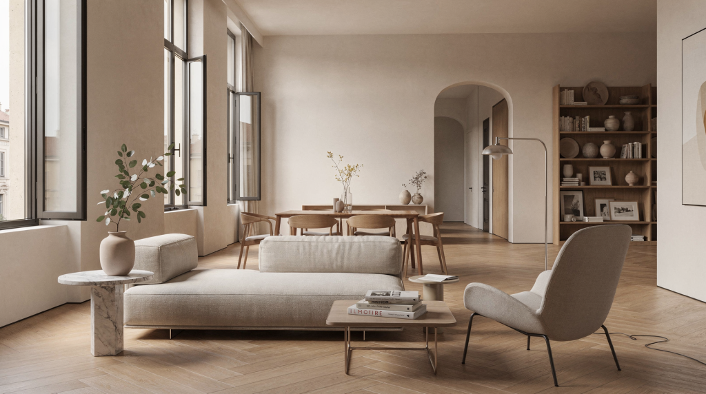
A sense of home isn’t something you decorate into existence. It builds up slowly, layer by layer, the way a composition comes together in a frame. Architecture gives a room its bones and its breathing room. Interiors translate that structure into daily comfort. Objects carry the memory, the rhythm, the personal handwriting. In Milan, where apartments often juggle historical strata, compact footprints, and light that changes personality from morning to afternoon, this relationship is impossible to ignore. Here, a home is something you compose — not just occupy.
What “home” really means in spatial terms
We talk about home as a feeling, but it has a physical logic. A room starts to feel like home when it does three things at once, without you having to think about them:
- Orientation: you understand how to move through it. Your eye lands, your body follows. The space reads clearly, like a well-composed image where nothing blocks the natural flow.
- Protection: it feels sheltering, not exposed. Proportions, ceiling height, the way a window frames the outside — these either wrap around you or leave you feeling on display.
- Recognition: it contains details that feel personally legible. These are visual anchors that your brain registers as familiar, as yours.
That recognition can come from a preserved parquet floor with decades of patina, a chair you’ve had forever, a lamp that softens the evening light just so, or a shelf arrangement that quietly mirrors your habits. In practice, home is built through repeated visual cues — small, consistent signals that tell you this place knows you.
Why architecture matters before styling does
Before you think about cushions, colors, or accessories, look at the architecture. The layout, proportions, openings, and existing materials already set the emotional tone of a home. They’re the underlying grid — the composition before you add elements. Get this wrong, and even the most beautiful furniture will feel like it’s fighting the room.
In Milan, many residential interiors still carry traces of early 20th-century apartments, postwar reconstruction, or later compartmentalized plans. What’s interesting is how recent apartment renovations in the city often start by preserving or reactivating existing elements — decorated ceilings, herringbone parquet, hexagonal tiles, original portals — rather than replacing everything. This isn’t nostalgia. It’s an understanding that memory can be built into the structure itself, and that certain materials and proportions already hold the room’s character.
The architectural elements that most affect the feeling of home
| Element | What it does | What to check |
|---|---|---|
| Layout | Defines flow and privacy — it’s the choreography of daily life. A good layout feels effortless, like a well-edited composition where nothing fights for attention. | Can you move without awkward detours? Does the circulation feel natural, or do you find yourself making unnecessary turns? |
| Thresholds | Mark the shift between public and private. They’re the punctuation marks of a home — signaling a change in atmosphere, much like a transition between scenes. | Does the entrance feel clear and welcoming? Does it read as an intentional pause or an afterthought? |
| Light | Sets mood throughout the day. Light is the most dynamic material in a room — it shifts color temperature, alters textures, and redraws the composition as hours pass. | Where does morning, afternoon, and evening light land? Track how sunlight moves across surfaces; a room that looks flat at noon might gain depth at dusk. |
| Materials | Create tactile familiarity. Materials speak to the skin before the eye — they establish a room’s temperature, both literal and emotional. | Are surfaces warm, cold, reflective, or absorbent? A mix of matte and polished, rough and smooth, creates the kind of tension that makes a space feel alive. |
| Proportions | Affect calm or tension. Proportions dictate psychological weight — a low ceiling can feel intimate or oppressive; a high ceiling can feel grand or cold. It’s all in the relationship between height, width, and depth. | Do rooms feel balanced or compressed? Stand in the center and look around. Does the volume feel harmonious, or does one dimension dominate? |
| Views and openings | Shape visual continuity. Openings frame views like a lens — they connect rooms, borrow light, and create visual depth beyond the immediate space. | Can one room borrow light or sightlines from another? Look through doorways. Do they create a layered perspective, or cut off the view abruptly? |
If the bones are wrong, no amount of styling can fix the posture. Poor circulation, dark corners, awkward thresholds — these are like a garment that doesn’t fit. You can accessorize it, but it will never feel right.
Interiors: the layer that turns structure into habit
If architecture is the skeleton, interiors are the way a body learns to live inside it. This is where comfort, function, and atmosphere meet — where the abstract becomes tactile. In Milanese interiors, a successful room often combines contrast rather than uniformity: old and new, polished and matte, rigid and soft, architectural and domestic. A steel kitchen can sit beside timber joinery without feeling cold. A minimal wall gains depth when balanced by a textured textile. A clean-lined table warms up simply through the light that falls around it. These aren’t contradictions; they’re conversations between surfaces.
The most useful interior moves
- Use fewer, better-defined pieces instead of many unrelated objects. Edit furniture like you’d edit a wardrobe: fewer pieces, but each with a clear silhouette and purpose. A room full of small, unrelated items reads as visual noise; a few strong pieces create a composition you can actually see.
- Repeat materials or colors across rooms to create visual continuity. Let one material or color travel from room to room — it’s the spatial equivalent of a recurring motif, creating rhythm without repetition.
- Let one or two strong surfaces anchor the room: flooring, wall finish, or built-in storage. A continuous floor, a textured wall, or a wall of storage acts like a background canvas — it holds everything else in place.
- Mix practical items with objects that carry memory or pleasure. A kitchen should have good knives and a ceramic bowl you love. Utility without memory feels sterile; memory without utility feels like a museum.
- Leave negative space; visual rest is part of comfort. Empty space is not wasted space. It’s where the eye rests, where compositions breathe. In styling, we call it negative space — the silence that makes the notes audible.
A room that reads clearly feels instantly more like home. When every surface shouts, nothing is heard. Calm comes from editing — knowing what to remove is as important as knowing what to keep.
Objects: small things that make a room feel inhabited
Objects are not secondary. They are often what make a space feel lived in rather than staged. A home becomes personal when objects do at least one of these things:
- support a routine — objects that earn their place through daily use: a lamp that makes reading comfortable, a tray that corrals morning coffee, a hook that holds the bag you reach for every day;
- carry emotional memory — things that hold stories: a ceramic piece from a trip, a textile inherited or found, a book that changed how you see. These don’t need to match; they need to mean something;
- improve how a room looks in natural light — some objects come alive in light: a glass vase that catches afternoon sun, a matte ceramic that absorbs and softens it, a mirror that bounces light into a dark corner;
- anchor scale in a large or empty room — in a room with high ceilings or generous proportions, objects can bring the scale down to human level. A large floor lamp, a substantial vase, a stack of books create intermediate points between floor and ceiling;
- soften hard architecture — textiles, plants, paper, wood absorb sound and light, taking the edge off hard surfaces like concrete, glass, or stone. They make a room feel less like a showroom and more like a place where someone actually lives.
A chair near a window, a stack of books on a side table, a ceramic bowl on an entry console, or a textile folded on a shelf can each shift the emotional register of a room. These items do not need to be expensive. They need to be placed with intention — positioned the way you’d place a prop in a still life, where every centimeter matters.
A simple rule for selecting objects
When I’m composing a room — or a still life — I ask three questions. They work for any object, from a chair to a candlestick:
- Does it serve a daily use?
- Does it add visual balance?
- Does it belong to the light, color, and material language of the room?
If the answer is no to all three, the object probably does not belong. It’s not about minimalism; it’s about intention.
The Milan context: why the city is useful as a lens
Milan is especially revealing because its residential architecture often sits between restraint and richness. Apartments may have historical bones but contemporary interiors. Entryways can be formal, while living areas are intimate. Light shifts sharply between courtyards, street-facing rooms, and deeper interior spaces — a constant play of brightness and shadow that reshapes the same room several times a day.
That makes Milan a useful place to study how home is composed:
- courtyards create pauses and transitions — they act as visual breathing room between the street and the private sphere;
- stairwells and entry halls shape anticipation — they set the tone before you even reach the door;
- older apartments often preserve original details worth keeping — not out of sentimentality, but because those details carry proportion and material intelligence;
- renovations frequently rely on subtraction rather than visual overload — a Milanese renovation often removes rather than adds, revealing what was already there;
- design culture in the city has trained people to read materials and proportion carefully — there’s a visual literacy here that comes from living surrounded by a certain kind of rigor.
For a visual journal, this matters because home is never just a polished final image. It is the result of decisions about what to keep, what to remove, and what to let remain visible. The beauty is in the editing.
How to build a sense of home in practice
Step 1: Read the room honestly
Before changing anything, look at what the space already gives you. Approach it like a location scout: what’s already working?
- Where is the strongest natural light?
- Which wall feels heavy or blank?
- What material already has character?
- Which area feels underused?
- What is the room’s most convincing feature?
Do not start by buying objects. Start by identifying the room’s existing strengths. The best rooms are often the ones that leaned into what was already there.
Step 2: Define the room’s main function
Every room needs a clear role, even if it performs several tasks. A room without a clear function feels adrift, no matter how beautiful the pieces in it.
Examples:
- a living room can be for reading first, hosting second — the layout should serve the primary activity;
- a bedroom can prioritize calm over display — everything in it should support rest;
- a small apartment may need one area to work as both dining and workspace — define it clearly so it doesn’t feel like a compromise;
- an entry zone may need to be more practical than decorative — it’s a transition, not a destination.
The clearer the function, the easier it is to style intelligently. Form follows what the room actually does.
Step 3: Choose a material logic
A home feels more coherent when materials speak to each other. It’s not about matching; it’s about dialogue. Good combinations often include:
- wood + linen — warm, breathable, tactile;
- stone + wool — solid and soft in balance;
- metal + matte plaster — industrial precision meets hand-finished surface;
- lacquer or glass + natural fiber — shine grounded by texture;
- painted walls + visible grain in furniture — smooth color against organic detail.
Avoid too many finishes competing in one room. Consistency helps a room feel settled, like a palette that knows what it wants to say.
Step 4: Edit the objects
Edit with discipline. This is where the stylist’s eye really comes in.
- Keep what you use often visible — the rest can be stored or rotated.
- Group smaller items so they read as a composition — a cluster of objects on a tray reads as one visual unit, not scattered noise.
- Give every object a reason to be where it is — if you can’t articulate why it’s there, it probably shouldn’t be.
- Remove anything that is purely filler — placeholders dilute the impact of the pieces that matter.
A home becomes calmer when objects feel selected rather than accumulated. It’s the difference between a curated shelf and a cluttered one.
Step 5: Test the room at different times of day
A room that works in morning light may fail at night. Light is the most unforgiving editor — it reveals everything.
Check:
- how colors shift in daylight — that warm gray might turn cold by afternoon;
- whether reflective surfaces become harsh — a glossy table can throw glare exactly where you don’t want it;
- whether lamps create enough softness — overhead light alone is rarely enough;
- if textiles absorb or amplify light — dark fabrics can swallow light, pale ones can bounce it;
- whether the room still feels balanced after dark — shadows change proportions.
This is especially important in Milan, where natural light can be beautiful but changeable — a room that glows at 10 a.m. might feel flat by 4 p.m.
Common mistakes that weaken the feeling of home
Over-decorating too early
Buying accessories before the room’s structure is clear leads to visual confusion. Start with architecture, then furniture, then objects. Layering prematurely is like adding jewelry before you’ve chosen the dress.
Ignoring scale
A beautiful chair can look lost in a large room. A small lamp can disappear on an oversized table. Scale matters more than style — a piece that’s the wrong size will never look right, no matter how lovely it is.
Treating every surface as important
Not every wall needs attention. Not every shelf needs to be filled. Quiet areas help important elements stand out. Visual hierarchy is everything.
Using too many competing colors
A home does not need many colors to feel rich. Often one restrained palette with a few accents works better. Let materials do the talking; color can be the punctuation, not the whole sentence.
Forgetting the entrance
The first few square meters shape the entire impression of home. If the entrance feels disorganized, the whole apartment feels less composed. This is the opening shot — it sets the tone for everything that follows.
A practical checklist for making a room feel like home
- The layout makes movement easy.
- One or two materials anchor the space.
- Natural light is considered, not ignored.
- Furniture is scaled to the room.
- Objects have a clear role or meaning.
- There is visual rest, not constant display.
- The room feels good at day and night.
- The entrance sets the right tone.
- At least one element carries memory or identity.
- The space feels personal without feeling crowded.
A useful way to think about the relationship between the three layers
| Layer | Main question | Goal |
|---|---|---|
| Architecture | How does the room move and breathe? | Clarity |
| Interiors | How does the room support daily life? | Comfort |
| Objects | What makes the room feel personal? | Identity |
When these three layers align, a home feels composed rather than decorated. It reads like a coherent image, not a collection of pretty things.
Conclusion
A sense of home is not achieved by one perfect piece or a finished style. It comes from the dialogue between structure, use, and personal presence. Architecture gives the room order, interiors make it livable, and objects give it memory. In Milan, where apartments often hold visible traces of the city’s residential history, this dialogue is especially clear: home is something you reveal, edit, and refine until it feels both practical and deeply yours. It’s not about perfection — it’s about a composition that finally feels true.
FAQ
What makes a room feel like home?
A room feels like home when it is easy to move through, comfortable to inhabit, and marked by details that reflect the person living there. It’s a combination of clear architecture, thoughtful interiors, and objects that carry meaning.
Should architecture or decor come first?
Architecture comes first. Layout, light, and proportions determine what kind of decor will actually work. Trying to decorate around a problematic structure is like styling an outfit that doesn’t fit — you can add accessories, but the foundation is off.
How many objects should a room have?
As many as support the room’s function and visual balance. The right number is usually lower than people expect. If every surface is covered, nothing stands out. Edit until the room breathes.
How do I make a rented apartment feel personal?
Use furniture, lighting, textiles, and objects that can move with you. Avoid relying only on permanent changes. The things you bring in — a lamp, a chair, a textile — can shift the entire atmosphere without touching the walls.
What is the easiest way to improve a room quickly?
Edit the objects, improve the lighting, and define one clear focal point. These changes usually have the fastest impact. Remove what doesn’t belong, add light where it’s needed, and give the eye one place to land.