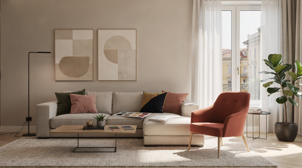
A colour palette is not a decorative afterthought. It is the visual foundation that holds a room together — the first thing the eye registers and the last thing that lets go. In Milan, where apartments oscillate between deep-shadowed period rooms and sharp, light-flooded renovations, a palette has to work harder than it would in a neutral, predictable shell. It must absorb the city’s seasonal light shifts, respond to the architecture it sits within, and still feel effortless. When I look at an interior, I read colour the way I once read a fashion image: as a system of relationships between light, surface, volume, and mood. The right palette makes a space legible. It tells you where to look, when to pause, and how to feel.
Why colour palette decisions matter
Colour precedes everything. Before the eye registers the shape of a sofa or the grain of a wooden floor, it absorbs colour. This is why a poorly chosen palette can undermine even the most carefully furnished room. It affects spatial perception — making a compact Milanese living room feel either cocooning or claustrophobic. It alters the temperature of natural light, pushing a north-facing space further into coolness or pulling it back toward warmth. It dictates how materials converse: whether a stone floor feels grounded or disconnected, whether linen upholstery reads as soft or simply faded. And it controls visual rhythm — the difference between a home that breathes and one that feels visually cluttered.
In Milan, these stakes are heightened by the city’s architectural duality. Many residential interiors sit inside buildings that carry the weight of heritage — moulded ceilings, terrazzo flooring, deep window reveals — while others have been stripped back to a modern shell. A palette that sings in a bright new-build with floor-to-ceiling glazing may collapse into flatness in a courtyard-facing apartment where light arrives filtered and indirect. A scheme that feels elegant in winter’s low, directional light can become oppressively heavy in summer if there is no counterbalance of lighter tones or reflective surfaces. Colour decisions are never standalone; they are always in dialogue with the specific conditions of the space.
Start with the apartment, not the moodboard
I have learned to distrust the moodboard as a starting point. It is too easy to fall in love with a photograph of a sun-drenched room in a different latitude and assume the same palette will translate. It rarely does. A palette should grow out of the room itself — its orientation, its fixed elements, its proportions. This is where the art director’s instinct for reading a set comes into play: you assess the existing conditions before you introduce anything new.
Study these four things first
- Natural light: North-facing rooms in Milan tend to receive cooler, more consistent light throughout the day. They often need warmth injected into the palette to avoid feeling austere. South-facing rooms, by contrast, can handle more depth and saturation because the light is strong enough to carry it. East and west orientations bring their own drama — morning brightness that fades, or afternoon glare that intensifies colour.
- Fixed elements: The floor is usually the largest colour field in a room, yet it is often overlooked in palette planning. Doors, window frames, radiators, stone surfaces, kitchen fronts, and any built-in joinery are non-negotiable anchors. They set the tonal framework that everything else must respond to.
- Room size and ceiling height: Compact rooms benefit from fewer dominant colours and clearer contrast. When every surface competes, the space shrinks visually. High ceilings can take more tonal variation, but low ceilings demand restraint.
- Architecture style: A Milanese apartment with original mouldings, terrazzo, or carved woodwork already carries significant visual texture. The palette should support that character, not fight it. A stripped-back renovation, on the other hand, may need the palette to supply the personality that the architecture withholds.
A palette that ignores these four conditions will always feel like it is working against the space rather than with it. The room will resist, and the result will be a quiet, persistent visual discomfort that is hard to diagnose but impossible to ignore.
A simple way to build a colour palette
I think of a palette as a series of layers, not a list of colours. Each layer has a job. When the layers are balanced, the room feels composed — the eye moves naturally from one surface to the next without getting stuck or skipping. This layered approach is something I carried over from styling, where a single outfit might combine a base tone, a secondary texture, a grounding element, and one deliberate point of focus.
1. Choose your base
The base is the colour family that occupies the largest visual area — typically walls, large upholstery pieces, or major cabinetry. It sets the atmospheric tone for the entire room. In Milan, I find that warm neutrals almost always outperform crisp whites. A warm white, soft greige, sand, muted stone, pale clay, or smoky beige absorbs shadow gracefully rather than turning it grey. Very stark white can look surgical in rooms with mixed artificial lighting, especially during winter evenings when the light source is low and warm. The base should feel like a quiet exhale — present but not demanding attention.
2. Add one secondary tone
This is where personality enters. The secondary tone gives the home character without taking over. It might appear on an accent wall, an armchair, a set of curtains, a rug, or a painted joinery detail. Olive, sage, muted blue, tobacco, terracotta, dusty rose, or a warm grey-brown — these are colours with enough presence to register but enough softness to recede when they need to. The secondary tone should support the base, not compete with it. If the base is a warm white, a muted olive on a single upholstered piece creates a gentle tension that feels intentional rather than decorative.
3. Include one deeper anchor
Every composed room needs a note of visual weight. Without it, the palette floats — pleasant but ungrounded. An anchor colour prevents the space from reading as washed-out or underdeveloped. Walnut brown, charcoal, forest green, deep blue, dark aubergine, or blackened bronze work beautifully in Milan apartments where shadow is part of the architectural language. A darker anchor also performs a subtle optical trick: it makes lighter colours read as richer by providing contrast. A sand-coloured wall looks more nuanced next to a walnut door frame than it does alone.
4. Add a highlight
The highlight is the smallest but most active element in the palette. It is the visual spark — a cushion, a vase, a lamp base, an artwork frame, or a single painted detail. Ochre, soft rust, muted cobalt, butter yellow, brick red. Used sparingly, the highlight creates rhythm. Scattered everywhere, it creates noise. I treat highlights the way I treated a single strong accessory on a fashion shoot: one well-placed point of energy is enough to animate the entire frame.
A practical palette formula
Over years of observing what makes a room feel settled versus unsettled, I have come to trust a simple proportional framework. It is not a rigid rule, but it is a reliable diagnostic tool when a space feels either underdeveloped or overdecorated.
| Role | Approximate share | Function | Common examples |
|---|---|---|---|
| Base | 60–70% | Sets the overall atmosphere | warm white, sand, greige |
| Secondary | 20–30% | Adds character and variation | olive, clay, muted blue |
| Anchor | 5–15% | Grounds the room | walnut, charcoal, deep green |
| Highlight | 1–5% | Adds visual spark | rust, ochre, cobalt |
When a room feels chaotic, it is often because the secondary and highlight proportions have swollen beyond their roles — too many colours competing at equal volume. When a room feels flat, the anchor is usually missing or too weak. This ratio helps restore hierarchy. It gives the eye a clear path: base first, then secondary, then the anchor that holds the composition steady, and finally the small punctuation of the highlight.
How Milan light changes colour
Milan light is not a single, stable condition. It shifts dramatically by season, by building orientation, and by the particular geometry of streets and courtyards. A colour that looks serene on a paint chip can turn unexpectedly cold, muddy, or bleached when subjected to the city’s specific light patterns. This is something I learned to read through years of working with natural light on fashion sets — the same fabric could look entirely different at 9 a.m. versus 4 p.m., and interior colour behaves identically.
What to expect
- Winter light sits low and cool. It is directional and often muted by cloud cover, which means pale neutrals can read greyer than intended. Warm undertones become essential to counteract this.
- Summer light is intense and direct, especially in street-facing rooms. Delicate, chalky colours can bleach out almost entirely, losing their nuance. A slightly more saturated base holds its character better under strong daylight.
- Courtyard-facing rooms receive softer, more enclosed light. Shadows are deeper and linger longer. These rooms can take richer, more saturated tones without feeling heavy because the light itself is gentler.
- Street-facing rooms gain energy from reflected light bouncing off surrounding buildings. Contrast reads more sharply here, and cooler palettes can work well if the architecture supports them.
This is why paint samples must be tested on the actual wall, not chosen from a screen or a showroom display. I always recommend painting large swatches on at least two walls and observing them at different times of day: morning, midday, evening, and under artificial light. A colour that feels calm at noon may turn sombre by dusk. The only way to know is to live with the sample for a few days and watch how it behaves.
Warm, cool, muted, or saturated?
Every palette begins with a temperature decision. This is not about personal preference alone — it is about how the colour will interact with the room’s light and the emotional weight the space needs to carry.
Warm palettes
Warm palettes suit most Milan homes when the goal is comfort and continuity. They create a softer, more domestic atmosphere and bring a sense of depth to shaded rooms. They also provide a calm, receptive backdrop for wood and natural textiles — materials that already carry their own warmth. Cream, sand, ochre, terracotta, and warm taupe are reliable directions. A warm palette does not mean a yellow room; it means a room where the undertones lean toward the sun rather than away from it.
Cool palettes
Cool palettes can work beautifully, but they need the right conditions. They suit rooms with abundant natural light and strong architectural lines. A cooler palette sharpens the reading of proportion and detail — it makes mouldings crisper, volumes clearer, and the overall atmosphere more edited. Blue-grey, slate, dusty sage, misty olive, and steel-toned neutrals are the directions I reach for when the architecture is doing enough work that the colour can afford to step back. In a Milanese apartment with original ceiling detail, a cool palette can feel elegant and restrained. In a darker, less defined space, it can feel simply cold.
Muted palettes
Muted colours are often the safest and most refined choice for residential interiors, and they are the ones I return to most frequently. Muted does not mean dull. It means the colour contains some grey, earth, or softness — a quality that makes it easier to combine with different materials and more forgiving under changing light. A muted olive will adapt to morning and evening light more gracefully than a saturated green. A muted clay will sit comfortably next to both wood and stone. In practice, muted palettes offer the most flexibility with the least visual friction.
Saturated palettes
Saturation demands intention. Strong colours work best when the room has a clear, defined role or when the architecture can support the visual weight. A reading corner, a dining room, a powder room, an entryway, or a study — these are spaces where a saturated colour can create a distinct atmosphere without overwhelming daily life. A fully saturated living room can be stunning, but only if the light and proportions are generous enough to carry it. Otherwise, the colour dominates rather than supports, and the room feels smaller and more demanding than it should.
Matching palette to room function
Different rooms carry different emotional weights, and the palette should respond accordingly. This is less about rules than about visual logic — what does the room need to do, and how can colour help it do that?
| Room | Better palette direction | Why it works |
|---|---|---|
| Living room | warm neutrals with one grounded accent | supports long stays and mixed activities without visual fatigue |
| Bedroom | soft, low-contrast tones | encourages rest and keeps the visual field quiet |
| Kitchen | cleaner base with a controlled accent | maintains freshness and practicality while allowing personality |
| Entryway | slightly darker or more defined palette | creates a deliberate transition from outside to inside and sets the home’s tone |
| Bathroom | compact palette with strong material contrast | prevents visual clutter in a small, hard-surfaced space |
| Home office | balanced neutrals with one focused tone | aids concentration without feeling sterile or uninspiring |
These are starting points, not prescriptions. The key is to match the emotional register of the colour to the way the room is used. A bedroom that feels visually busy will never feel restful, no matter how soft the bedding. A home office that is too muted may drain energy rather than support focus. The palette should serve the life that happens in the room.
How to use materials to support colour
A palette is never just paint. It is colour in relationship with surface. The same warm white will read differently on a matte plaster wall than it will next to polished stone or raw linen. Materials carry their own colour — wood has undertones, stone has depth, metal has reflectivity — and these must be factored into the palette from the start.
- Wood warms even cooler shades. A walnut floor or an oak table introduces amber and brown notes that shift the entire colour field toward warmth.
- Stone adds quiet depth and visual weight. Its natural variation in tone creates a subtle, living texture that flat colour cannot replicate.
- Linen and cotton soften stronger colours by absorbing light rather than reflecting it. They make saturated accents feel more integrated and less abrupt.
- Metal sharpens the palette. A brass lamp base or a steel door handle introduces a point of reflectivity that adds contrast and definition.
- Glass and lacquer increase reflection and visual movement. They catch light and throw it back into the room, which can lift a palette that feels too heavy or static.
In Milan apartments, where architectural restraint is common and ornament is often minimal, texture does a significant portion of the visual work. A room with a simple colour palette — say, warm white, sand, and walnut — can feel layered and rich if the materials are varied: a linen sofa, a stone coffee table, a woollen rug, a glazed ceramic vase. The eye reads the differences in surface as complexity, even when the colour range is narrow. This is one of the most useful principles I brought from fashion styling, where a monochromatic look succeeds or fails entirely on the interplay of matte, shine, and texture.
Step-by-step method to choose your palette
When I approach a new interior, I follow a sequence that moves from the fixed to the flexible, from the given to the chosen. This prevents the common mistake of starting with a colour you love and then trying to force the room to accommodate it.
Step 1: Identify what stays
Make a list of the non-negotiables: the floor, doors, kitchen fronts, any existing sofa or curtains, inherited furniture, and artwork that will remain. These are your anchors. The palette must work with them, not around them.
Step 2: Decide the atmosphere
Choose one clear direction. Calm and soft? Warm and enveloping? Clean and architectural? Layered and moody? Light and airy? This decision guides every subsequent choice. A room cannot be all of these things at once, and trying usually results in visual confusion.
Step 3: Build around the largest surface
Start with the wall colour — the largest colour field in most rooms. Do not begin with accents or accessories. The base sets the stage; everything else plays a supporting role.
Step 4: Test in real light
Paint large samples on at least two walls. Observe them in the morning, at midday, in the evening, and with artificial light on. Watch how the colour shifts. A sample that looks perfect at 2 p.m. may feel entirely wrong at 8 p.m. Live with it for a few days before committing.
Step 5: Edit
If the room already has a lot happening in form and material — mouldings, patterned floors, varied furniture silhouettes — reduce the number of colours. Let the architecture and objects carry the visual interest. If the architecture is plain, the palette can do more of the work. The principle is balance: colour should fill the visual gaps, not create excess.
Common mistakes to avoid
Over the years, I have seen certain patterns repeat in rooms that feel unsettled. These are the most frequent missteps, and they are almost always fixable once you know what to look for.
- Too many mid-tones: When everything sits at the same tonal weight, the room feels indecisive. There is no hierarchy, no place for the eye to land.
- Using only “pretty” colours without a structural base: A collection of beautiful shades does not make a palette. Without a dominant base, the room lacks coherence.
- Ignoring undertones: This is especially critical in whites, beiges, and greys. A white with a pink undertone will clash with a beige that leans green. The mismatch reads as visual discomfort even if the viewer cannot name the cause.
- Matching everything too closely: A room where every beige is identical loses depth. Slight variation within the same colour family creates richness; exact matching creates flatness.
- Forgetting that artificial light changes colour dramatically: A palette that works in daylight can collapse under warm LED or cool fluorescent light. Test under both conditions.
- Applying a strong accent everywhere: An accent colour needs one clear role. Scattered across cushions, vases, lamps, and artwork, it loses its impact and becomes visual noise.
A quick checklist before you commit
Before finalizing any palette, I run through a short set of questions. If the answer is no to two or more, the scheme needs editing.
- Does the palette suit the amount of natural light the room actually receives?
- Do the wall colour and floor colour work together, or do they fight?
- Is there enough contrast to define the architecture — to make door frames, mouldings, and transitions readable?
- Are there at least three levels of depth: base, accent, and anchor?
- Does the room feel better in daylight and at night, or does it lose its character after dark?
- Can the palette adapt if one piece of furniture changes, or is it so tightly calibrated that any shift will break it?
This checklist is a tool for objectivity. When you have been staring at samples and swatches for weeks, it is easy to lose perspective. These questions bring the focus back to how the room actually performs, not how it looks in isolation.
Palette examples that work well in Milan homes
These are not prescriptions but reference points — palettes I have seen succeed repeatedly in the specific conditions of Milanese apartments. Each one balances light, material, and architectural context in a way that feels natural rather than forced.
1. Soft urban classic
- Warm white
- Greige
- Walnut
- Blackened metal
This palette works well in period apartments and renovated flats that retain original details. The warm white and greige provide a soft envelope, walnut grounds the composition, and blackened metal adds a crisp, contemporary edge that prevents the scheme from feeling nostalgic.
2. Earthy contemporary
- Sand
- Olive
- Clay
- Dark brown
A strong choice for homes that want warmth without heaviness. The sand base keeps things light, olive and clay introduce natural, grounding tones, and dark brown provides the necessary anchor. This palette feels connected to the earth but still urban and current.
3. Quiet modern
- Cream
- Smoky beige
- Slate blue
- Charcoal
This suits cleaner interiors with simple lines and less ornament. The cream and smoky beige create a calm, understated base, while slate blue adds a cool, refined accent. Charcoal anchors the scheme without introducing brown tones, keeping the overall feeling crisp and architectural.
4. Light and tactile
- Ivory
- Pale stone
- Dusty sage
- Natural oak
Useful in smaller Milan apartments that need calm and brightness. The ivory and pale stone maximize light reflection, dusty sage adds a gentle, organic note, and natural oak brings warmth without visual weight. This palette makes compact spaces feel open and breathable.
FAQ
How many colours should a residential interior have?
Most homes work well with three to five colour families, including neutrals. More than that can become fragmented unless the space is very large or strongly curated. The key is not the number of colours but the clarity of their roles. A room with three well-defined layers will always feel more composed than a room with seven colours competing for attention.
Should every room use the same palette?
Not necessarily, but a home feels more coherent when rooms share the same colour logic — the same temperature, a similar level of saturation, a consistent approach to contrast. Each space can have its own emphasis while still belonging to the same visual family. The transition from room to room should feel like a conversation, not a jump cut.
Is white always the safest choice?
No. White can be surprisingly difficult in Milan apartments, especially when the light is cool or uneven. A stark white in a north-facing room can feel grey and institutional. A warmer off-white — something with a hint of cream or sand — often performs better because it softens shadow and feels more inviting under artificial light. White is not neutral; it has undertones, and those undertones will either work with the room’s light or against it.
Can a small apartment handle dark colours?
Yes, if they are used deliberately. Dark colours can make a small room feel more intentional and architectural rather than simply small. The key is pairing the dark colour with enough light, contrast, and texture. A deep charcoal wall in a compact entryway, for example, can create a sense of arrival that a pale wall cannot. The darkness becomes a feature, not a flaw.
What is the easiest palette for beginners?
A warm neutral base with one muted accent and one darker anchor is the most forgiving starting point. It provides enough structure to feel composed and enough flexibility to accommodate mistakes. From there, you can refine and adjust as you learn how the colours behave in your specific light.
Conclusion
The best colour palette for a residential interior is not the most fashionable one. It is not the palette you saw in a magazine or saved on a moodboard. It is the one that fits the light, the architecture, and the way a home is actually used — day after day, season after season. In Milan, that usually means working with warmth, shadow, texture, and restraint rather than chasing dramatic colour for its own sake. The city’s apartments reward palettes that feel settled rather than staged.
Start with the room. Read its light, its fixed elements, its proportions. Build the palette in layers — base, secondary, anchor, highlight — and test it in real conditions. Edit until the space feels clear and the eye can move through it without resistance. When the palette is right, the interior does not just look coordinated. It feels complete. It holds its own in morning light and evening lamplight, in the quiet of winter and the brightness of summer. And that is the difference between a room that is decorated and a room that is truly resolved.