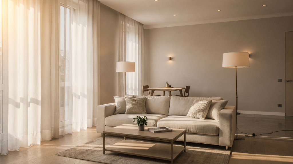
Light does more than illuminate a room. It sculpts volumes, anchors furniture arrangements, and sets the entire emotional register of a space. In my years of building images around composition and texture, I’ve learned that the same visual logic we use on set — where light is the first tool, decoration the second — holds just as true inside a home. A sofa can be impeccably upholstered, but if the light flattens its shape and drains its color, the piece never reads the way it was intended. In Milan, where apartments often juggle deep floor plans, historic apertures, and sharp contrasts between street-facing and courtyard rooms, lighting becomes the invisible editor of daily life. It has to perform three roles simultaneously: support how you cook, read, and dress; honor the existing architecture; and hold its own when a camera enters the room.
Why lighting matters more than decoration
I’ve walked into rooms filled with considered furniture that still felt indecisive, simply because the light was one-dimensional. A beautiful surface — raw plaster, brushed oak, a woven linen — can lose its entire character if the only source is a cold overhead panel washing away every shadow. Light dictates the color of walls across the day, the perceived depth of a niche, the way a textile reads as matte or lustrous. When I style a shot, I adjust lamps and curtains before touching a single object, because light sets the hierarchy of what the eye sees first. In Milanese homes with dual exposures or generous casement windows, the same room can feel gentle and layered in the morning and almost graphic by late afternoon. The right artificial lighting doesn’t fight that shift; it collaborates with it. For day-to-day living, you need a scheme that carries you from breakfast to midnight without forcing you to consciously adapt. For photography, you need enough structural contrast and clarity that the room appears intentional, not bleached or swallowed in shadow.
The three layers every home needs
The most functional and photogenic interiors I’ve encountered all share one principle: no single fixture does the work alone. Light is built like a composition, with a background, midground, and focal points.
1. Ambient light
This is the general wash that lets you read the room’s volumes. It can come from ceiling-mounted fixtures, cove lighting, wall sconces that graze the perimeter, or even a large pendant with a soft diffuser. The key is that ambient light shouldn’t dominate — it’s the canvas, not the subject. When it’s too bright or too uniform, the space loses its bones.
2. Task light
Task lighting is the most honest layer because it follows a specific need: cutting vegetables, reading a book, applying makeup, sorting papers. It should be focused and bright enough to eliminate strain, but contained so it doesn’t bleed across the entire room and flatten the contrast. A well-placed task light creates a small pool of clarity that anchors its zone without competing with the ambient layer.
3. Accent light
This is where personality enters. Accent light catches the edge of a bookshelf, a textured wall, an alcove, a painting, or the sculptural silhouette of a chair. It adds the fine lines that make a room feel composed rather than merely functional. Without accent light, even a layered scheme can feel like a technical exercise. With it, the room gains a sense of depth and a quiet focal rhythm.
A home that only relies on a single overhead ambient source often looks two-dimensional in both life and on camera. The three layers work together to give spaces visual weight, direction, and softness — qualities that are as practical as they are aesthetic.
How Milan homes change the lighting equation
Milan’s residential architecture introduces a very specific set of conditions that demand a more tailored lighting approach. The city is full of apartments that don’t follow the predictable loft-style openness of newer buildings, and that’s a good thing — it forces the lighting to become smarter.
Common situations I see regularly:
- Deep, enfilade layouts where daylight only reaches the first few meters of a room, leaving the far end in permanent dimness.
- North-facing apartments that receive a steady but cool, diffuse light all day, which can feel serene or somber depending on the materials it hits.
- South-facing rooms where hard summer light bounces off pale stone or terrazzo, creating extreme contrast and overexposed patches.
- Historic buildings with thick masonry walls, small window openings, and compartmentalized plans that break the space into distinct light zones.
- Renovated apartments where new steel-framed glazing, open-plan layouts, or bespoke joinery alter the original relationship between light and surface.
These constraints mean there is no universal formula. The most successful schemes I’ve seen in Milan treat each room’s daylight personality as the starting point, then build artificial layers that extend that character into the evening. A deep, narrow room might benefit from grazing wall light to pull the eye inward, while a south-facing living area might need sheer textiles and dimmable sources to tame the midday intensity without sacrificing the sense of openness.
Start with daylight before adding fixtures
Before you choose a single lamp, spend time in the apartment during the day with nothing switched on. This sounds almost too simple, but it’s the step most people skip. Understanding how natural light moves through the space determines where artificial light will need to support, correct, or simply stay out of the way.
What to check
- Which rooms receive direct sun, and at what hours — morning light is cooler and sharper, late afternoon light is warmer and more directional.
- Which zones stay shaded all day, and how that shadow behaves: is it a soft penumbra or a hard line?
- Whether light reflects off pale walls and ceilings and reaches deeper into the plan, or is absorbed by dark finishes and heavy textiles.
- How the space transforms in morning, midday, and evening — the same corner can look expansive at 10 a.m. and intimate at 6 p.m.
- Where shadows land across tables, sofas, and walkways — these are the places where you’ll later want to add a lamp to restore definition.
This is the same discipline used in interior photography: you read the room’s natural light choreography first, then introduce artificial sources to complement the scene, not overpower it. The best source isn’t always the brightest — it’s the one that aligns with how the room is oriented and what actually happens there.
A practical lighting plan room by room
| Room | What it needs | Common mistake | Better choice |
|---|---|---|---|
| Living room | A soft ambient background, directional reading light near seating, and one or two accent points that highlight texture or art. The goal is a balanced composition where no single corner feels forgotten. | One central ceiling fixture that turns the entire volume into an undifferentiated wash. This kills any sense of intimacy or hierarchy. | Combine a floor lamp beside the sofa, wall sconces that warm up the perimeter, and a dimmable ceiling source for flexibility. Let different heights of light draw the eye around the room. |
| Kitchen | Strong, clean task light over worktops and prep areas, with minimal shadows cast by your own body. A secondary softer layer for eating zones. | Decorative pendants that look attractive but leave counters in relative darkness, forcing you to work in your own shadow. | Under-cabinet strips or focused overhead spots for the task zone, paired with a warmer pendant or wall light over the dining area to separate the functions. |
| Bedroom | Low-glare ambient light that doesn’t bounce harshly off ceilings, and bedside reading lights that are adjustable and contained so one person can read without flooding the whole room. | Harsh downlights positioned directly above the bed, creating an uncomfortable glare when lying down and flattening the textiles. | Warm, dimmable sources placed low or to the side — wall-mounted reading arms, small table lamps, or a pendant pulled to one side. Let the light graze surfaces, not hammer them. |
| Bathroom | Even illumination around the face for grooming, a well-placed mirror light that minimizes under-chin shadows, and safe general light for bathing. | A single bright bar above the mirror that casts heavy shadows on the face and leaves the perimeter of the room in gloom. | Balanced light from both sides of the mirror or a large, diffused source directly above and slightly forward. Add a soft ceiling fixture for the rest of the space. |
| Entryway | Clear general light to greet you, plus a touch of warmth that makes the threshold feel inviting rather than utilitarian. | A dark, narrow entry lit by one weak bulb that sets an unwelcoming tone for the entire home. | A ceiling fixture for visibility, complemented by a small lamp or wall sconce that introduces a softer glow and visually expands the narrow passage. |
Choosing the right color temperature
Color temperature is often reduced to a number, but what it really controls is the emotional temperature of a room. In my styling work, I’ve seen how the same fabric can appear inviting under one light and sterile under another — and the same applies to wall paint, wood, and even skin tones in a photograph.
Warm light, roughly 2700K to 3000K, tends to feel residential, relaxed, and flattering to warm materials like oak, terracotta, or linen. Neutral light, around 3500K to 4000K, reads cleaner and more alert; it can work well in spaces where precision and clarity matter, such as a kitchen work zone or a home office. Cool light, beyond 4000K, can quickly become clinical and is rarely the right choice for a living environment unless it’s used very intentionally for contrast or a specific material effect.
The real key is consistency. When you have a warm-toned lamp in one corner and a blue-white bulb in the next, the eye reads the discrepancy before it reads the room. In a photograph, mixed temperatures create color noise that is difficult to correct in post-production. Stick to a coherent family of temperatures within any line of sight, and the space will feel unified whether you’re sitting in it or framing it through a viewfinder.
Light that photographs well
A room can feel beautiful in person and still fall apart on camera. Lenses exaggerate glare, compress depth, and reveal color mismatches that the brain filters out in real life. To make a space photograph well without relying on heavy post-processing, the lighting needs to be built with a few principles in mind.
- Install dimmers wherever possible — they allow you to adjust intensity per shot, controlling highlights and preventing overexposed patches on walls or furniture.
- Avoid depending on a single overhead source as the main solution; it creates top-down shadows that hide the shape of objects and flatten the room’s character.
- Keep bulb temperatures close to one another across all visible fixtures, so the camera records a consistent white balance throughout the frame.
- Balance strong window light with interior fixtures — if the daylight is dominant, use lamps to open up the shadows and prevent the room from collapsing into a silhouette.
- Use lamps and indirect sources to carve edges. The goal is to reveal the contours of a chair, the fall of a curtain, and the volume of a bookshelf through soft gradations, not through hard, uniform brightness.
Milan-based interior photographers often favor natural light as the foundation, introducing artificial light only to solve a specific visual problem — to lift a dark corner, to add a rim of light on a textured wall, or to balance a bright window with a gentler interior glow. That approach translates beautifully into daily living. The aim isn’t theatrical drama, but structured, believable light that works as hard for a quiet dinner as it does for a magazine frame.
Common mistakes to avoid
- Relying on one central ceiling fixture for the entire room, which erases depth and creates a flat, shadowless volume.
- Choosing lamps purely for their sculptural shape without assessing the quality or direction of light they emit.
- Using bulbs that are too cool for living spaces, making warm materials like wood and wool look cold and uninviting.
- Ignoring the reflected light from white walls, mirrors, glass surfaces, and pale curtains — these can be powerful secondary light sources if the primary source is positioned correctly.
- Placing too many points of light with no clear hierarchy, so the room feels busy and directionless instead of composed.
- Letting decorative lamps replace functional task lighting, leaving you straining to read or work comfortably.
- Forgetting that the same room needs different lighting conditions at different times of day — a bright midday setup is rarely appropriate after sunset.
A simple step-by-step method for improving your home
Step 1: Map the room by use
Write down what actually happens in each zone — reading, working, eating, resting, dressing, entering. Lighting should follow activity, not just architecture.
Step 2: Check daylight
Observe the room in the morning, at midday, and in the evening. Note where daylight helps and where it disappears, and how the color of the light shifts across the hours.
Step 3: Identify the main shadow problem
Is the room too dark, too flat, or too contrasty? This single observation tells you whether you need more general ambient fill, more layered sources, or softer diffusion to bring down harsh edges.
Step 4: Add task lighting first
Fix practical needs before decorative ones. A visually stunning lamp is irrelevant if you can’t read, cook, or work comfortably in the space it’s supposed to serve.
Step 5: Add one ambient layer
Introduce a ceiling fixture, wall light, or indirect source that makes the room feel visually complete without dominating the scene. This is your background wash.
Step 6: Finish with accent light
Highlight a shelf, artwork, plant, or architectural detail. This final layer gives the room a sense of depth and a quiet focal structure, like the finishing stroke in a composition.
A quick checklist for each room
- Can you use the room comfortably after sunset?
- Is there a clear difference between general, task, and accent light?
- Do all the bulbs feel similar in tone, or does the eye catch a mix of warm and cool?
- Are any surfaces overexposed or painfully bright in the field of view?
- Are corners left completely dead, with no light reaching them?
- Does the room still look good if one light source is switched off?
- Would the space photograph well without major rearranging?
How to make a room look good in both life and photos
The strongest interiors I’ve encountered in Milan often feel calm precisely because the lighting doesn’t compete with the architecture. In older apartments with textured plaster walls, terrazzo floors, or deep wooden doorframes, the character lives in the details — and those details need a certain amount of shadow to read clearly. Too much evenness erases depth, making chairs, tables, and textiles look like flat cutouts rather than solid objects. A little contrast gives the eye something to hold onto. It turns a doorway into a framed moment, a draped fabric into a study of folds, a simple corner into a still life.
Good lighting is not about eliminating every shadow. It’s about choosing what to reveal first and what to leave in gentle recession. When a room has that kind of visual hierarchy, it works effortlessly for both a quiet morning coffee and a carefully composed photograph.
When to invest more heavily
There are moments when lighting deserves a larger portion of the budget because it will fundamentally change how you experience the space. Spend more on lighting when the apartment has limited or compromised daylight, and every fixture has to pull double duty as both functional source and mood-setter. Similarly, in compact layouts, where a single well-placed wall light or directional spot can perform two or three different roles depending on how it’s angled, the investment pays off in spatial efficiency.
If you photograph the home regularly — whether for personal documentation, social media, or professional work — the quality of light becomes immediately visible in the results. And if a renovation has altered the room’s proportions, wall finishes, or window sizes, lighting is the most effective tool to visually rebalance the space: it can lift a low ceiling, widen a narrow corridor, soften a hard material, and make a modest room feel composed. In Milan, where visual coherence often matters as much as practical function, good lighting is one of the most transformative upgrades you can make. It doesn’t just decorate a room — it redefines how the room is perceived.
Final takeaway
Lighting a home well is a practice of observation, layering, and editing. Start with the daylight already present, learn its rhythms and its limits, then layer artificial light with intention. Keep the scheme practical for the way you actually live, but don’t underestimate the visual payoff of well-placed warmth and shadow. If a room feels comfortable to inhabit and still reads as composed after dark — with clear volumes, soft gradients, and a sense of quiet hierarchy — the lighting is doing exactly what it should.
FAQ
What is the best lighting for a small apartment?
Small apartments feel instantly larger when light comes from multiple directions rather than a single overhead source. Use one general ambient fixture, one or two focused task lights near seating or work areas, and a few soft accent points — a wall sconce, a small table lamp in a dark corner. The goal is to create depth, pulling the eye around the room instead of letting it hit a dead wall.
How do I make my home look better in photos?
Maximize daylight when possible, and keep all bulb temperatures consistent across the visible frame. Avoid harsh overhead light that flattens shapes and creates unflattering shadows. Add floor lamps, wall lights, and indirect sources to introduce soft gradients and gentle highlights on textured surfaces. The camera reads contrast and depth more than absolute brightness.
Should every room have dimmers?
Not every room requires them, but dimmers are one of the simplest tools for making lighting flexible throughout the day. They allow you to shift a room from bright and functional to low and atmospheric in seconds, which is useful both for daily comfort and for controlling exposure in photographs.
What color light is best for living spaces?
Warm to neutral light, typically between 2700K and 3000K, usually works best in living rooms and bedrooms. It flatters skin tones, enriches natural materials, and creates a relaxed atmosphere. Kitchens and work areas can handle a slightly more neutral tone if precision and clarity are priorities, but avoid anything too cool that makes the space feel clinical.
Why does my apartment look better during the day than at night?
Daylight naturally brings depth and softness because it changes angle, intensity, and color temperature across the hours. Artificial lighting often lacks that layering — replacing it with a single, static source that doesn’t create the same gentle shadows and highlights. The solution is usually to add more layers: a floor lamp here, a wall sconce there, a soft ambient source overhead, so the room regains its three-dimensional quality after dark.