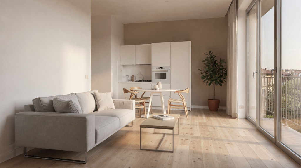
A compact apartment reads as calm and spacious not because it’s empty, but because its visual weight is distributed with intention. Circulation stays open, and the eye lands on a few confident anchors rather than bouncing between dozens of small distractions. In Milan, where tall ceilings meet narrow footprints and original details sit alongside awkward later additions, balance matters far more than stripping everything back to a minimalist shell.
What “visual balance” actually means
Visual balance isn’t symmetry for its own sake. I think of it as how the room lands on the eye — whether any corner feels overloaded, whether a wall reads as an afterthought, whether one material or color bullies everything else into submission.
When I walk into a room that works, three things are usually true:
- The eye moves naturally from one zone to another without getting stuck or confused
- Furniture, color, and texture are distributed so the composition feels deliberate, not accidental
- There’s enough negative space — breathing room — for each element to register clearly
For a small apartment, this approach almost always outperforms the instinct to simply buy smaller furniture. It’s not about shrinking everything; it’s about composing what you have so the space holds together visually.
Why small apartments in Milan need a different approach
Milanese apartments come with a distinct architectural vocabulary: parquet laid in geometric patterns, tall windows that pull light deep into the room, narrow entrance corridors, original plaster moldings, and rooms shaped by centuries of subdivision rather than open-plan ideals. These bones are beautiful, but they can also create visual tension when the furnishings ignore the architecture.
The recurring problems I see:
- A long, narrow living room that draws the eye too fast toward the far wall, like a tunnel with furniture
- A studio where every object is visible from every angle, leaving no visual rest
- A rental with zero built-in storage, where belongings colonize the floor
- A room with one generous window and corners that swallow light
- A mix of period finishes and modern additions that never quite find a common language
The aim isn’t to erase character — quite the opposite. It’s to let the architecture and the furnishings speak to each other rather than talk over one another.
The core principles of visual balance
1. Start with the room’s strongest point
Every room has a natural focal point — the element that should command attention first. In a compact apartment, this is rarely something you need to invent. It’s already there:
- A window with generous light and a view, even if the view is just a courtyard
- A fireplace or an original architectural detail worth celebrating
- The sofa wall, which anchors the main living zone
- A dining table that doubles as the social center of the home
- A piece of art with enough presence to hold a wall
- In a studio, the bed wall that defines the sleeping area
Once that focal point is clear, everything else arranges itself in relation to it. If nothing is emphasized, the room becomes a democracy of objects where everything competes and nothing wins — visually exhausting in any space, but punishing in a small one.
2. Control the visual weight
Visual weight is how heavy something feels in a composition. Dark colors carry more weight than light ones. Solid, grounded shapes feel heavier than pieces raised on legs. Dense textures — velvet, thick wool, dark timber — read as heavier than linen, glass, or pale cotton.
A room that feels balanced almost always combines both heavy and light elements. The contrast is what creates depth.
| Heavy elements | Lighter elements | Effect |
|---|---|---|
| Dark sofa | Light rug | Grounds the seating area without anchoring it too aggressively |
| Solid wood cabinet | Slim metal lamp | Adds structure without crowding the eye |
| Thick curtain | Sheer curtain | Keeps light and softness while still framing the window |
| Large artwork | Empty wall space around it | Prevents the composition from reading as clutter |
The mistake I see repeatedly in small apartments is using only light, airy pieces. The intention is understandable — keep things visually light to make the room feel bigger — but the result often reads as insubstantial, even temporary. A room usually needs one or two grounded elements to feel composed. Without them, everything floats, and floating reads as unfinished.
3. Keep circulation obvious
Circulation is the invisible architecture of how you move through a space, and it matters just as much visually as it does practically. If you have to navigate around furniture constantly, the apartment feels smaller than its square meters. In compact Milan homes, where corridors are often narrow and rooms connect in sequence rather than radiating from a hall, circulation should be readable at a glance.
Ask yourself:
- Can I move from the entrance to the living area without a detour around a chair or console?
- Does a dining chair block a passage when pulled out?
- Can cabinet doors open fully without hitting something?
- Is there a direct, unobstructed route to the window?
The eye reads open paths as space. A room feels balanced when the floor plan has clear channels of movement — even if those channels are narrow, their presence registers as generosity.
4. Repeat colors and materials
A small apartment settles visually when the palette is limited and repeated across zones. This doesn’t mean matchy-matchy. It means the same few tones appear in different materials and at different scales throughout the home, creating a thread the eye can follow.
A formula I return to often:
- 1 base color for walls or the largest surfaces
- 1 secondary color for large furniture or dominant textiles
- 1 accent color for smaller objects — ceramics, a lamp base, the spine of a book
In Milan, the light has a particular quality — warm in the morning, cool and diffuse by late afternoon — and certain palettes work with it rather than against it. Warm neutrals, soft greys, muted greens, clay tones, cream, and dark wood tend to sit comfortably with both the daylight and the parquet floors that are so common here. They absorb and reflect light in a way that feels natural, not decorated.
5. Mix heights and volumes
If every object in a room sits at roughly the same height, the space flattens. There’s no rhythm, no rise and fall for the eye to travel. Balance comes from variation — not chaos, but a deliberate mix of vertical and horizontal, solid and airy.
Some combinations that create this rhythm without adding busyness:
- A low sofa paired with a taller floor lamp that draws the eye upward
- A compact dining table anchored by a vertical shelf or a tall plant
- A horizontal artwork balanced by a slim standing mirror on the adjacent wall
- A soft textile — a throw, a cushion — next to a solid side table in wood or stone
This interplay of heights and densities gives the room a quiet visual pulse. It feels composed, not static.
The fastest way to balance a small apartment
If a space already feels off — restless, cramped, or somehow unresolved — I follow a sequence that addresses the most common culprits first.
Step 1: Remove one-third of the visible clutter
Start with surfaces, open shelving, and anything sitting directly on the floor. Small apartments become visually unstable when too many small objects compete for attention. The eye doesn’t know where to land, so it skims restlessly.
A practical rule:
- Keep only what supports the room’s function or its mood
- Group similar objects together — a cluster of three ceramics reads as one element, not three
- Leave some empty space on every surface; a clear corner of a shelf or table is as important as what sits next to it
Step 2: Define one main anchor per zone
Each functional zone should have one clear anchor — the piece that defines the area and around which everything else arranges itself.
Examples:
- Living zone: the sofa or the rug that defines the seating area
- Dining zone: the table or a pendant light centered above it
- Sleeping zone: the bed or the headboard wall
- Entry zone: a console or a mirror
Don’t give every wall equal importance. When every surface demands attention, the room feels restless and unfocused.
Step 3: Add one grounded piece
If the room feels too light, too temporary, or somehow unmoored, add one element with more visual weight:
- A darker rug that anchors the seating area
- A wood cabinet with some substance
- A heavier chair — something with a solid frame and presence
- A framed artwork with enough scale and depth to hold the wall
This single piece acts as a visual anchor. It stops the room from feeling like it might drift apart.
Step 4: Balance hard and soft surfaces
A visually rich small apartment almost always has both hard and soft surfaces in dialogue. Too many hard surfaces — wood, stone, metal, glass — and the room feels cold, acoustically live, even a little hostile. Too many soft ones — linen, wool, cotton, bouclé, sheer curtains — and the edges blur, the space loses definition.
The aim is a mix. Let a stone or wood floor meet a wool rug. Let a metal lamp sit beside a linen curtain. Let a glass vase catch light near a bouclé armchair. The contrast makes each material more legible.
Room-by-room guidance
Living room
The living room carries the most visual load in a small apartment — it’s where you sit, gather, read, and where guests form their first real impression of the home. It needs the clearest hierarchy.
What works:
- Use a rug to define the seating area; it creates a visual boundary even in an open plan
- Choose a sofa proportionate to the room — not oversized “for comfort,” because a sofa that dominates the space makes it feel smaller, not cozier
- Keep one wall more open than the others; a breathing wall balances the more furnished ones
- Use one large artwork instead of a cluster of small pieces; a single strong image reads as confident, while many small ones read as visual noise
What to avoid:
- Matching every piece in the same tone — the room loses dimension
- Pushing all furniture against the walls — it creates a void in the center and makes the perimeter feel cluttered
- Too many side tables, stools, and small extras that accumulate without adding structure
Kitchen
In a small Milan kitchen, balance depends on reducing visual interruption. The eye should read the space as a whole, not as a collection of competing finishes, appliances, and accessories.
What works:
- Keep upper and lower cabinets visually aligned — continuity calms the eye
- Repeat one finish for handles or fixtures throughout
- Use closed storage for daily clutter; open shelving in a small kitchen can tip into chaos quickly
- Choose a backsplash that doesn’t fight the rest of the apartment — it should connect to the palette, not introduce a new one
What to avoid:
- Mixing too many materials in a small area — wood, stone, tile, metal, and glass all within a few square meters
- Leaving every appliance out on display
- Heavy, dark upper cabinets if the room already lacks natural light — they’ll close the space in
Bedroom
The bedroom should feel more restful than the living area, but not empty. It’s a quieter composition, not an absence of one.
What works:
- Keep the bed centered when the layout allows — off-center beds can work, but they need a deliberate counterbalance
- Use matching bedside elements if the room’s proportions support symmetry; it creates a sense of order that helps the mind settle
- Choose one calm wall color and let the bedding carry the texture
- Add visual interest through textiles — linen, cotton, a wool throw — rather than decorative objects
What to avoid:
- Over-decorating the headboard wall with shelves, art, sconces, and objects all competing
- Mismatched bedside lamps unless the asymmetry is intentional and balanced by something else
- Filling every corner with storage — a bedroom needs some emptiness to feel restful
Entryway
The entry is often the most overlooked part of a small apartment, yet it sets the visual tone for everything that follows. It’s the first composition you see when you walk in.
What works:
- Use a mirror to expand light and open the view — it also serves as a practical last-check before leaving
- Keep a narrow console or a wall-mounted shelf; something that doesn’t eat into the circulation path
- Add one controlled drop zone for keys, mail, and the small debris of daily life — a tray or a dish contains the clutter
What to avoid:
- Turning the entrance into a storage corridor where shoes, coats, and packages spread across the floor
- Letting the entry become a dumping ground — it’s the first note of the composition, and it should feel intentional
Common mistakes that make small apartments feel unbalanced
Over years of looking at interiors — on set, in clients’ homes, in my own apartment — certain patterns repeat. The same missteps show up again and again in small spaces:
- Buying too many small pieces instead of investing in a few strong ones with presence
- Applying identical visual weight to every wall, so nothing leads and nothing follows
- Ignoring the room’s natural focal point and scattering attention across the space
- Blocking windows with heavy curtains or tall furniture — light is the most valuable asset in a small apartment
- Mixing too many wood tones, metals, or shades of white that don’t quite relate to each other
- Choosing furniture that is physically small but visually busy — ornate legs, multiple colors, patterned upholstery on a tiny chair
- Filling open shelves with too many objects until they read as textureless clutter
- Forgetting to vary height, texture, and density, so the room feels flat and monotonous
A small apartment doesn’t need more decoration. It needs better editing — the discipline to leave things out so what remains can be seen clearly.
A practical checklist before you buy anything
Before adding furniture or decor to a small space, I run through this list. It’s saved me from more impulsive purchases than I can count:
- Have I measured the usable space, not just the room’s dimensions? A corner with a radiator or a door swing changes everything.
- Is there a clear main focal point, or am I about to dilute it?
- Does the room have at least one open visual path — a line the eye can travel without obstruction?
- Do I already have enough of the same material or color elsewhere? Repetition is powerful; too much variety is chaos.
- Will this piece add balance, or will it just add more presence to an already crowded composition?
- Can I leave part of the wall or surface empty? Emptiness is a material in its own right.
- Does the new item work with the apartment’s light — not just in the showroom or the photograph, but at different times of day?
If the answer to any of these is unclear, I wait. In small spaces, restraint almost always improves the result. The pieces you don’t buy are as important as the ones you do.
A simple balancing formula for compact apartments
When I’m composing a small room — whether for a shoot or for everyday living — I often start with this formula. It’s not a rigid recipe, but a framework that ensures the basics are covered:
- 1 anchor piece — the element that defines the zone
- 1 grounding piece — something with visual weight that stops the room from floating
- 1 light-reflective element — a mirror, a glass surface, a metallic finish that catches and moves light
- 1 soft texture — linen, wool, cotton, something that absorbs light and adds warmth
- 1 empty surface or wall area — deliberate negative space that lets the composition breathe
An example in practice:
- Sofa as the anchor
- Dark wood coffee table as the grounding piece
- Mirror positioned near a window to bounce light deeper into the room
- Linen curtain softening the window frame
- Clear wall above the sofa — no art, no shelf, just space
That combination alone is often enough to make a small room feel composed, calm, and visually complete.
What matters most in Milan apartments
In Milan, many compact homes already have strong bones: generous proportions where it counts, beautiful parquet floors, tall windows that pull in that particular Milanese light — warm and golden in the morning, cool and silvery by late afternoon. The best interiors I see don’t fight those qualities. They edit around them, letting the architecture lead.
A visually balanced small apartment in Milan usually has:
- Respect for natural light — curtains that frame rather than block, mirrors placed to extend the light’s reach
- A limited but warm color repetition — a few tones that move through the apartment in different materials
- Furniture that matches the room’s scale — not miniature, but proportionate
- Clear circulation — paths the eye and body can follow without obstruction
- A mix of softness and structure — textiles against hard surfaces, curves against straight lines
- Enough emptiness to let architectural details breathe — a molding, a floor pattern, a window frame that deserves to be seen
That’s what makes a small apartment feel composed rather than crowded. It’s not about having less. It’s about making what’s there readable.
Conclusion
A small apartment feels visually balanced when every element has a reason to be there — not a decorative reason, but a compositional one. Focus on proportion, rhythm, light, and restraint. Build the room around one or two strong anchors, and let the rest support them rather than compete. In a Milan setting, this approach works especially well because even compact interiors often have enough character — in their floors, their windows, their proportions — to carry a thoughtful, edited layout. The architecture does some of the work for you, if you let it.
FAQ
How do you make a small apartment look balanced without making it minimal?
Keep a limited palette, repeat materials across different zones, and use a few strong pieces rather than many small ones. Balance is about clarity and intentional composition, not emptiness. A room can feel composed and still be full of texture, color, and personality — as long as the elements relate to each other visually.
What furniture makes a small room feel more stable visually?
A grounded sofa with some substance, a solid coffee table in wood or stone, a rug that defines the seating area, or a cabinet with presence can stabilize the room. Pair those heavier pieces with lighter elements — a slim lamp, a sheer curtain, an open wall — so the space doesn’t tip into feeling heavy.
Should all furniture match in a small apartment?
No. Matching everything can flatten the room, stripping it of depth and making it feel like a showroom rather than a home. A better approach is to repeat a few tones and materials — the same wood, the same metal finish, the same textile family — while varying height, texture, and shape. Consistency in palette, variety in form.
What is the biggest mistake in small apartment styling?
Filling every corner. Too many objects, too many finishes competing for attention, and too little empty space make the apartment feel cramped almost immediately. The eye needs places to rest. Without them, even a well-furnished room reads as chaotic.
How can I balance a rented apartment?
Use removable strategies that don’t require permanent changes: mirrors to expand light, rugs to define zones, curtains to soften windows, lamps to create pools of light, textiles to add warmth, and a few carefully chosen storage pieces that can move with you. Focus on composition — how things relate to each other in the space — rather than on altering the architecture itself.