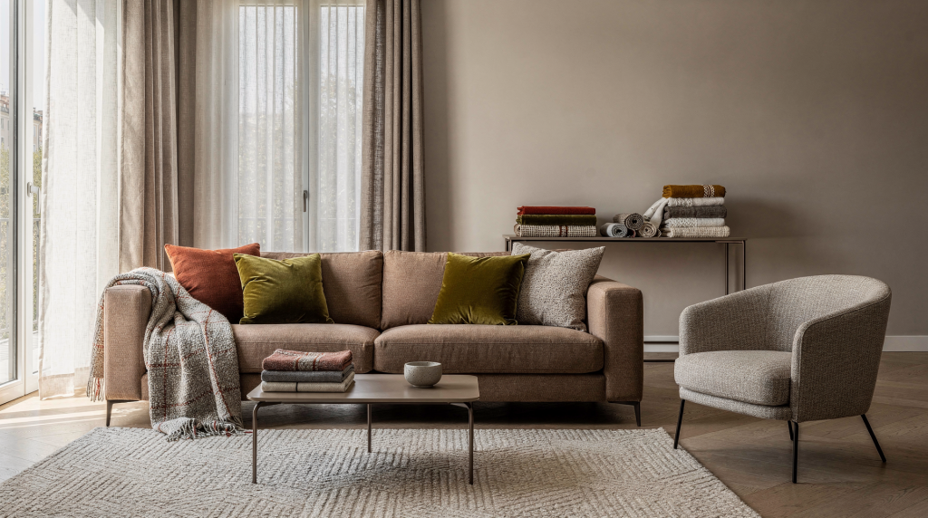
A room without textiles can feel like a photograph before the final retouch — technically correct, but missing the layer that makes it feel intentional. In my years as an art director and stylist, I’ve learned that the last layer is often the one that resolves an image. In a room, that layer is almost always fabric. The right mix of layers, colour and texture can recalibrate the scale of a space, control how light moves across surfaces, and give even a simple Milan apartment a more composed, lived-in character. Because so many homes here balance classic architectural bones with modern interventions, textiles become one of the fastest, most reversible ways to shape atmosphere without touching the structure itself.
Why textiles matter in a room
I’ve walked into rooms that were perfectly proportioned and still felt oddly unfinished — everything hard, reflective, and visually loud. Textiles are the element that lets a space take a breath. They absorb sound, warm up reflected light, and create depth across surfaces that would otherwise read flat. In my styling work, fabric is what gives a set its atmosphere; the same holds true at home.
In practice, textiles do three main jobs:
- soften strong architectural lines
- connect furniture, flooring and walls into one visual story
- bring scale, rhythm and touch to the room
That is why a good textile scheme is never just about “adding cushions.” It is about composing a room the way an art director composes a frame: balancing volume, colour temperature, and surface contrast.
Start with the room, not the shopping list
Before looking at a single fabric, I stand in the room and read it like a set. The most common mistake I see is buying textiles in isolation and hoping they will fix the space — they rarely do.
Check these points first:
- How much natural light enters the room?
- Are the surfaces mostly hard or soft?
- Is the architecture visually calm or already busy?
- What is the dominant undertone: warm, cool, greyed, yellow, pink, stone?
- Which element should lead: sofa, bed, window, dining table, or flooring?
A Milan apartment with terrazzo floors, pale walls and dark wood trim asks for a different textile language than a newer space with white plaster and large windows. The first needs warmth and softness; the second needs contrast and definition.
The three layers every room needs
When I compose a room, I think in terms of a three-layer system — base, middle and accent. The base layer sets the overall softness and tone with pieces like curtains, large rugs, bedding or sofa covers; the middle layer adds volume and comfort through throws, cushions, table linens or upholstered chairs; the accent layer creates focus and rhythm with patterned pillows, a distinctive fabric or a single bold throw. The key is not to let every layer compete. The base should be quiet and stable, the middle should give comfort, and the accent should provide just enough tension to keep the space from becoming overly polite.
| Layer | Function | Typical pieces | Common mistake |
|---|---|---|---|
| Base layer | Sets the room’s overall softness and tone | Curtains, large rugs, bedding, sofa covers | Choosing items too thin or too short |
| Middle layer | Adds volume and comfort | Throws, cushions, table linens, upholstered chairs | Repeating the same texture everywhere |
| Accent layer | Creates focus and rhythm | Patterned pillows, decorative fabric, a single bold throw | Using too many accents at once |
How to layer textiles without making the room feel heavy
Layering textiles is like building contrast in a photograph: each fabric needs a distinct role or the whole image flattens. If every surface is soft, the room feels out of focus; if everything is crisp, it turns cold. The aim is controlled contrast.
I usually follow a simple sequence:
- Choose one grounding textile.
- Add one or two supporting textures.
- Introduce a single accent with stronger colour, weave or pattern.
- Step back and check whether the room still has visual breathing space.
A wool rug under a linen-covered sofa works because the difference between dense wool and slubbed linen is immediately legible. Add one velvet cushion and the composition gains depth; add a second velvet cushion in the same tone and you’ve tipped into repetition — the room starts to feel overworked rather than layered.
Colour: build the palette before you add pattern
Colour is where textile styling either comes together or falls apart, and in my experience it usually hinges on understanding the room’s existing structure. If the architecture is already strong, colour should support it rather than compete.
I work with three colour roles:
- a grounding neutral
- a supporting colour
- a deliberate accent
For Milan interiors, this often means a warm stone, sand or off-white base, then a deeper tone such as rust, olive, cobalt or tobacco, followed by one sharper note if needed. The palette should feel connected to the light in the room. Milan daylight can shift quickly, so a fabric that looks elegant in the morning may look overly flat at dusk if the undertone is wrong.
A practical palette check
Before committing, place the textiles near:
- the window
- the floor
- the main upholstered piece
- the main wall colour
Then ask:
- Does the fabric look too yellow, too pink or too grey next to the wall?
- Does it disappear against the sofa or bed?
- Does the room gain depth, or does everything merge into one tone?
If the answer is unclear, the colour probably needs either more contrast or more simplicity.
Texture: the real difference between “decorated” and “considered”
In fashion styling, I learned that texture often carries more weight than colour — the same beige can read as flat or rich depending on the surface. A room is no different. Two spaces can use an identical neutral palette, but the one with linen, wool, brushed cotton and a woven rug will feel far more composed than the one filled with smooth, flat surfaces.
Mix textures by combining different surface types:
- matte with slightly reflective
- dense with open-weave
- soft with structured
- irregular with smooth
A few combinations that work well:
- linen curtains + wool rug
- cotton slipcover + velvet cushion
- boucle chair + crisp tablecloth
- woven throw + glazed ceramic objects nearby
The point is not to show every texture in the room at once. It is to let the eye move between them.
Common textile materials and what they do
Below is a quick reference of the materials I use most often, along with what each one brings visually and where it can go wrong.
| Material | Best use | Visual effect | Watch out for |
|---|---|---|---|
| Linen | Curtains, bedding, slipcovers | Relaxed, airy, slightly irregular | Can look limp if undersized |
| Wool | Rugs, throws, upholstery | Grounding, warm, substantial | Can feel heavy in dark tones |
| Cotton | Slipcovers, sheets, casual drapes | Clean, versatile, easy to live with | May read flat without texture nearby |
| Velvet | Cushions, chairs, accents | Rich, reflective, dimensional | Can overpower a small room |
| Bouclé | Chairs, pillows, occasional upholstery | Soft, tactile, sculptural | Can look bulky if overused |
| Silk blends | Curtains, decorative cushions | Light-catching, elegant | Needs careful placement |
| Woven blends | Throws, curtains, upholstery | Textural, durable, layered | Can become visually noisy if mixed with too many patterns |
Styling each room type
Different rooms ask for different textile strategies, but the underlying logic — balance, contrast, and a clear hierarchy — stays the same. Here’s how I approach each one.
Living room
In a living room, textiles need to create enough depth to feel welcoming without overwhelming the furniture. I always begin with a rug that is large enough to anchor the seating group — a rug that is too small will visually shrink the room. Once the rug is placed, I repeat one colour from it in cushions or a throw to create a thread.
The structure I use most often is:
- rug as the base
- curtains as the vertical frame
- cushions as the flexible layer
- one throw as the finishing note
If the sofa is neutral, use textiles to introduce the room’s main colour story. If the sofa is already strong in colour, keep the surrounding textiles quieter so the eye has somewhere to rest.
Bedroom
The bedroom should feel like a place to exhale, not a stage set. Textiles here work best when they create calm rather than spectacle. I tend to keep the palette restrained and let texture do the work: washed linen sheets, a heavier blanket with visible weight, one or two pillows with subtle contrast in tone or scale. A well-composed Milan bedroom is quiet but never plain.
Checklist for the bed:
- fitted sheet in a breathable fabric
- top layer with visible weight
- pillows in two scales, not five
- one folded throw or quilt
- no more than one strong accent unless the room is very simple
Dining area
Dining rooms are often the most underestimated spaces for textile styling. A tablecloth, runner, seat cushions or upholstered chairs can shift the atmosphere from stark to intentional. In hard-surfaced dining areas — think terrazzo floors, plaster walls, marble tables — textiles also help reduce echo and make the table feel like a composed still life.
Use:
- linen or cotton for table linen
- upholstered seats for comfort
- a runner only if the table surface is worth revealing
- napkins or placemats as smaller colour notes
If the table has a strong material identity, keep the textile layer lighter so it can breathe. If the room feels severe, increase softness through fabric.
Small apartments
Small Milanese apartments are a lesson in textile economy. Every piece has to earn its place — there’s no room for clutter. The goal is to create warmth and visual rhythm with fewer, more significant pieces.
Best priorities:
- one substantial rug
- curtains that reach the floor
- one or two tactile cushions
- a throw that adds colour or weight
- bedding that stays visually calm
Avoid fragmenting the space with too many miniature fabric gestures. In a small room, every textile choice is visible.
How to choose a textile palette that works in Milan light
Milan light can be deceptive. Apartments facing inner courtyards or narrow streets often receive a softer, more filtered light than you’d expect from the city’s bright facade. A fabric that looks vivid under showroom spotlights can turn mute once you get it home. I always test fabrics in the room’s actual light, not under artificial store lighting.
Useful approach:
- choose one main neutral that matches the room’s undertone
- add one deeper shade to prevent the scheme from washing out
- use one lighter fabric to lift the composition
- test all fabrics together in daytime and evening light
If the room has north-facing light, warmer fabrics usually help. If it gets strong afternoon sun, cooler neutrals may balance the heat. In both cases, the fabric should still look good when the light changes, not only at noon.
Typical mistakes to avoid
In my work I see the same missteps repeated, and they almost always come down to one thing: forgetting that textiles are part of a larger visual composition. Here are the ones to watch.
- Too many “special” fabrics: when every textile has a strong story, nothing stands out. Let one or two pieces carry the character.
- Matching everything too closely: a room where cushions, curtains and rugs are all nearly the same tone can feel flat. Better to vary value, weave or finish.
- Ignoring scale: small cushions on a large sofa, or a tiny rug under a big seating area, make the room look underdressed.
- Using only smooth surfaces: a room made of plain cotton and flat paint can feel unfinished. Add at least one textile with real depth.
- Choosing fabrics without considering wear: beautiful fabric that marks easily will become stressful in daily use. Match the textile to the room’s actual life.
A simple styling method you can apply at home
This is the method I use when restyling a room from scratch, and it works just as well for a quick refresh.
- Decide the mood: calm, warm, crisp, sensual or graphic.
- Identify the dominant light in the room.
- Pick one base neutral.
- Add one supporting colour.
- Select two or three textures with clear differences.
- Place the largest textile first: rug, curtains or bedding.
- Add medium-sized pieces next.
- Finish with one accent only if the room still feels too even.
Quick checklist before you finish styling
Before you call the room finished, run through this visual audit. It’s the same set of questions I ask myself before stepping back from a styled set.
- Does the room have at least three distinct textures?
- Is there a clear colour hierarchy?
- Are the largest textiles proportional to the furniture?
- Do the fabrics look balanced in daylight and at night?
- Is there enough contrast to keep the room from flattening?
- Does one textile element lead, rather than everything competing?
When to keep it quiet, and when to be bolder
There’s a time for restraint and a time for drama in textiles. I’ve learned to read the room’s existing visual noise before deciding.
A quiet textile scheme works best when the room already has strong architecture, patterned floors or sculptural furniture. In that case, fabrics should frame the space, not dominate it.
A bolder textile scheme works when the room is simple and needs personality. Then colour, weave and pattern can do more of the visual work.
The strongest rooms usually do both: they keep the base calm and let one textile moment carry energy.
Final thought
Styling textiles is not about adding softness for its own sake. It is about building a room’s visual rhythm through layers, colour and texture so the space feels complete, livable and distinct. In Milan, where many interiors rely on a precise balance between architecture and atmosphere, textiles are often the element that turns a room from arranged to fully composed.
FAQ
How many textile layers does a room need?
A room usually needs at least three distinct layers — base, middle and accent. Fewer than that can leave the space feeling sparse; more often leads to visual clutter. I usually start with three and only add if the room still feels unresolved.
What is the easiest way to make a room look more finished?
Start with a larger rug or better curtains. These two changes usually have the strongest visual impact because they anchor the room and frame the light.
Can I mix patterns and textures in the same room?
Yes, but keep one element dominant. If the pattern is strong, make the texture quieter. If the texture is rich, reduce the pattern. This keeps the room from feeling visually noisy.
What fabrics work best in a rented Milan apartment?
Look for reversible, movable and durable textiles: rugs, throws, cushions, curtain panels and slipcovers. These add character without altering the architecture, which is often not possible in a rental.
How do I know if a colour works in my room?
Test it next to the wall, floor and main furniture piece in both daytime and evening light. If it still feels balanced in both conditions, it is probably right.