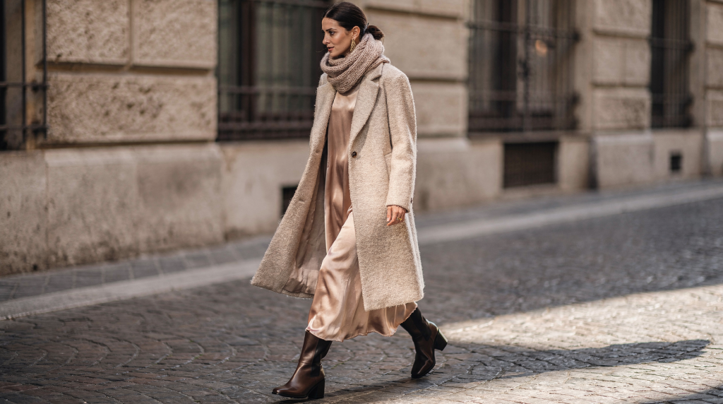
Texture is the quickest route to shifting the emotional register of a fashion photograph. It can make an image feel intimate or severe, expensive or unsettling — often before the viewer registers the silhouette or the color story. A matte wool coat shot in flat, even light reads as calm and protected; satin catching a narrow shaft of sun feels entirely different — more theatrical, more alive. The eye responds to how surfaces behave, and that response sets the emotional tone of the entire frame. This is as true for a photograph as it is for a room: the way light hits a plaster wall or a velvet sofa defines the atmosphere before we notice the furniture.
In fashion imagery, texture is not decoration. It is mood, structure, and memory. It tells the viewer how to feel about the garment and, by extension, the person wearing it. Over years of building images, I’ve learned that texture is the silent director — it guides the eye, weights the composition, and gives the photograph its tactile presence.
Why texture matters more than people think
Many fashion images are judged first by color or styling, but texture does the deeper, quieter work. It communicates material quality, emotional temperature, and visual depth before the brain has time to analyze the outfit. In my experience, texture is what makes an image feel considered rather than simply styled.
Texture affects:
- how light lands on the frame
- how expensive or tactile a garment appears
- whether an image feels soft or sharp
- how much depth the photograph holds
- whether the scene reads as intimate, editorial, or commercial
In Milan, where interiors, architecture, and fashion share a visual vocabulary of controlled surfaces and material contrast, this sensitivity is second nature. The city’s aesthetic often pairs stone against velvet, lacquer against linen, polished metal against brushed wood. These juxtapositions train the eye to read texture as meaning. That same intelligence translates directly into fashion photography — a Milanese image rarely relies on color alone; it leans on the conversation between surfaces.
What texture actually means in fashion photography
Texture is the visible and implied surface quality of a subject. It includes both what the eye can see and what the mind can almost feel. Just as a room feels different when you pair a rough brick wall with a smooth leather chair, a fashion image gains depth when you set a nubby knit against a high-gloss backdrop.
Visible texture
This is the obvious one: bouclé, silk, denim, leather, shearling, knitwear, pleats, embroidery, sequins, grainy film, matte paper backdrops. These surfaces announce themselves immediately and become key players in the composition.
Implied texture
This is subtler. A smooth dress can still feel tactile if the light grazes it correctly. A plain cotton shirt can read as rich if the composition gives it weight and breathing room. Implied texture relies on light and context — it’s the difference between a fabric that looks flat and one that looks like it would be cool to the touch.
Surface contrast
The strongest images often combine opposites. Contrast gives the eye something to move between; without it, even the most expensive styling can feel lifeless. Think of it as the visual equivalent of a room where a rough plaster wall meets a polished concrete floor — the tension holds your attention.
- soft fabric against hard architecture
- matte cloth against glossy tile
- rough wall paint against refined tailoring
- airy tulle against dense shadows
How texture changes mood
Texture does not just describe materials. It sets emotional temperature. The dominant surface in a frame tells the viewer how to feel before any narrative element comes into play.
| Texture choice | Visual effect | Mood it creates |
|---|---|---|
| Silk, satin, patent leather | Reflective, fluid, reactive to light | Glossy, sensual, theatrical |
| Wool, cashmere, felt | Soft, dense, low-reflection | Calm, protected, intimate |
| Denim, canvas, cotton drill | Structured, everyday, grounded | Practical, casual, direct |
| Lace, organza, chiffon | Light, layered, semi-transparent | Fragile, romantic, delicate |
| Velvet, mohair, boucle | Deep, absorbent, tactile | Rich, domestic, warm |
| Metal, glass, lacquer | Sharp, reflective, cool | Modern, formal, detached |
But mood isn’t fixed by the fabric alone. It shifts with light and context. A velvet coat in soft window light feels domestic and warm; under a hard side light, it becomes dramatic and sculptural. A white cotton shirt can read as crisp, sensual, or severe depending on whether its folds are left relaxed or pressed into sharp geometry. The material is only half the story — the other half is how you let it behave in the frame.
Light and texture are inseparable
Texture cannot be planned in isolation. It only becomes visible through light. The same fabric can look entirely different under diffused morning light versus a direct spotlight. Understanding this relationship is what separates a flat image from one with real presence.
Soft light
Soft light flattens harsh edges and makes surfaces feel gentle. It is useful when the goal is to suggest comfort, quietness, or romance. It works well for wool, knitwear, gauze, washed cotton, and skin texture that should remain believable but not aggressive. In interior terms, it’s the equivalent of north-facing window light on a linen sofa — calm and undemanding.
Hard light
Hard light reveals structure. It picks out seams, folds, grain, wrinkles, and stitching. It can make an image feel more graphic, more architectural, and more intentional. It is especially effective for leather, tailoring, and garments where cut matters as much as fabric. This is the light that gives a blazer its authority.
Side light
Side light is the most useful tool for texture. It builds relief. It shows depth in a sleeve, a hem, a placket, a pleat, or a woven surface. When I want the viewer to almost feel the material, I start with side light. It’s the same principle that makes a roughly plastered wall come alive when lit from an angle.
Backlight
Backlight can dissolve texture or amplify it, depending on the material. It turns edges into halos, gives transparency to sheer fabrics, and makes layered textiles glow. It’s the light of atmosphere and suggestion rather than definition.
Practical rule: choose the light that serves the material
If the fabric is the story, light should reveal it. If the silhouette is the story, light should sharpen it. If the atmosphere is the story, light should simplify everything else. This rule has saved me from overcomplicating countless shoots. It forces you to decide what the image is actually about before you start adding layers.
A Milan approach to texture
Milan is useful as a visual reference because the city often treats material as composition. A room, a courtyard, a corridor, or a fashion set is rarely just a backdrop. It is a field of surfaces that must coexist with intention. Walking through the city, I constantly notice how materials are chosen to live together: stone paving against a plastered wall, a brass door handle against aged wood. That way of seeing translates directly into fashion photography.
Instead of placing a model in a neutral setting and hoping the clothes carry the image, I build the frame around a conversation between surfaces. Think in terms of:
- plaster walls and silk dresses
- stone floors and wool tailoring
- brass details and matte jersey
- aged wood and crisp shirting
- glass reflections and structured coats
This is one reason Milan images often feel restrained but rich. The mood comes from material intelligence, not excess. Every surface has a role, and nothing shouts over anything else.
How to style texture for a stronger image
1. Decide the emotional direction first
Before choosing fabrics or props, decide what the image should feel like. I always pin down the mood in a few words — it becomes the anchor for every decision that follows.
Ask:
- Should it feel intimate or distant?
- Warm or cool?
- Domestic or architectural?
- Soft or precise?
- Quietly luxurious or intentionally raw?
Once that is clear, texture selection becomes much easier. You’re no longer choosing materials because they look interesting; you’re choosing them because they serve the feeling.
2. Build contrast, not clutter
Too many textures can cancel each other out. Choose one dominant texture and one or two supporting surfaces. A formula I return to often:
- 1 main garment texture
- 1 secondary texture in accessories or layers
- 1 environmental texture in the set or background
Example:
- a matte wool coat
- a silk scarf
- a rough plaster wall
That combination already tells a story of contrast and comfort without overcomplicating the frame. The eye moves from the softness of the wool to the sheen of the silk to the grittiness of the wall — and that movement keeps the image alive.
3. Use texture to guide the eye
The eye naturally follows changes in surface. Put the most tactile element where you want attention. Good places for texture emphasis:
- collar
- cuffs
- hemline
- shoulder line
- hands
- accessories
- background edge near the face
4. Leave some surfaces quiet
If everything is highly textured, nothing stands out. Empty or calm surfaces are not wasted space; they are visual rest. They help the textured areas feel intentional. In a room, a smooth wall lets a textured textile sing. In a photograph, a clean background lets a richly detailed garment hold the frame.
Common texture mistakes in fashion images
Over-styling every surface
When every part of the frame demands attention, the image loses hierarchy. Texture should support the composition, not compete with it. I’ve seen many shoots where the urge to add interest results in visual noise — bouclé, ruffles, lace, sheen, patterns, and reflective props all fighting for dominance. The result is chaos, not richness.
Using flat light on a material that needs dimension
Some textiles need directional light to make sense. Without it, they can look cheap or lifeless. A heavy knit under flat light loses its depth; a ribbed texture becomes a blur. Always test how the material reads under the intended lighting.
Mixing textures without a clear hierarchy
Boucle, ruffles, lace, sheen, patterns, and reflective props may all be beautiful individually. Together, they can create visual noise. Decide which surface leads and let the others support it.
Ignoring the background
A textured garment against the wrong backdrop can disappear. A rough knit against a rough wall may blend in too much. A shiny dress against a shiny wall may become visually confusing. The background is not neutral — it’s an active surface in the composition.
Forgetting how texture photographs
A surface that looks rich in person may look dull on camera. Always test it under the intended light and from the intended distance. What feels tactile to the hand doesn’t always translate to the lens without the right light.
A simple workflow for planning texture in a shoot
Step 1: Define the mood
Write three words for the image. Examples:
- quiet, intimate, tactile
- sharp, modern, reflective
- soft, warm, restrained
Step 2: Choose one leading material
This is the material that should dominate the emotional tone. Examples:
- velvet for depth
- cotton for clarity
- leather for tension
- silk for movement
Step 3: Add contrast
Pick one material that opposes the first. Examples:
- silk with wool
- metal with knitwear
- sheer fabric with stone
- satin with plaster
Step 4: Decide the light
Ask what kind of light reveals the chosen surfaces best.
- soft box or window light for calm softness
- hard directional light for structure
- side light for grain and folds
- backlight for transparency and edge glow
Step 5: Check the image in black and white
This removes color from the equation and makes surface relationships easier to read. If the image still has depth in monochrome, the texture is doing its job. It’s a test I use on almost every shoot — it reveals whether the composition holds up without the distraction of hue.
Texture checklist for set and styling
Use this before a shoot:
- Does the main fabric support the intended mood?
- Is there enough contrast between garment and background?
- Will the light reveal the material properly?
- Are any textures fighting each other?
- Does one area of the frame need to stay visually quiet?
- Does the garment still read well at the chosen crop?
- Is the image tactile from both close-up and full-frame distances?
When texture should be reduced
Not every image benefits from heavy tactility. Sometimes the right choice is restraint. Reduce texture when:
- the silhouette should feel clean and minimal
- color is the main storytelling device
- the image needs a graphic, editorial edge
- the client wants clarity over atmosphere
- the set is already visually active
In those cases, use smooth fabrics, controlled lighting, and simpler backgrounds. The lack of texture becomes part of the mood — a deliberate quietness that lets other elements speak.
Texture in close-up vs full look
Texture behaves differently depending on framing. Understanding this helps you build a series that works at every distance.
Close-up
A close crop magnifies surface detail. Stitching, weave, pilling, gloss, and seam finishing become storytelling elements. Close-ups are ideal when the garment’s material quality is central to the image. They reward the viewer who looks closely and give the photograph a tactile intimacy.
Full look
From farther away, texture works more as atmosphere than detail. The viewer reads density, movement, weight, and contrast. At this distance, structure and silhouette must still be clear; texture supports the overall impression rather than leading it.
A good fashion series usually needs both: a close frame that rewards inspection, and a wider frame that shows how the textures live together. The interplay between the two creates a more complete visual story.
FAQ
Why does texture make a fashion image feel more expensive?
Because it signals material quality, careful lighting, and visual control. Rich textures usually photograph with more depth and weight, giving the image a sense of substance that reads as luxury.
What is the easiest texture to photograph well?
Matte fabrics such as wool, cotton, and brushed knits often photograph cleanly because they show form without excessive glare. They’re forgiving under a range of light conditions.
Can a plain outfit still have strong texture?
Yes. Texture can come from light, seams, layering, background surfaces, or the way fabric falls. A simple white shirt can feel incredibly textural if the light grazes its folds and the background offers a contrasting surface.
What kind of texture works best for Milan-inspired imagery?
Materials that balance restraint and richness: wool, stone, linen, velvet, brushed metal, plaster, lacquer, and muted silk. The Milanese eye favors surfaces that feel considered rather than loud.
How do I know if texture is helping the image?
If removing the texture would make the photo feel flatter, less emotional, or less precise, then it is doing real work. A good test is to imagine the same composition with all surfaces smoothed out — if the image loses its grip, texture was carrying the mood.
Conclusion
Texture shapes the mood of a fashion image because it gives form to emotion. It tells the viewer where to look, how to feel, and how to read the relationship between body, garment, and environment. The strongest fashion photographs don’t simply show clothes. They organize surfaces. They let light reveal what the material already knows how to say. That’s a lesson I carry from the studio into every room I walk into — because whether you’re composing a photograph or a living space, texture is the quiet language that sets the tone before anything else speaks.