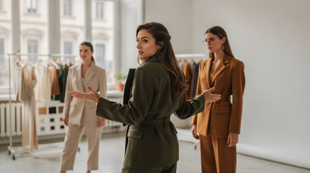
When I look at an editorial shoot, I don’t see a sequence of beautiful pictures — I see a visual argument. One built from silhouette, color, light, texture, and pacing, where every frame feels like it belongs to the same world. If the styling is coherent, the story reads instantly, before the viewer registers the brand, the model, or the location.
In Milan, this idea carries even more weight. The city rewards restraint, precision, and a sharp eye for composition. The best editorial images here rarely shout; they feel considered, composed, almost architectural in their logic. A cohesive shoot never happens by accident — it’s the result of decisions made long before the first garment is pulled, much like the way a well-designed room is planned before a single piece of furniture enters it.
What makes a fashion shoot feel cohesive?
Cohesion is the quiet certainty that all images belong to one visual system. That system can be minimal, romantic, architectural, raw, polished, or nostalgic — but it must be consistent. Think of it like walking through a Milanese apartment where every room shares a material palette, a light quality, and a sense of proportion, even if the function changes. The same logic applies to a fashion story.
A cohesive shoot usually depends on five things:
- A clear concept that can be explained in one sentence
- A controlled color palette
- Repeated visual shapes or proportions
- Consistent treatment of light and shadow
- Styling choices that evolve without breaking the mood
If one image feels soft and airy while the next feels heavy and industrial, the story fractures. The viewer may still like the individual pictures, but the narrative loses strength — much like a room where a delicate fresco ceiling suddenly meets a brutal concrete floor without any mediating element. The eye gets confused, and the story dissolves.
Start with one visual idea, not a pile of references
The most common mistake I see is collecting too many references and mistaking variety for direction. A good editorial shoot needs references, but they should sharpen the concept, not dilute it. It’s like designing a room: you don’t pull every beautiful chair you’ve ever saved on a moodboard; you choose the one that serves the atmosphere you’re building.
Before pulling clothes, define:
- The emotional temperature: calm, tense, sensual, ironic, formal, intimate
- The visual structure: sharp, loose, layered, linear, symmetrical, off-balance
- The setting logic: studio, apartment, courtyard, street, hotel room, stairwell
- The light behavior: soft natural light, hard noon sun, directional window light, mixed ambient light
A useful test is this: if you cannot describe the shoot in one short sentence, the styling is probably still unfocused. That sentence becomes the filter for everything that follows — the same way a single line can define the mood of an entire interior before a single tile is chosen.
Example of a clear creative statement
- “A restrained city story built on tailored volumes, pale neutrals, and quiet interior light.”
- “A soft domestic narrative where texture does the work and color stays muted.”
- “A sharp Milanese daytime story with architectural lines, black accents, and clean contrast.”
Each of these statements immediately suggests a palette, a silhouette language, and a relationship with the space. That clarity is what keeps the shoot from wandering.
Build the palette before you build the looks
Color is often what keeps a shoot from drifting. A limited palette creates continuity and gives the eye a place to rest — exactly as it does in a well-edited interior, where a few recurring tones tie separate pieces into a single composition.
In practice, that means deciding:
- The dominant color family
- The supporting neutral tones
- The accent color, if there is one
- Whether warm and cool tones will mix or stay separated
A palette doesn’t need to be monochrome to feel controlled. It simply needs rules. In Milan, neutral palettes often work especially well because they echo the city’s architecture and interiors. Beige, stone, ivory, charcoal, tobacco, and softened black can carry a story far better than a crowded color mix — they let the light and the textures do the talking, much like the plaster walls and terrazzo floors that quietly define so many local homes.
| Palette approach | Best use | Common risk | What to watch |
|---|---|---|---|
| Monochrome | Minimal, architectural, refined stories | Flatness | Add texture and tonal variation |
| Two-tone | Clean editorial narratives | Visual boredom if too strict | Vary materials and proportions |
| Neutral base + one accent | Modern lifestyle or seasonal story | Accent becoming too loud | Repeat the accent sparingly |
| Warm-cool contrast | More dramatic or cinematic shoots | Mood conflict | Keep one temperature dominant |
Think in volumes, not just garments
Fashion styling reads first as shape. The viewer sees outline before detail — just as you perceive the mass of a sofa before you notice its stitching. That means the relationship between large and small volumes matters more than any single item.
Use this logic:
- If the top is oversized, keep the lower half clean or narrow
- If the trousers are wide, bring definition back at the waist or shoulder
- If the dress is fluid, add a structured element through outerwear or accessories
- If everything is soft, the image can lose tension
- If everything is hard, the image can become rigid and lifeless
This is where styling becomes visual editing. You’re not just choosing pieces; you’re balancing mass, rhythm, and negative space — the same way an art director composes a still life or an interior designer arranges furniture in a room. A large armoire against an empty wall creates a different tension than a cluster of small objects on a console. The same principle applies to a silhouette against a plain backdrop.
Let texture carry the story
When color is restrained, texture becomes the main source of depth. This is especially useful in Milan, where natural light can reveal surface detail beautifully — the way it catches the grain of a wooden door or the uneven surface of hand-troweled plaster.
Mix textures with intention:
- Matte wool against polished leather
- Crisp cotton against brushed knitwear
- Silk or satin against raw denim
- Sheer layers against dense tailoring
- Smooth surfaces against something visibly tactile
Texture matters because it changes how the light behaves. A look can appear richer, more layered, and more expensive without becoming more colorful — just as a room with linen curtains, a rough ceramic vase, and a glossy lacquered table feels complex without a single bright hue.
Practical rule
If a look feels too simple, don’t automatically add more color. First ask:
- Is there enough texture contrast?
- Is there a matte surface next to a reflective one?
- Is one material absorbing the light while another catches it?
Often the answer is in the fabric, not the accessory. A matte wool coat next to a silk scarf can do more than a third color ever could.
Plan the story as a sequence, not isolated outfits
A shoot becomes cohesive when the looks evolve logically. Each frame should feel like the next step in the same visual sentence — like moving through a well-planned apartment where the transition from entry to living room to study feels intentional, not accidental.
A useful structure is:
- Opening image: establishes the world
- Mid-story images: develop silhouette and mood
- Detail images: show texture, construction, accessories, and touch
- Closing image: leaves a strong final impression
The wardrobe doesn’t need to change dramatically from frame to frame. In fact, too much change can weaken the story. Instead, let the story progress through:
- A shift in layering
- A change in posture or movement
- A different crop or framing
- A subtle change in light
- A controlled alteration in color density
This gradual evolution feels organic, not forced — like the way daylight moves across a room, subtly transforming the same space hour by hour.
Match styling to the location
The strongest fashion images often feel rooted in place. In Milan, that means using architecture and interiors as part of the composition rather than as a neutral backdrop. A location should support the styling language, not fight it.
Consider how different spaces interact with clothes:
- A bright apartment works well with pale tones, soft tailoring, and clean silhouettes
- A courtyard can support stronger contrast and longer shadows
- A staircase adds rhythm and vertical movement
- A room with older finishes may pair well with quieter, more tactile garments
- A modern interior can handle sharper lines and reduced palettes
Don’t style against the location’s logic unless that clash is intentional. If the room is visually busy — ornate moldings, patterned floors, heavy textures — the wardrobe should usually be quieter. If the environment is minimal, the clothes may need more shape or texture to hold the frame. It’s the same dialogue that happens in interior design: a highly decorative space calls for simpler furnishings, while an austere room can take a sculptural piece.
Light is part of styling
Lighting is not separate from wardrobe; it changes how the outfit reads. A piece that looks elegant in diffuse light can feel harsh under direct sun, and a pale fabric that seems refined in a studio can vanish in a bright interior. In Milan, where the light shifts dramatically depending on the time of day and the orientation of a room, this becomes critical.
Before the shoot, check:
- Where the main light source comes from
- How the light changes during the day
- Whether reflective surfaces will flatten the image
- Which fabrics need testing under real conditions
- Whether the background and wardrobe compete in brightness
A simple light test checklist
- Shoot one look in full light and one in shadow
- Check if the silhouette still reads at a glance
- Look at the fabric texture at 100%
- Confirm skin tone and clothing tone do not merge
- Make sure highlights are not wiping out detail
If the look only works in one exact light condition, the shoot becomes fragile. Strong styling usually survives variation — it’s like a well-designed room that looks good at noon and at dusk because the materials and volumes hold their own under different light.
Use a shot list to protect the story
A shot list is not a bureaucratic tool. It’s what keeps the editorial from becoming random — much like a floor plan keeps an interior from becoming a collection of unrelated rooms.
A practical shoot sequence might include:
- One wide establishing frame
- Two or three mid-distance frames
- One seated or transitional pose
- One detail shot of fabric, hands, or accessories
- One image with strong negative space
- One closing frame that feels quieter or more final
This gives the set rhythm and helps avoid visual repetition. It also makes it easier to notice if the story is missing a necessary type of image — just as you’d realize a home tour is incomplete without a glimpse of the quiet corner where someone actually sits to read.
Common styling mistakes that break cohesion
Even strong individual looks can fail as a series. The most frequent problems are simple, and they almost always come from trying to say too much at once.
- Too many competing colors
- Mixing too many style references at once
- Changing silhouette language from image to image
- Using accessories that don’t belong to the same visual world
- Ignoring how fabric behaves under the chosen light
- Styling every frame as if it needs to be the hero shot
- Forgetting to leave visual breathing room
A cohesive story needs restraint. Not every detail has to perform equally hard — in fact, the quiet moments often make the louder ones resonate. It’s the same principle that makes a room with one striking artwork feel more powerful than a room where every surface competes for attention.
A practical pre-shoot workflow
Use this workflow when building the story. It turns abstract ideas into a concrete visual plan.
- Write one sentence that defines the mood and visual direction.
- Choose a limited color palette and stick to it.
- Select 2–4 silhouette principles to repeat across the shoot.
- Test all key fabrics in the actual light if possible.
- Build a shot list with wide, mid, detail, and closing frames.
- Check that every accessory supports the same world.
- Remove anything that feels decorative without adding meaning.
- Review the sequence as a group, not as separate images.
Quick checklist before call time
- The palette is controlled
- The silhouettes relate to each other
- Textures create depth
- The location supports the concept
- The light is understood
- The shot list covers the story arc
- Nothing feels like an accidental addition
Milan as a visual mindset
In Milan, fashion images often work best when they feel composed rather than over-styled. There’s an appreciation here for clarity, material quality, and subtle tension — qualities you see in the city’s residential architecture, where a beautifully proportioned doorway or a carefully framed courtyard often says more than elaborate decoration.
That doesn’t mean the shoot must be minimal. It means every choice should look considered:
- A strong jacket line can do more than a decorative accessory
- A neutral room can be more expressive than a loud set
- A textured fabric can carry emotion without print or embellishment
- A quiet pose can be more editorial than an elaborate gesture
This is why Milan is such a useful context for fashion storytelling. The city naturally rewards images that balance discipline and sensuality, structure and ease — the same balance you find in a well-loved apartment where every piece has a reason for being there, and nothing screams for attention.
Conclusion
A cohesive fashion shoot is built through discipline, not decoration. When the concept, palette, silhouette, texture, and light all point in the same direction, the images stop behaving like separate pictures and start reading as one visual story — much like a home where every room, object, and material choice contributes to a single, unmistakable atmosphere.
The real work is not choosing more — it’s choosing better, then repeating those choices with enough consistency that the story holds from the first frame to the last.
FAQ
How many colors should a fashion shoot use?
Usually two or three dominant colors are enough, plus neutrals if needed. More can work, but only if the palette is tightly controlled — like a room where several shades of the same hue create depth without chaos.
What makes a styling story feel editorial?
Editorial styling usually has a clear point of view, a visual rhythm, and a sense that each look contributes to the same narrative. It doesn’t just show clothes; it builds a world around them, the way a well-photographed interior tells you how it feels to live there, not just what the furniture looks like.
Should all looks in a shoot match exactly?
No. They should relate, not copy each other. Small shifts in silhouette, layering, or texture make the story feel alive while keeping it coherent — like variations on a theme in a musical score, or the way different rooms in a house share a material language but have distinct personalities.
What is the biggest mistake in fashion shoot styling?
Trying to do too many things at once. The story usually becomes stronger when the wardrobe, color, and location are edited down to the essentials. Overloading a shoot is like filling a room with too many statement pieces: nothing stands out, and the eye has nowhere to rest.
How can a small budget still look cohesive?
Use a limited palette, repeat a few key shapes, prioritize fabric texture, and avoid unnecessary variety. Cohesion often matters more than cost — a simple, well-edited story can feel far more luxurious than an expensive but chaotic one, just as a modest apartment with a clear point of view can outshine a lavish but disjointed interior.