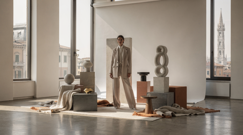
A fashion set never simply fills the background. It anchors the clothes in a specific world, gives the image its emotional temperature, and transforms a series of shots into a coherent visual statement. When the space is built with intention, every element — the angle of a chair, the weight of a shadow, the distance between objects — pulls in the same direction. The result feels inevitable, not accidental.
Why set design matters in fashion photography
In fashion photography, the set carries meaning. It’s not decoration layered on after the fact; it’s part of the message itself. A well-considered environment can make structured tailoring read as sharper, allow a fluid fabric to breathe, or push a simple silhouette into editorial territory without a single extra accessory.
Working in Milan sharpens this instinct. The city’s residential architecture teaches you to see a room as a complete composition rather than a collection of furniture. Surfaces, light, proportions, and the way objects sit in relation to architectural lines — these are not separate layers. They form a single visual system. That way of looking at space translates directly into building sets: every decision about placement, material, and emptiness becomes part of the same logic. Milanese interiors rarely shout, but they always feel considered. That restraint is one of the most useful tools an art director can bring to a shoot.
What a strong visual world actually means
A “strong visual world” isn’t about complexity or budget. It’s about coherence — a set of connected choices that make the final image feel as if it could only exist in that exact form. It includes:
- a clear spatial idea that defines the relationship between body and environment
- a limited but intentional color palette that supports the mood rather than competing with the clothes
- material contrast that gives the camera something to register beyond flat color
- controlled light that shapes volume, texture, and atmosphere
- props that earn their place by serving the narrative, not just filling a corner
- enough visual restraint to keep the garment as the primary subject
In practice, the set answers one question: what kind of world is this garment entering? A sharply tailored coat might demand architectural lines, harder surfaces, and a sense of structure. A sheer dress needs softness, room to move, and shadows that reveal rather than flatten. The strongest sets balance composition, texture, color, and depth so that the frame feels designed — never crowded, never arbitrary.
Start with the narrative, not the props
Before reaching for objects, define the mood and the relationship you want between the subject and the space. This step prevents the common mistake of gathering beautiful things that don’t share the same visual language. A vintage vase and a modernist chair might each be stunning alone, but together they can fracture the image if there’s no unifying idea.
Ask these questions first
- Is the image intimate, graphic, or theatrical?
- Should the set feel residential, abstract, or cinematic?
- Is the clothing meant to dominate, or blend into the environment?
- Should the world feel lived-in, or constructed and precise?
- What should the viewer notice first: silhouette, texture, posture, or atmosphere?
Answering these shapes every choice that follows. It gives you a filter for rejecting objects, colors, and surfaces that don’t belong — even if they’re beautiful on their own.
The main building blocks of fashion set design
1. Composition
Composition is how everything sits inside the frame — furniture placement, empty space, body position, and the relationship between foreground and background. In Milan, I’ve often noticed how a single chair placed against a wall can hold the entire geometry of a room. The same principle works on set: one well-positioned object can create more structure than five scattered pieces.
Useful principles:
- keep one dominant focal point — the eye needs a place to land
- use negative space to reduce visual noise; emptiness is an active element, not a void
- repeat lines, shapes, or tones to create a sense of order without rigidity
- avoid equal visual weight on both sides unless symmetry is a deliberate choice
- use overlap — a shoulder in front of a doorway, a sleeve crossing a table edge — to build depth
A simple chair, table, or shelf becomes powerful when it’s positioned to create structure rather than fill a gap. The goal is a frame that feels balanced but alive, never static.
2. Light
Light decides whether the set reads as soft, dramatic, flat, or dimensional. It also determines how materials behave on camera — the same linen can look rich and textural under directional light or washed-out under flat diffusion. In Milan, where daylight and interiors often carry as much weight as the clothes themselves, controlling natural light is one of the most effective ways to anchor an image in a specific place and time of day.
| Lighting choice | Visual effect | Best use |
|---|---|---|
| Soft natural light | Calm, airy, with gentle transitions between light and shadow | Linen, knits, light palettes — anything that benefits from a quiet, tactile feel |
| Directional light | Sharper shadows, stronger volume, more sculptural definition | Tailoring, structured silhouettes, looks that need architectural presence |
| Diffused light | Even, clean, minimal — removes harshness without losing clarity | Catalog-style clarity, quiet editorials where the garment must speak without drama |
| Low contrast light | Subtle, atmospheric, with soft shadow edges | Domestic interiors, muted stories, images that feel intimate rather than staged |
| High contrast light | Graphic, dramatic, with strong separation between light and dark | Fashion with an architectural or bold visual language; creates tension and edge |
3. Texture
Texture gives the camera something to register beyond color. It makes an image feel tactile — you can almost sense the surface through the frame. A set with only smooth, uniform surfaces quickly feels sterile; one with too many competing textures becomes chaotic. The sweet spot is tension: a deliberate friction between materials that keeps the eye moving.
Useful texture pairings:
- matte wall + glossy object — the contrast makes both surfaces more legible
- polished wood + rough fabric — refinement meets rawness
- metal frame + soft drape — hard structure against fluid movement
- stone surface + skin or silk — weight and permanence next to fragility
- old plaster + precise tailoring — history against sharp modernity
These combinations work because they create a dialogue. The camera reads the difference, and that difference adds depth without adding clutter.
4. Scale
Scale shapes the emotional tone of the image. A small chair beside a long dress can introduce vulnerability or delicacy. A large table under a structured coat grounds the look, making it feel architectural and deliberate. The relationship between the body and the objects around it tells the viewer how to feel about the clothes — whether they’re protected, exposed, monumental, or intimate.
When working with scale, pay attention to:
- how much empty space surrounds the body — too little can feel cramped, too much can feel lost
- whether objects dwarf or support the model — each choice shifts the power dynamic
- whether the background recedes or presses forward — depth changes the psychological weight
- whether the composition feels intimate or monumental — a corner versus a vast room
5. Color
Color should support the visual idea, not simply match the wardrobe. A palette that’s too literal can flatten the image; a palette with subtle friction keeps it alive. For Milan-inspired work, restrained tones often work best — they echo the city’s interiors, courtyards, and older domestic spaces without feeling like a period piece.
A practical way to build a palette:
- choose one dominant neutral to anchor the space
- add one secondary tone for depth
- introduce one accent only if the image genuinely needs it
- repeat tones across garments, props, and background to create cohesion
Colors that consistently perform well in this context: stone, tobacco, ivory, charcoal, faded green, burgundy, dusty blue, warm grey. They hold light beautifully and allow the clothing’s cut and texture to remain the focus.
How to build a set step by step
Step 1: Define the mood board
Build the board around spatial references, material references, light references, and only one or two object references — not just fashion images. If every reference looks like a finished editorial, the final set risks becoming derivative. I always include architectural details, fragments of interiors, still-life compositions, and domestic scenes. A worn doorframe, the way plaster catches light, the proportion of a window to a wall — these often spark more original set ideas than another fashion spread.
Step 2: Choose the spatial structure
Decide whether the set is a corner, a room fragment, a table top, a corridor-like axis, a staged domestic interior, or an abstract studio plane. This choice changes how the viewer reads the clothes. A corner suggests containment and intimacy. A wide room implies freedom. A narrow axis creates tension and directs movement through the frame. The spatial structure is the invisible architecture of the image — get it right, and everything else falls into place more easily.
Step 3: Limit the object count
A frequent mistake is adding too many props too early. Start with the minimum: one anchor object, one supporting surface, one secondary detail. Then test the frame. Add only if the image feels genuinely empty, not just because there’s space to fill. Empty space is not a problem to solve — it’s a compositional tool that lets the garment breathe and the eye rest.
Step 4: Test light on surfaces first
Before bringing in the model, check how light behaves on fabric, wall, floor, reflective surfaces, and shadow edges. The same lamp or daylight source can make one material feel expensive and another look flat. I always test the set as a material composition first — moving a light source a few centimeters can completely change how a texture reads. This step saves time later and prevents unpleasant surprises when the model steps in.
Step 5: Place the body last
The model should enter a set that already has visual logic. Once the body is introduced, adjust for line of sight, balance of negative space, rhythm between limbs and furniture, and the interaction between fabric and surface. Small shifts — a hand resting on a table, a step forward — can anchor the composition and make the relationship between garment and space feel organic rather than forced.
Set design tools that actually help on a shoot
Checklist for a reliable fashion set
- one clear concept that everyone on set understands
- a controlled palette that doesn’t fight the wardrobe
- at least one textural contrast to give the image tactile depth
- a defined light direction — even if it’s soft, it should have intent
- enough empty space for the garment to breathe and move
- props that serve a compositional role, not just decoration
- no object that competes with the hero look for attention
- a backup plan if natural light changes — a scrim, a bounce, an alternative angle
Useful materials on set
- muslin or linen backdrops — they soften light and add subtle texture
- painted boards — quick to reposition and infinitely customizable
- mirrors used sparingly — they can expand space or introduce unwanted reflections, so use with caution
- plaster-like surfaces — they catch light beautifully and feel both raw and refined
- wood with visible grain — adds warmth without pattern
- fabric panels for softening hard spaces or controlling spill light
- domestic objects with a strong silhouette — a well-shaped vase, a simple stool, a lamp with presence
Common mistakes in fashion set design
1. Over-decorating the frame
Too many objects make the image feel busy and weaken the clothing. If every element demands attention, nothing holds it. The eye needs hierarchy — a clear hero, a supporting cast, and quiet space. When in doubt, remove one thing and see if the frame still works.
2. Matching everything too perfectly
A perfect match between outfit, props, and background often feels flat and lifeless. Small frictions — a slightly unexpected color note, a texture that contrasts rather than blends — create visual energy. The set should feel like a real world, not a catalog page where every tone has been color-matched.
3. Ignoring shadows
Shadows are part of the set. They give depth, rhythm, and direction. When shadows are accidental — cast by equipment, falling in the wrong place — the image loses control. Treat shadows as a design element: shape them, use them to lead the eye, and make sure they support the mood.
4. Choosing props before the concept
Beautiful objects are not enough. Every item needs a function in the frame — to anchor a corner, to introduce texture, to create a line that guides the eye. If a prop doesn’t earn its place compositionally, it’s just visual noise.
5. Forgetting the camera angle
A set may look balanced in real life but collapse from the chosen viewpoint. Always build from the camera position, not from the floor plan alone. What reads as depth to the naked eye can flatten through the lens; what feels spacious can become cluttered. Check the frame constantly as you build.
Fashion set design in a Milan context
Milan offers a particularly strong reference point for set building because the city’s domestic spaces rarely treat architecture, furnishing, and atmosphere as separate layers. Walk through a Milanese apartment and you’ll notice how a doorway frames a view, how light falls across a courtyard at a specific hour, how furniture sits in dialogue with the proportions of the room. These spaces feel composed, not decorated — and that’s exactly the sensibility that translates into editorial work.
For fashion photography, this means:
- using residential references instead of generic studio styling — real rooms have better bones
- treating the set like a room with visual logic, not a backdrop
- valuing doors, thresholds, courtyards, and entryways as compositional devices — they create natural frames within the frame
- mixing modern restraint with historical depth where appropriate — a contemporary garment against an aged wall tells a richer story
- allowing the architecture to remain visible rather than covering it up — let the space breathe
This approach works especially well for projects that want a quieter, more intelligent form of fashion imagery — images that reward a second look rather than demanding attention with volume.
A practical framework for different fashion moods
| Mood | Set strategy | Best visual cues |
|---|---|---|
| Minimal | Reduce objects, emphasize line and proportion | White walls, strong shadow, one sculptural piece — let emptiness do the work |
| Domestic | Make the set feel lived-in but edited | Books, tableware, textiles, natural daylight — a sense of quiet occupancy |
| Graphic | Use sharp geometry and clear contrast | Angles, hard edges, repeated shapes — the frame becomes a composition of lines |
| Romantic | Soften edges and introduce movement | Drapes, layered fabrics, diffused light — everything feels slightly in motion |
| Architectural | Let structure lead the composition | Columns, doorframes, stairs, long planes — the space itself is the main character |
How to evaluate whether the set is working
A set is working when the garment remains the main story, the space supports the mood without explaining it too literally, the frame has depth rather than clutter, textures read clearly on camera, the palette feels intentional, and the image looks considered from every angle.
A simple test: remove the model. Does the frame still communicate a clear visual world? If the empty set holds its own — if it has atmosphere, structure, and a point of view — then it has enough backbone to carry the clothing. If it collapses into a random collection of objects, it needs more editing.
Quick pre-shoot checklist
- define the emotional tone — put it into words, not just images
- select one spatial idea and commit to it
- restrict the palette to a few deliberate tones
- test surfaces under the intended light — don’t assume, verify
- remove any object that feels decorative only
- check the frame from the camera position — and from a few steps to each side
- leave breathing room for movement — the model needs space to inhabit
- shoot a still-life test before bringing in the model — it reveals what the set is actually doing
FAQ
What is set design in fashion photography?
Set design is the planning of the space, objects, materials, and light around the subject so the image carries a specific mood and visual structure. It’s about building a world, not just decorating a corner.
Do fashion shoots always need a built set?
No. A strong set can be minimal or naturally found — an empty room, a courtyard, a stretch of wall. What matters is that the environment feels intentional and supports the clothing. Sometimes the best set is the one you don’t have to build.
How many props should a fashion set have?
Usually fewer than expected. Start with one anchor object, one supporting piece, and only add more if the image genuinely needs depth or context. Restraint almost always reads as more confident.
What makes a set look expensive on camera?
Controlled light, material contrast, and restraint. Expensive-looking sets rely on proportion and texture rather than quantity. A single well-placed object with the right surface can feel more luxurious than a room full of things.
How can Milan inspire fashion set design?
Through its residential architecture, interiors, courtyards, and quiet domestic details. Milan teaches you to see the room as a composition — where light, proportion, and materials work together. It’s an endless source of ideas for sets that feel composed, lived-in, and visually disciplined without being sterile.
Conclusion
Strong fashion set design is not about filling space. It’s about building a believable visual world where every object, surface, and shadow serves the same idea. When the set is clear, the clothing becomes sharper, the image feels more specific, and the editorial holds attention longer.
For fashion photography that wants depth — especially in a Milan context — the most effective sets are usually the ones that look edited rather than decorated: precise, quiet, tactile, and fully aware of how a room can become part of the story. The space doesn’t just hold the clothes; it completes them.