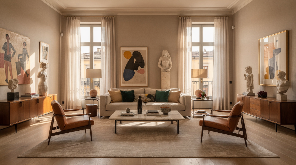
A photogenic room is not simply a pretty room. It’s a space where light, proportion, material and atmosphere work together so the room reads clearly both in person and in photographs. In Milan, the best rooms feel calm, layered and intentional without ever looking staged.
For an art director’s eye, the question is never just “Does this room look good?” It’s: what does the room do with light? What does it say through its materials? And where does the eye land first?
What Makes a Room Photogenic in Milan
Milanese interiors often succeed because they are built around a strong visual frame: generous windows, period proportions, clean architectural lines and a disciplined use of materials. Across the city’s residential projects, natural light is rarely an afterthought – it’s treated as a compositional element, as deliberate as a piece of furniture or a wall finish.
I’ve walked through renovated apartments where the living area is placed in the brightest zone and partitions are partly opened to let daylight travel deep into the floor plan. This isn’t only practical; it gives the room depth and makes it photograph with a clear, three-dimensional quality. A room that photographs well almost always has three things in place:
- clear structure
- controlled light
- enough contrast to avoid visual flatness
A room can be minimal and still feel rich. It can be classic and still look fresh. What makes it work is not the amount of decoration, but the relationship between surfaces, objects and light – exactly the same interplay I would build on a fashion set.
The Visual Ingredients That Matter Most
1. Natural light first
Natural light is the most important material in any room I photograph. In Milan, north-facing windows deliver a cool, soft light that wraps surfaces evenly, minimizing harsh shadows. It’s ideal for revealing subtle textures like plaster, linen or matte wood. South-facing rooms bring stronger brightness and more dramatic movement from morning to afternoon; that shift can animate the space and make stone, glass or polished concrete come alive.
Many high-quality interiors across the city use large windows, French doors or unbroken views to pull daylight far into the home. What to look for:
- how the room looks in the morning and late afternoon – the quality of light changes, and with it the room’s whole mood
- whether direct sun creates harsh glare that flattens detail
- whether shadows shape the volume of the room or simply darken it
2. Proportion before decoration
A photogenic room feels balanced even when it holds very few objects. Ceiling height, window size, the scale of the furniture and the empty space between pieces all determine how the room reads in a still image. I often compare it to the way a garment sits on a body: if the proportions are wrong, even the most beautiful fabric collapses visually.
The common reflex is to fill every corner. But in the Milanese apartments I return to, negative space does far more work than extra decor. It gives the architecture breathing room and lets the eye rest, so the objects that remain register with more meaning.
3. Material contrast
The rooms that stay in my mind are the ones that pair soft and hard materials with real intention. Wood and stone, linen and metal, plaster and glass, matte and reflective surfaces – when placed together they create depth because the camera reads the difference in how each surface catches or absorbs light. This is the same principle I used when styling silk against raw canvas or polished silver against unglazed ceramic. The contrast keeps the frame alive without needing any extra decoration.
4. A restrained palette
Rooms photograph better when the palette feels edited rather than assembled. Neutral tones, muted colour blocks and one or two deliberate accents almost always work harder than many competing colours. When light shifts across a restrained palette, it becomes the real colourist. The result is a room that reads clearly and doesn’t fight the camera.
Milan Room Types That Tend to Photograph Well
| Room type | Why it works visually | What to watch for |
|---|---|---|
| Period apartment living room | High ceilings, mouldings, parquet and the rhythm of multiple windows create instant structure. | Too many competing styles can break the composition – keep the backdrop consistent. |
| Bright dining room | A dining table creates a strong horizontal line that organises the whole space. | Over‑styling the table can feel artificial; let the surface’s geometry lead. |
| Kitchen with natural light | Materials and hardware catch light clearly, giving the shot immediate texture. | Reflective surfaces can create visual clutter in photos – edit what stays out. |
| Bedroom | Soft textiles and lower furniture naturally create a calm, grounded composition. | Too much pattern flattens the image; keep bedding tonal and tactile. |
| Entryway or corridor | Transitional spaces can feel cinematic and graphic with the right light. | These areas need clean lines and a good balance of shadow; clutter kills the effect. |
How to Style a Room So It Photographs Better
Start with one visual idea
Before I move a single object, I decide what the room should communicate. It might be quiet and architectural, warm and lived‑in, graphic and modern, or classic with a restrained update. If the room tries to say everything at once, it usually says nothing clearly. One clear narrative gives every styling choice a reason.
Edit the room, don’t over‑decorate it
The most effective action is removal. I take out anything that interrupts the main reading of the space: unnecessary cables, too many small objects, decorative items with no visual relationship, and furniture that blocks the room’s natural flow. A well‑edited room photographs as a coherent whole rather than a collection of distractions.
Build layers in the right order
A room almost always photographs better when the layers are arranged from large to small:
- architecture (walls, floor, ceiling)
- main furniture
- textiles
- objects
- personal traces
This is the same logic I use in still‑life styling: the largest forms define the frame, while smaller items add rhythm and interest without competing for dominance.
Use objects with shape, not just meaning
Books, ceramics, trays, lamps and stools work well because they have clear silhouettes the camera can read quickly. A cherished but formless memento might be meaningful in life but can disappear in the frame. I choose props the way I choose accessories for a shot – each one has to earn its place visually.
Let one surface do the work
A textured wall, a parquet floor, a stone tabletop or a linen curtain can carry much of the image’s character. Once I’ve identified that surface, I don’t compete with it by placing too many strong elements nearby. Instead, I let it breathe so the camera can record its materiality without interference.
A Practical Room‑By‑Room Styling Method
Living room
- Anchor the space with one decisive sofa or a pair of armchairs – this creates an immediate focal point.
- Keep the coffee table low and edited; a table that’s too tall interrupts the sightline and breaks the composition.
- Use one large textile (a rug, a throw, a generous curtain) to soften the hard geometry of the room.
- Balance hard materials with one organic element – a sculptural plant or a curved lamp – to introduce a living, irregular line.
Dining room
- Let the table remain legible as a strong horizontal plane; it’s the principal graphic element.
- Use fewer objects on the table than you think – a single vessel or bowl often reads stronger than a full arrangement.
- Choose chairs with clean profiles that don’t visually clutter the lower half of the frame.
- If the room is bright, avoid highly shiny tableware that reflects too much light and creates distracting hotspots.
Bedroom
- Reduce visual noise – this is the room that benefits most from restraint.
- Keep bedding tonal and tactile; let the texture, not pattern, carry the interest.
- Add only one or two deliberate objects – a side lamp, a book, a small ceramic.
- Use curtains and lamps to create softness; the goal is a gentle fall of light, not a display of accessories.
Entryway
- Think of it as the opening frame of a sequence.
- Use a mirror, bench or console only if the scale fits the proportions of the corridor.
- Leave breathing room around the main object – an entryway should feel open, not compressed.
- Keep wall surfaces clean; a single thoughtful piece is more powerful than a gallery wall squeezed tight.
Kitchen
- Simplify countertops: the more surface visible, the more light plays across the materials.
- Group everyday objects into quiet clusters rather than spreading them out.
- Favour materials that age well in photos – wood, stone, stainless steel, and painted fronts with a soft patina.
- Avoid excessive packaging, bright plastics and mixed visual labels; they introduce colours and shapes that compete instead of complement.
Common Mistakes That Make Rooms Look Worse in Photos
- too many small objects scattered across every surface – the eye can’t settle
- furniture pushed tightly against walls without a clear spatial reason
- mixed light temperatures that create a muddy colour cast
- curtains that block the best daylight rather than shaping it
- overly glossy finishes that reflect everything and kill texture
- a palette with no hierarchy, where every colour has equal weight
- styling that is too symmetrical and therefore lifeless
- trying to “decorate for Instagram” instead of composing the room honestly
The biggest mistake is usually not bad taste. It’s lack of editing. A room overloaded with good things still photographs badly if nothing is allowed to breathe.
How to Read a Room Before You Photograph It
Before I even lift the camera, I walk through this short checklist:
- Where is the strongest light source, and what is it falling on?
- What is the main subject of the room – the element that should lead the image?
- What is distracting the eye, even slightly?
- Which surface gives the room its visual identity?
- Is there enough empty space for the composition to breathe?
- Does the room feel warmer or cooler than the mood I intend to capture?
- What should stay visible, and what should disappear from the frame?
If I can’t answer these quickly, the room isn’t ready yet. The camera will only amplify the confusion.
Step‑by‑Step: Turn a Room Into a Better Image
1. Clear the noise
Remove visual interruptions first. This includes loose cables, unnecessary packaging, mismatched objects and anything that competes with the architecture. A clean frame lets the structure speak.
2. Find the dominant angle
Stand where the room reads most clearly. In Milan apartments, this is often the view that includes window light, the rhythm of the floor and one strong furniture anchor. A single, deliberate angle is far stronger than ten casual snaps.
3. Edit by height
Keep low surfaces calm (uncluttered floor and low tables), mid‑level surfaces structured (console, sideboard) and upper areas as open as possible. This creates a natural hierarchy the eye can follow.
4. Add one focal point
A chair, lamp, artwork or table object should guide the eye. Only one element needs to lead; everything else supports. If two objects compete, the image loses its centre.
5. Check the shadows
Shadows should define form, not hide it. If the room feels too dark, I move the subject slightly closer to the window or remove a blocking element. A well‑placed shadow can give architecture weight; a messy one just dims the shot.
6. Photograph in sequence
I start with wide views to establish the space, move to medium compositions that show relationships, then capture details. This creates a coherent visual story instead of random fragments.
Table of Useful Styling Choices
| Goal | What to use | What to avoid |
|---|---|---|
| Make the room feel calm | Tonal textiles, open space, natural materials | Too many contrasting colours |
| Make the room feel architectural | Straight lines, strong shadows, simple furniture | Decorative clutter |
| Make the room feel warm | Wood, linen, amber‑toned light, soft shapes | Harsh white lighting |
| Make the room feel editorial | One sculptural object, clear framing, edited surfaces | Over‑styled arrangements |
| Make the room feel lived‑in | Books, a few personal objects, a touch of real imperfection | Fake “styled disorder” that looks forced |
Milan‑Specific Details That Work Especially Well
Milan interiors often photograph beautifully when they maintain a dialogue between old and new. A parquet floor, moulded ceiling or traditional layout can sit naturally beside contemporary lighting, simple upholstery and pared‑back styling. This isn’t about contrast for its own sake; it’s about letting each layer keep its own voice.
A few local cues I’ve come to rely on:
- period architecture anchored by modern furniture – the bones do the work, the pieces stay quiet
- quiet courtyards or balcony views that offer depth beyond the room
- natural stone, wood and plaster – materials that absorb and shape Milan’s changing light
- restrained Italian design classics that never shout
- light that moves clearly across the day, transforming the same room from soft to dramatic
The key is never to overwhelm the room’s original character. In Milan, good styling respects the architecture first, and the rest follows.
A Simple Checklist for a Photogenic Room
- one clear visual subject
- one dominant light source
- a restrained palette
- a balance of hard and soft textures
- enough empty space
- no visual clutter
- furniture scaled correctly to the room
- details that feel intentional, not random
If all eight are in place, the room will almost always photograph well – and, more importantly, it will feel resolved when you stand in it.
FAQ
What makes a room photogenic?
A photogenic room has strong light, clear structure, balanced proportions and a limited number of well‑chosen objects. It looks coherent from every angle because every element has been placed with a visual logic – nothing competes, and nothing is missing.
Do photogenic rooms need to be minimalist?
No. They need to be edited. A room can be layered, classic or colourful and still photograph well if the composition is clear. Minimalism is one path; a carefully edited richness is another. The common thread is that nothing is there without a reason.
How do I make a small Milan apartment look better in photos?
Use fewer objects, choose furniture with a lighter visual weight, keep surfaces clean and let daylight do most of the work. Mirrors and pale textiles can help open the space, but only when used sparingly – too many reflective surfaces create visual noise.
What is the biggest styling mistake?
Overfilling the room. Too many objects weaken the architecture and make the image harder to read. Often, removing half the items is the fastest way to make a room photograph twice as well.
Should I style a room differently for photography and real life?
Only slightly. The best rooms are not fake sets. They are real spaces with better editing, better light control and more intentional composition. When you style with that mindset, the room feels good to live in – and the photos simply prove it.
Conclusion
A photogenic room is not about luxury or trendiness. It is about clarity. In Milan, the most compelling interiors combine architecture, daylight, material contrast and a disciplined edit. If the room has strong structure and a thoughtful rhythm of objects, it will not only look good in photos – it will feel good to live in. And that, ultimately, is the only kind of beauty worth chasing.