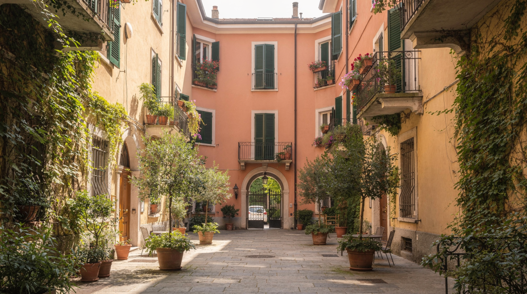
Milan keeps its most interesting architecture half-hidden. You can walk the same street for years and never suspect that behind a nondescript facade, past a heavy wooden door left slightly ajar, there is a courtyard with proportions so precise they feel intentional down to the centimeter. This is the Milan I return to with a camera — not the city of landmarks, but the one composed of thresholds, worn stone, and the quiet choreography of domestic life. As someone who spent years building images through composition, light, and texture in fashion, I recognize the same visual logic at work in these spaces: a railing casting its shadow across plaster, the way a potted plant breaks the geometry of a portico, the tension between a polished entrance and a stairwell that hasn’t been repainted in decades.
Why Milan’s courtyards matter
The courtyard in Milan is not ornamental. It is a structural answer to how people live densely while still claiming light and privacy. Historic palazzi used the courtyard as the building’s organizational center — a void that ordered everything around it, giving each apartment a relationship to open air and a sense of arrival. Later apartment blocks and contemporary developments kept the same instinct alive, even when the proportions changed or the porticoes disappeared.
What makes these spaces visually compelling is their double life. From the street, many buildings give away nothing. The facade is flat, sometimes severe. Then you step through the entrance passage — often a narrow, low-lit corridor that compresses your field of vision — and the building opens into a second world. It is quieter inside. The light falls differently. Materials that face the street are hard and uniform; materials inside the courtyard show age and variation. This shift between public restraint and private character is one of the most distinct visual signatures of Milanese housing, and it teaches the eye to look for layers rather than surfaces.
Reading the city as a sequence of thresholds
A residential building in Milan rarely gives you the full experience in one glance. It reveals itself in controlled steps, and each threshold changes something: the scale of the space, the quality of light, the acoustic atmosphere, the degree of privacy. Understanding this sequence is essential if you want to capture how these buildings actually feel rather than how they look in a real estate brochure.
- Street facade
- Entrance passage
- Courtyard
- Stairwell or gallery
- Balcony or loggia
- Apartment interior
Each step is a visual edit. The street is wide and impersonal. The entrance passage narrows the view and drops the light level — it acts almost like a palette cleanser, resetting your eye before the courtyard opens again. The courtyard offers height and air but remains enclosed. From there, staircases and galleries lead upward into increasingly private territory, where the details become smaller, more personal, less architectural and more human.
That is why gates, doorways, and shared passages matter as much as the rooms themselves. They carry the rhythm of the building. A worn stone threshold tells you about decades of footsteps. A painted metal gate with chipped edges shows where hands have pushed it open. These are not imperfections; they are evidence of use, and they give a photograph texture that no amount of styling can replicate.
What to look for in Milanese residential details
Strong images come from paying attention to the relationship between form and atmosphere. A beautiful old wall is not enough. What matters is how it meets the pavement, what light does to its surface at a specific hour, and what object or shadow interrupts its plane. The table below breaks down the elements I watch for when building a visual record of a residential space.
| Detail to observe | Why it matters | What to check |
|---|---|---|
| Courtyard proportion | Determines how light enters and how the space breathes. A narrow vertical courtyard creates dramatic shadow; a wide one offers generosity and calm. | Is it narrow and vertical, or open and generous? |
| Pavement material | Carries the history of the building in its wear. Stone, terrazzo, and brick age differently, and each gives the space a distinct tactile quality. | Stone, terrazzo, concrete, brick, gravel |
| Railings and balustrades | Create visual rhythm across the facade. Curved ironwork feels fluid and decorative; straight grids feel more rational and restrained. | Iron curves, straight grids, patina, repainting |
| Window rhythm | Organizes the building’s visual order and affects how light reads on the facade throughout the day. | Repetition, alignment, depth of reveals |
| Color shifts in light | Give the building its mood. A wall that looks flat ochre at noon can turn warm and complex by late afternoon. | Warm morning light, flat noon light, shadow at dusk |
| Vegetation | Softens hard architecture and signals that the space is lived in, not just maintained. | Potted plants, climbing greenery, courtyard trees |
| Entry doors | Signal the threshold between public and private. Their material, weight, and detailing set expectations for what lies beyond. | Heavy wood, painted metal, glass inserts, brass details |
These details are what separate a generic residential building from one that feels distinctly Milanese. They are the visual vocabulary of the city’s domestic culture, and once you learn to read them, you start seeing the city differently — not as a collection of streets, but as a series of interiors unfolding outward.
The visual language of the Milanese courtyard
A well-composed courtyard balances two opposing forces: openness and enclosure. It needs to feel protected without feeling trapped, airy without being exposed. Historic examples often achieve this through porticoes, columns, and symmetrical proportions that give the space a quiet formality. More modern versions strip away the ornament but keep the same spatial logic — an inward-facing void that organizes the building’s life around it.
For a visual journal, the most effective shots are rarely the obvious ones. A wide, symmetrical image of the courtyard center might document the space, but it rarely captures its atmosphere. I find stronger compositions in the edges and transitions: a corner where raking light cuts across stone and reveals every grain of texture; a balcony glimpsed through a passage, framed by darkness on both sides; a single chair placed against an aged wall, where the contrast between the object’s domestic scale and the architectural scale tells its own story. Reflections in glass that merge interior curtains with the courtyard beyond can also create layered images where the boundary between inside and outside dissolves.
Milan teaches you to look for composition inside ordinary space. The city does not perform for the camera; it just exists with a particular visual discipline, and the task is to recognize where that discipline produces moments worth recording.
Historic and contemporary references
Milan’s residential fabric is not monolithic. It stretches from grand palazzi with formal courtyards and arched passages to case di ringhiera with shared external galleries where daily life — laundry, plants, bicycles, neighbors talking — plays out in semi-public view. There are rationalist apartment blocks with cleaner geometry and a more restrained sense of order, and there are contemporary compounds that reinterpret the inward-looking courtyard as a landscaped garden or a sequence of terraces.
This diversity matters because it prevents the city from being reduced to a single aesthetic note. A visual diary can move between these different registers, and the contrast between them often produces the most interesting reading. A historic courtyard photographed next to a ringhiera gallery next to a modern glass-and-steel entry tells you more about Milan’s residential culture than any single building could alone.
What connects them is not style but a shared spatial idea: homes arranged around shared or semi-shared space, where the boundary between private and collective is always being negotiated. That idea keeps surfacing in new forms, and tracking it across different eras and neighborhoods reveals how resilient the courtyard model actually is.
How to shoot courtyards and residential details well
When the goal shifts from documentation to visual storytelling, the method needs to shift with it. A courtyard is best captured not in a single image but in a sequence that respects the building’s own logic of threshold and transition.
A practical shooting method
- Start from the street and photograph the facade before entering.
- Capture the threshold: doorframe, gate, intercom, or passage.
- Move into the courtyard and take one wide image for orientation.
- Record medium shots of surfaces, stairs, railings, and windows.
- Look for one or two quiet still-life details: a bench, a bicycle, a potted plant, laundry, or a chair.
- Return at a different time of day if the light is too flat.
This sequence works because courtyard photography is less about spectacle and more about rhythm. You are not hunting for a single hero image; you are building a visual record that captures how the space feels as you move through it. The same courtyard can feel heavy and closed in the morning and almost theatrical in late afternoon, when low light rakes across the walls and turns every plaster imperfection into a textural event.
Light to pay attention to
- Side light that skims across plaster and stone, pulling out texture that frontal light flattens
- Soft overcast light that reduces contrast and lets proportions speak without the distraction of harsh shadows
- Evening light that warms brick, paint, and metal, shifting their color temperature into something richer
- Deep shadow that emphasizes structure and turns architectural volumes into graphic shapes
In Milan, light is often what separates a flat, forgettable image from one that holds the eye. The same wall, photographed at noon and again at six in the evening, can look like two entirely different materials. Learning to anticipate how light will behave in a given courtyard — where the shadows will fall, how the color will shift — is part of the craft.
From wardrobe to room: applying a styling eye to domestic space
The visual language I used for years in fashion — balancing volumes, calibrating texture, managing how surfaces respond to light — translates directly into interior space. A room works when its elements relate to one another with clarity, the same way a garment works when the fabric, cut, and proportion are all speaking the same visual sentence.
This means treating furniture and objects not as standalone pieces but as parts of a composition. A chair is not just for sitting; it is a volume that occupies space, a texture that contrasts with the floor beneath it, a silhouette that reads against the wall behind it. A table, a textile, a shelf — each plays a role in the visual balance of the room.
Useful styling principles for residential interiors
- Keep contrasts intentional: soft against hard, matte against reflective, old against new. A linen curtain next to raw plaster is more interesting than either element alone.
- Repeat one or two materials to avoid visual noise. If the floor is terrazzo and the table is wood, let those surface qualities lead rather than introducing a third strong texture.
- Let negative space breathe around the main objects. A single lamp on a console against an empty wall can read more clearly than a crowded arrangement.
- Use color restraint when architecture already has strong character. Milanese apartments often have distinctive floor patterns, ceiling heights, or window proportions — let those features hold the visual attention.
- Place objects according to sightlines, not just function. What does the eye see first when entering the room? What aligns along the main axis? These decisions shape how the space photographs.
This approach is especially practical in Milan, where many apartments have strong architectural bones but limited square meters. A small table in the right position, a linen curtain filtering the light, a well-placed lamp defining a corner — these moves can shift the feeling of a room more dramatically than any large-scale renovation, because they work with the existing proportions rather than fighting them.
Common mistakes when reading or photographing Milan interiors
A residential diary falls flat when it relies on clichés or skips the visual work of actually looking. The most frequent mistakes I see are easy to avoid once you name them.
- Over-focusing on “beautiful old walls” while ignoring the spatial layout that makes them work. A textured wall in a poorly proportioned room is just a textured wall.
- Photographing only the center of a courtyard and missing the thresholds, edges, and transitions that give the space its character.
- Using overly styled interiors that erase the building’s real patina. When every surface looks freshly painted and every object looks curated, the image loses its connection to actual living.
- Ignoring how natural light interacts with material tone. A terrazzo floor in morning light is a different color than the same floor at dusk, and that shift is part of the room’s visual truth.
- Treating decorative objects as isolated details rather than elements in a composition. A vase on a shelf is not a subject; it is a note in a larger visual chord.
- Polishing every room until it looks pristine, when some of the most interesting spaces are imperfect — the stair landing with chipped paint, the kitchen corner with mismatched chairs, the balcony where plants and laundry coexist.
A Milanese interior does not need to look luxurious to feel precise. Often the most visually articulate spaces are the ones where renovation, memory, and daily use overlap without one erasing the other. That layered quality — the sense that a room has been inhabited, not just decorated — is harder to capture than simple good taste, but it is what makes an interior worth documenting.
Checklist for a Milan residential visual diary
When I explore a neighborhood, courtyard, or apartment with a camera, I run through a mental checklist that helps me move past first impressions and into the visual structure of the space. These questions are designed to uncover the logic behind what I am looking at, not just its surface appeal.
- Does the building have a clear sequence from street to interior?
- What is the dominant material: stone, plaster, brick, concrete, wood, metal?
- Where does natural light enter, and how does it shift during the day?
- Are there traces of old and new coexistence?
- Which details repeat and create rhythm?
- Is the space symmetrical, irregular, or layered?
- Does the courtyard feel public, shared, or private?
- What small domestic objects reveal how the place is actually lived in?
If the answers are specific — if you can describe the quality of light in the stairwell, the sound your footsteps make on the pavement, the exact shade of green on a painted gate — then the space is worth recording. Vague impressions produce vague images. Specific observation produces images with visual conviction.
Milan neighborhoods to observe with a visual eye
Different parts of Milan generate different residential atmospheres, and the most useful visual diary draws from that variety rather than settling into one preferred typology. The historic center offers formal courtyards with arched passages, symmetrical proportions, and a sense of architectural ceremony. Residential streets with early-to-mid-20th-century apartment blocks have a different rhythm — less grand, more repetitive, but often rich in textured facades and everyday domestic details. Mixed neighborhoods, where careful renovations sit directly beside older housing, create a productive visual friction between eras. And newer developments around the city reinterpret Milanese inwardness through planted courtyards, terraces, and shared gardens, proving that the courtyard idea is not a historical relic but a living model that keeps adapting.
The richest material comes from comparing these different conditions, not from searching for one ideal Milanese style. The city’s residential culture is not frozen. It keeps repeating its essential ideas — enclosure, threshold, the relationship between shared and private space — in new forms, and tracking that repetition across time and neighborhood is part of what makes the visual diary worth building.
Why this matters for the site
A visual journal about Milan works best when it treats apartments and houses as composed spaces, not just interiors to admire. That means looking at a room the way I used to look at a set: where are the sightlines, what is the dominant texture, how does the light fall, where does the eye rest? Courtyards, entryways, stairwells, balconies — these are not secondary spaces. They are where architecture, styling, and photography overlap most naturally, because they carry the building’s visual DNA in concentrated form.
They are also where the city’s residential identity becomes visible in everyday life. You can study Milan’s housing culture through books and plans, but you feel it in the worn stone of a courtyard passage, the rhythm of railings along a ringhiera gallery, the way a single chair on a balcony reads against the sky. For a journal built around composition, texture, domestic character, and the quiet intelligence of ordinary space, this city offers an archive that never exhausts itself. The real subject is not only the room. It is how the room meets the city, and what that encounter looks like when you slow down enough to see it.
FAQ
What makes Milan courtyards different from other Italian cities?
Milan’s courtyards are tightly woven into the city’s apartment culture. They function as central organizing devices that manage light, circulation, and privacy within the building, and they tend to feel more enclosed and inwardly focused than the courtyards of, say, Rome or Naples, where the relationship to the street is often more open and performative. In Milan, the courtyard is a domestic tool first and a display space second.
What should be photographed in a Milan residential visual diary?
Focus on thresholds, courtyards, stairwells, balconies, material details, and small domestic objects rather than only full-room views. The transitional spaces often carry more visual information about how the building is composed and lived in than the finished interiors do.
How can a small apartment be styled to look better in photos?
Use restraint: repeat a few materials rather than introducing many, keep surfaces clear enough that the eye can rest, and place objects so they support the room’s geometry and respond to the natural light. A single strong element — a textured textile, a well-placed lamp, a chair with a distinct silhouette — can anchor the composition without crowding it.
Why are courtyards important for understanding Milan housing?
They reveal how the building handles light, movement, privacy, and shared domestic life. The courtyard is often the element that organizes everything else — apartment layout, window placement, circulation paths — and understanding it unlocks how the entire building works visually and functionally.
What is the best time to photograph residential details in Milan?
Morning and late afternoon usually produce the most articulate light: low angles, longer shadows, warmer color temperature, and more texture on surfaces. Midday light tends to flatten materials and reduce contrast, which can work for certain architectural studies but rarely serves the kind of atmospheric detail that a residential visual diary depends on.
Conclusion
Milan’s courtyards and residential details are not a niche interest. They are part of a larger visual system where architecture, daily use, and atmosphere work together, and where the city’s domestic identity reveals itself in the spaces between the obvious landmarks. For anyone building a visual diary, the images that stay with you rarely come from grand facades or polished interiors. They come from quiet thresholds, worn pavements, the shadow of a railing across plaster, a chair placed in a corner as if it has always been there.
The task is straightforward but demands a particular kind of attention: look closely, move slowly, and pay attention to how a home is composed from its thresholds inward. The reward is a body of images that do not just document Milan but actually see it — with the kind of visual clarity that comes from treating every doorway, every material shift, and every fall of light as part of the composition.