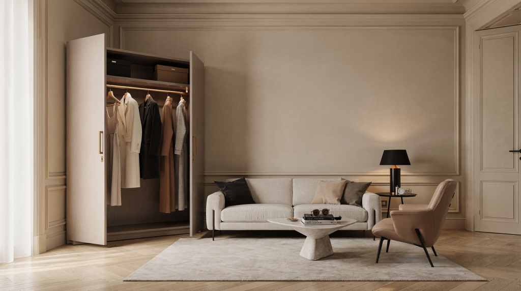
Styling a room like a fashion editorial is not about making it look “fashionable.” It is about composing space with the same discipline used on set: balancing volume, controlling light, editing color, and deciding what deserves attention and what should remain in the background. In Milan, where apartments often combine strong architecture, compact footprints, and a high visual standard, this approach is especially useful.
I learned this firsthand. After years of building images around garments — deciding where the eye should land, how fabric should fall, which surface should catch the light — I started noticing the same principles at work in the rooms I walked through every day. A doorway in Brera with its proportions just right. A courtyard off Corso Magenta where the afternoon light hit the stone exactly where it needed to. A living room on Via Arena where the sofa, the lamp, and the window formed a composition so balanced it felt inevitable. The visual grammar doesn’t change when you move from a model to a room. The elements just get larger, heavier, and more permanent.
Why fashion thinking works so well in interiors
Fashion styling and interior styling share the same visual grammar: silhouette, texture, contrast, rhythm, and negative space. In both cases, the goal is not to fill every surface, but to create a clear image. On set, you learn very quickly that the eye needs somewhere to rest. If every inch of the frame competes for attention, nothing registers. The same is true in a room.
A room becomes more convincing when it has:
- a dominant line or shape — something that anchors the space visually, like a strong sofa profile or a pronounced window;
- a controlled palette — not necessarily neutral, but intentional;
- one or two tactile contrasts — rough against smooth, matte against reflective;
- a sense of pacing from one area to the next — the room should unfold, not reveal everything at once;
- enough restraint to let the architecture breathe — especially important in Milan, where the bones of the building often do half the work.
That is why many Milan apartments photograph so well when they are edited rather than decorated. The best results usually come from subtraction, not accumulation. I’ve walked into apartments on Via della Spiga where the owner removed three pieces of furniture and suddenly the room had presence. Before, it was a showroom. After, it was a composition.
What “editorial styling” means in a home
An editorial room is arranged as if it were a still-life frame. Every object has a visual job. Nothing is there by accident. This is the mindset shift that matters most: you stop seeing a chair as seating and start seeing it as a form that occupies space, casts shadow, and interacts with the light at different times of day.
Think of it this way:
- a chair is not just seating, it is a form — its legs create lines, its back creates a silhouette against the wall;
- a table is not just practical, it is a horizontal anchor — it grounds the composition and gives the eye a place to pause;
- a lamp is not just functional, it creates a point of light and a vertical note — it draws the gaze upward and breaks the horizon;
- textiles soften hard edges and change the atmosphere immediately — a linen throw can take a room from cold to calm in seconds;
- books, trays, bowls, and vessels work like accessories in a wardrobe — they finish the look, but only if they’re chosen with the same restraint.
In Milanese interiors, this logic works especially well in apartments with period details, long corridors, or compact living rooms, because the styling can clarify the architecture instead of competing with it. A narrow corridor in a ringhiera building, for example, doesn’t need decoration — it needs one well-placed console, one lamp, and enough empty wall to let the proportions speak.
Start with the room’s “look,” not with objects
Before choosing anything, decide what the room should communicate. Editorial styling begins with direction. On a fashion shoot, you don’t start by pulling clothes — you start with a mood, a reference, a single image in your head that everything else will serve. A room deserves the same clarity.
Ask these questions:
- Is the room calm or graphic? This determines everything from color to furniture profile.
- Does it need warmth or precision? A bedroom might lean toward warmth; a dining area might benefit from precision.
- Should it feel lived-in, gallery-like, or intimate? Each has a different material and object vocabulary.
- Which element should lead: light, color, texture, or proportion? In Milan, light often deserves to lead — it changes so dramatically by season and orientation that it becomes a material in itself.
A simple styling brief
Use this before shopping or rearranging. It forces decisions before objects enter the room, which is the opposite of how most people approach decorating:
- Main mood: soft / sharp / warm / restrained
- Main materials: wood / metal / linen / stone / glass
- Main colors: 2–3 only
- Main function: rest / gather / work / display
- Main focal point: window / sofa / table / wall / artwork
If you cannot describe the room in one sentence, the styling is probably not clear enough yet. “A quiet living room anchored by a low sofa and a single large artwork” is a direction. “A living room with a sofa and some chairs and maybe a rug” is not.
Translate fashion principles into interior decisions
1. Silhouette becomes furniture profile
In fashion, silhouette is what makes a look readable from a distance. Before you see color or texture, you see shape. In interiors, it is the outline of furniture and objects — what registers when you squint or see the room from the doorway.
Use this rule:
- mix one solid, grounding shape with lighter pieces — a substantial sofa paired with slender-legged chairs;
- avoid too many visually heavy items in one zone — the eye needs variation in weight;
- repeat curves or straight lines intentionally — if the architecture has strong verticals, echo them in a tall cabinet or lamp; if the room has arched windows, a round table or curved sofa back creates dialogue.
For example, a Milan living room with a low sofa, a round side table, and a tall lamp feels composed because the shapes are distinct and balanced. Each occupies a different vertical zone: low, mid, high. The composition reads clearly even from across the room.
2. Fabric styling becomes textile layering
Fashion editors know that fabric changes everything. The same garment in wool versus silk communicates entirely differently. Interiors work the same way. Textiles are the fastest, most reversible way to shift a room’s atmosphere — and they’re often underused in Milan apartments, where hard surfaces dominate.
Useful layers:
- curtains to soften windows — they also frame the light and add vertical drape;
- a throw to break up a flat sofa — it introduces a diagonal line and a different texture;
- cushions in different scales — one large, one medium, one small reads better than three identical;
- a rug to define a “zone” — especially useful in open-plan Milan apartments where the living and dining areas share one volume;
- table linens for a more domestic, less staged look — they signal that the space is lived in, not just photographed.
Choose textiles for contrast, not matching. A room often becomes more interesting when linen meets velvet, or bouclé meets polished wood. The tension between textures creates visual energy without adding objects.
3. Color styling becomes palette discipline
A strong interior editorial usually follows a limited palette. Milan interiors often handle muted neutrals very well — the city’s light, soft and diffuse for much of the year, flatters beige, greige, and stone tones. But the palette does not need to be beige to be elegant. What matters is control.
Try one of these approaches:
- tonal: variations of one color family — different depths of the same hue create depth without chaos;
- contrast-led: warm and cool balanced together — a warm wood floor against cool grey walls, for instance;
- accent-led: mostly quiet, with one sharp note — a single ochre cushion in an otherwise neutral room;
- material-led: color comes from wood, stone, metal, and fabric rather than paint — this is where Milan apartments excel, because the materials themselves carry so much chromatic information.
Avoid using too many “almost” colors. If the palette is unclear, the room feels accidental. I’ve seen rooms where the walls were cream, the sofa was beige, the rug was taupe, and the curtains were off-white — and nothing held together because the colors were close but not related. Better to commit to one clear base and build from there.
4. Accessories become the final edit
In fashion, accessories finish the look. They’re the last decision, not the first. In a room, objects do the same — they should complete the composition, not create it from scratch. This is where most rooms lose their way: accessories are added before the structure is clear, and they end up as visual noise.
Good editorial accessories:
- books with strong spines or neutral covers — they add horizontal rhythm and color without competing;
- one sculptural vase — it works as a standalone object, not just a vessel;
- a tray to contain small items — it turns scattered objects into one visual unit;
- a bowl, box, or ceramic object — organic shapes soften the geometry of furniture;
- a framed image with enough breathing space around it — the wall around the artwork is part of the composition.
Bad styling usually happens when every shelf is treated like storage. Editorial styling asks for selection. One shelf with three objects and space between them reads as intentional. A shelf packed with twenty objects reads as clutter, no matter how beautiful each individual piece is.
How to style a room like a fashion editorial: step by step
Step 1: Clear the room
Remove anything that does not support the mood or function. This includes duplicate objects, overly small decor, and decorative items with no visual relationship to the rest. Be ruthless. On set, we clear the frame before we build it. A room deserves the same discipline. If you’re not sure about an object, take it out — you can always bring it back, but you can’t see the room clearly until it’s gone.
Step 2: Identify the anchor pieces
Keep the largest or most useful elements first:
- sofa;
- table;
- bed;
- cabinet;
- rug;
- main lamp.
These pieces set the scale. Everything else should support them. If the anchor pieces are wrong — too large for the room, too small, wrong proportion — no amount of styling will fix it. In Milan apartments, where rooms are often compact, getting the scale right is the single most important decision.
Step 3: Build the palette
Limit yourself to a controlled mix:
- one base color;
- one secondary color;
- one accent or material contrast.
A Milan apartment with a stone floor and dark wood may only need linen, black metal, and one warm accent to feel complete. The materials are already doing the work; the palette just needs to support them.
Step 4: Introduce texture
A room without texture looks flat in person and worse in photographs. This is something you learn quickly on set: light needs something to catch on. Combine:
- matte and reflective — a matte ceramic vase next to a polished metal lamp;
- rough and smooth — raw linen against smooth leather;
- soft and structured — a slouchy throw on a tailored sofa.
Texture is what makes a room feel three-dimensional. Without it, even the best palette falls flat.
Step 5: Edit surfaces
Treat every tabletop and shelf like a frame. Leave some emptiness. One object with space around it is often stronger than three objects touching each other. This is the hardest step for most people — the instinct to fill is strong. But negative space is not emptiness; it’s breathing room. It gives the objects that remain more presence.
Step 6: Check the room from different distances
Look at it:
- from the entrance — this is the first impression, the establishing shot;
- from seated eye level — how the room feels when you’re living in it, not just looking at it;
- from across the room — the wide shot that shows the whole composition;
- in natural light — Milan’s morning light is cool and clear; afternoon light is warmer and more directional;
- in evening light — lamps change the hierarchy completely; what recedes during the day may become the focal point at night.
If the room works only from one angle, the composition is not finished. A well-styled room holds up from every viewpoint.
A practical styling framework for Milan apartments
Milan homes often come with specific conditions: compact rooms, strong daylight changes, older buildings, deep windows, or a mix of original details and modern interventions. This means styling has to respect the apartment, not impose a generic look. A loft in Porta Nuova and a period apartment in Porta Venezia need entirely different approaches — the architecture dictates the rules.
What usually works well in Milan
- clean sight lines — the eye should move through the space without obstruction;
- furniture with clear proportions — pieces that read well from a distance, not just up close;
- fewer but better objects — Milan has a long design tradition; one good piece says more than five average ones;
- materials that age well — stone, wood, brass, linen — they gain character over time;
- a balance between formal and relaxed — the architecture often leans formal, so the styling can afford to soften it.
What often fails
- oversized decor in small rooms — a massive chandelier in a compact dining area overwhelms everything;
- too many competing finishes — glossy, matte, metallic, and textured all in one room reads as chaotic;
- copying a showroom look without adapting it to the apartment — showrooms have different proportions, different light, different purpose;
- overfilling every corner — the room needs to exhale;
- ignoring the way daylight moves through the space — a beautiful arrangement at 10am can look harsh and unbalanced at 4pm if you haven’t accounted for the light’s path.
Room-by-room editorial styling guide
Living room
The living room needs a clear hierarchy. This is usually the largest space in a Milan apartment and the one that sets the tone for everything else. Without hierarchy, it becomes a collection of furniture rather than a room.
Focus on:
- one anchor sofa — this is the main volume, the piece that grounds the composition;
- one table or ottoman — it provides a horizontal counterpoint to the sofa’s horizontality;
- one lamp with presence — a floor lamp that creates a vertical accent and a pool of light;
- one artwork or wall composition — something that holds the wall and gives the eye a destination;
- one textile layer that softens the space — a rug, a throw, or curtains.
Keep side tables edited. If everything is visible at once, the room loses rhythm. The eye should discover the room in layers, not absorb it all in one glance.
Dining area
A dining area works best when it feels purposeful and calm. In Milan apartments, the dining zone is often part of the living room or tucked into a pass-through space — which means it needs to read clearly without dominating.
Use:
- a table with a visible shape — round, oval, or rectangular with strong lines;
- chairs that repeat one line or material — consistency creates calm;
- a pendant or lamp that defines the zone — light creates a boundary even without walls;
- a centerpiece that is low and simple — a bowl, a single branch, a ceramic object.
Avoid overdecorating the table. Dining spaces should feel ready, not crowded. A table set for a photo shoot looks staged; a table with one beautiful object and empty space around it looks intentional.
Bedroom
A bedroom editorial should feel quieter than the rest of the apartment. This is the room where restraint pays off most. The goal is calm, not drama.
Use:
- muted bedding — color and pattern should recede, not demand attention;
- one strong texture, such as washed linen or wool — it adds depth without adding visual weight;
- a pair of lamps or matching asymmetry — two identical bedside lamps create symmetry; two different but balanced lamps create a more interesting tension;
- minimal bedside surfaces — a lamp, a book, maybe one small object. Nothing more;
- one piece of art or a restrained wall gesture — something quiet that holds the wall above the bed.
If the bedroom feels too staged, reduce contrast and remove decorative noise. A bedroom should feel like a place to exhale, not a place to perform.
Shelf or console styling
This is where most people overdo it. Shelves become storage, consoles become dumping grounds, and the visual noise accumulates until nothing reads clearly.
A reliable formula:
- start with 1 vertical object — a vase, a stack of books on its side, a framed piece leaning against the wall;
- add 1 horizontal stack or tray — it anchors the composition and contains smaller items;
- add 1 organic shape — a bowl, a sculptural object, something that breaks the geometry;
- leave empty space — at least a third of the surface should be clear.
Repeat this rhythm across the shelf rather than filling every gap. The empty spaces are what make the objects visible.
Editorial styling checklist
Before considering a room finished, check:
- Does the room have one clear focal point? If your eye doesn’t know where to land, the composition needs work.
- Are there at least two different textures? Matte and reflective, rough and smooth, soft and hard — the contrast keeps the room from feeling flat.
- Is the color palette limited and legible? If you can’t name the colors in the room, there are probably too many.
- Are objects scaled to the furniture? A tiny vase on a massive table disappears; an oversized lamp on a delicate side table overwhelms.
- Is there visible negative space? Surfaces, walls, and corners should have breathing room.
- Does the room feel better from the doorway than when standing inside it? The establishing view matters — it’s the first impression and often the most honest.
- Would the room still work if three objects were removed? If the answer is no, the room is probably overstyled and dependent on decoration rather than composition.
Common mistakes to avoid
1. Styling everything equally
Not every object deserves equal attention. A good room has hierarchy — some pieces lead, others support, and some simply fill space quietly. When everything shouts, nothing is heard.
2. Confusing “minimal” with empty
Minimal does not mean unfinished. It means every piece has a reason to be there. A minimal room can be warm, textured, and full of presence — it just doesn’t carry excess.
3. Using too many statement pieces
One strong chair, one strong lamp, or one strong artwork is usually enough. Too many focal points create visual competition, and the room becomes exhausting to look at. Let one piece lead; let the others support.
4. Ignoring light
A beautiful arrangement can fail if it blocks daylight or looks flat in the evening. In Milan, where light shifts significantly by season and orientation — a south-facing room in July is entirely different from the same room in December — this matters a lot. Always check the room at different times of day before finalizing the composition.
5. Buying decor before defining the composition
Objects should complete the room, not create it from scratch. If you buy accessories hoping they’ll somehow pull the room together, you’re working backward. Define the structure first, then choose objects that serve it.
How to make a room photograph well
Because editorial styling and photography are closely linked, a room should be checked through the camera eye. The camera is unforgiving — it reveals clutter, flattens texture, and exposes weak composition. But it’s also the best editor you have.
Useful rules:
- simplify the background — what’s behind the main subject matters as much as the subject itself;
- align objects with the room’s geometry — a lamp slightly off-center from a window reads as a mistake, not a choice;
- avoid clutter at the edges of the frame — the eye is drawn to the edges, and chaos there undermines the whole image;
- use natural light when possible — Milan’s light, especially in the morning and late afternoon, has a quality that artificial light can’t replicate;
- create depth with one foreground, one mid-ground, and one background layer — this gives the image three-dimensionality and guides the eye through the frame.
A room that photographs well is usually a room where the composition is already disciplined in real life. The camera doesn’t lie — it just amplifies what’s already there, for better or worse.
Quick comparison: wardrobe styling vs room styling
| Fashion editorial | Interior editorial |
|---|---|
| Outfit silhouette | Furniture profile and room shape |
| Fabric mix | Textile and material layering |
| Accessories | Objects, books, lamps, ceramics |
| Color story | Room palette |
| Final look | Overall atmosphere |
| Fit on body | Proportion in space |
| Negative space around garment | Breathing room around furniture |
FAQ
How do I start if my room already feels messy?
Remove duplicates, clear surfaces, and choose one visual direction before buying anything new. Editing always comes before styling. Take everything out if you need to — seeing the empty room is often the fastest way to understand what it actually needs.
Can small apartments still look editorial?
Yes. Small spaces often benefit most from editorial thinking because clarity matters more than quantity. In a compact Milan apartment, every object has to earn its place. The discipline of editing is even more important when square meters are limited.
Do I need expensive furniture to get this look?
No. What matters first is proportion, placement, and restraint. Even simple pieces can look strong when the composition is right. I’ve seen rooms furnished almost entirely with vintage market finds that looked more editorial than apartments filled with designer pieces — because the owner understood scale and negative space.
How many colors should a room have?
Usually two or three main colors, plus materials that add variation. More than that is possible, but it needs a very controlled hand. If you’re not confident with color, start with two and let materials do the rest.
What if I like collecting objects?
Collecting is fine, but display everything in rotation. Not every object has to live on view at the same time. Think of it like a wardrobe — you don’t wear everything you own at once. Rotate objects seasonally or whenever you want the room to feel fresh. The pieces in storage gain power when they return.
Final thought
Styling interiors like a fashion editorial is not about making a home look dressed up. It is about giving the room clarity, tension, and rhythm. When the composition is right, even the most ordinary objects gain presence, and the apartment begins to feel edited rather than decorated. The goal is not perfection — it’s intention. A room where every object has a reason to be there, where the light is considered, where the textures talk to each other, and where the eye can move through the space without getting stuck. That’s what editorial styling does. It doesn’t add more. It makes what’s already there visible.