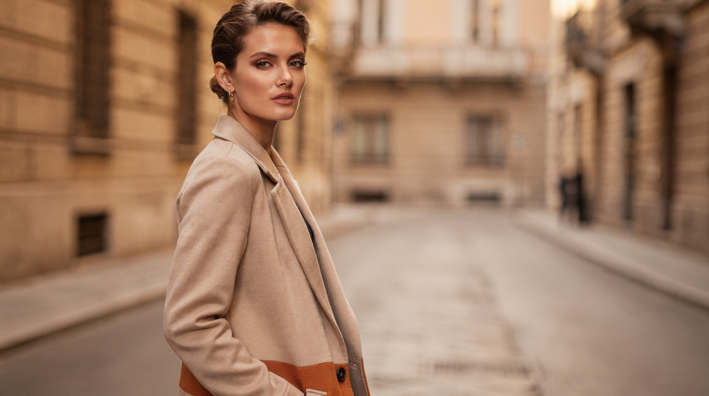
An editorial image starts working long before the viewer registers the clothes. It begins with where the eye lands first, how the light falls across a surface, and whether the frame feels intentionally composed or merely filled. In fashion, art direction is the discipline that shapes those decisions—composition, colour, and light—into a single, coherent visual statement. In Milan, where residential architecture already carries a strong sense of proportion and material contrast, this way of seeing becomes second nature.
What fashion editorial art direction actually does
Art direction gives an image its skeleton. It’s not about decorating a set; it’s about editing a scene until every element—from the angle of a chair to the weight of a shadow—earns its place. When I approach a frame, I think in terms of visual hierarchy: what reads first, what supports, what recedes. That hierarchy is built through composition, colour temperature, and the quality of light.
In practice, that means deciding:
- the composition of the frame
- the colour palette and its temperature
- the quality of light
- the relationship between subject and background
- the balance between texture, volume, and negative space
- the narrative tone: restrained, dramatic, intimate, or graphic
A good art director does not decorate a scene. They edit it. Every visible element should earn its place.
The difference between styling and art direction
Styling selects the pieces; art direction orchestrates how they speak to each other. A stylist might choose a perfectly cut coat, but the art director decides whether that coat should be photographed against raw plaster or polished marble, in hard morning light or soft afternoon shadow, with the frame cropped tight or left open to breathe. That’s why some editorials with simple garments feel unforgettable—the structure does the heavy lifting. A strong editorial may use very modest clothes, but the framing, surfaces, shadows, and rhythm across the series make it feel intentional.
Composition: the frame decides the story
Composition is the backbone of editorial work. Before colour and styling register, the viewer reads structure. It determines where tension lives, how a subject relates to space, whether the image feels calm or charged, static or cinematic.
In Milanese apartments, composition often presents itself ready-made: a doorway becomes a natural frame within the frame, a long corridor a leading line, a courtyard window a source of layered depth. The architecture already knows how to direct the eye.
Core composition tools
- Negative space: lets the subject breathe and gives the eye rest
- Cropping: can create intimacy, tension, or graphic sharpness
- Diagonal lines: bring movement and energy
- Symmetry: creates stability, formality, and control
- Off-centre placement: often feels more editorial than a centred portrait
- Layering: adds depth and makes the frame feel lived-in
A practical way to compose a frame
- Decide the subject of the image in one sentence.
- Remove anything that does not support that idea.
- Check the largest shapes first: walls, furniture, body position, light blocks.
- Then add smaller details: hands, textile folds, accessories, books, flowers, reflections.
- Ask whether the frame still works if the viewer ignores the clothes for a moment.
I often test a composition by squinting—if the largest shapes still hold together, the structure is solid. If the image still feels strong without the outfit, the composition is doing its job.
Common composition mistakes
- overfilling the frame with props
- placing the subject too centrally by habit
- ignoring background lines that cut through the body
- using too many competing focal points
- confusing detail with composition
Colour: the quiet architecture of mood
Colour is rarely just decorative. In editorial work, it creates emotional direction and visual hierarchy. A restrained palette often feels more sophisticated because it allows shape, texture, and light to speak. A stronger palette can work beautifully too, but only when the relationship between tones is controlled.
In Milan, the starting point is often the room itself. Warm terracotta floors, dove-grey plaster, a sliver of cool northern light—that’s already a complete colour story. The clothes can either continue that conversation or introduce a deliberate tension.
What colour does in an editorial image
- sets temperature: warm, cool, or neutral
- creates contrast or harmony
- links garments to the set
- signals period, mood, or cultural reference
- guides the eye across the frame
Useful colour strategies
| Colour strategy | Effect | Best used when |
|---|---|---|
| Tonal palette | Quiet, cohesive, sophisticated | Subtlety and elegance are the goal |
| Monochrome | Graphic, disciplined, modern | You want a strong visual system |
| Complementary contrast | More energy and tension | The image needs to feel dynamic |
| Muted neutrals | Timeless, spatial, architectural | The setting itself is important |
| Single accent colour | Focus and memorability | You need one strong visual note |
How to build a palette that works
Start with the room, not the clothes. In Milan interiors, this is often the smartest approach because apartments frequently provide strong base tones through plaster, parquet, stone, lacquer, or tile.
Ask:
- What is the dominant neutral?
- Is the light warm or cool?
- Which surface reflects light most?
- What colour already exists in the architecture?
- Do the clothes repeat, soften, or interrupt that palette?
A good editorial palette usually has one dominant family, one secondary tone, and one accent, used sparingly.
Typical colour mistakes
- using too many saturated colours at once
- matching everything too closely, which flattens the image
- ignoring undertones
- treating white as neutral when it is actually warm or cold
- choosing colours that look good separately but not together
Light: the element that makes everything believable
Light does more than illuminate. It models form, reveals texture, and creates emotional tone. In editorial art direction, light is never accidental. Milan offers an especially useful lesson here: many residential spaces are shaped by changing daylight, long windows, courtyards, filtered reflections, and surfaces that hold light differently from one room to another.
I’ve learned to read a room’s light like a script: at 9 a.m. the corner near the window holds a soft, wraparound glow perfect for textiles; by 2 p.m. the same spot might be flat and uninteresting. The angle of light is often the difference between an image that feels sculptural and one that feels like a catalogue.
Main light qualities
- Soft light: gentle, diffuse, flattering, quiet
- Hard light: sharper shadows, stronger texture, more drama
- Directional light: gives form and depth
- Flat light: reduces shadow and can feel clean but lifeless if overused
- Natural window light: often best for interiors and domestic editorials
- Mixed light: useful, but risky if colour temperatures clash
How to read light in a room
Before shooting, observe:
- where the light enters
- how long it stays in one area
- whether it reflects off pale walls or dark surfaces
- what time of day creates the cleanest shadow
- which corners become too flat or too noisy
A room can be visually interesting at 10 a.m. and completely dead at 3 p.m. The difference is often just the angle of light.
A simple editorial lighting checklist
- check the direction of the main light source
- decide whether shadows should be visible or reduced
- test how fabric reacts to light
- test skin against background tone
- look at reflections in mirrors, glass, and polished surfaces
- keep one source dominant whenever possible
Composition, colour and light in Milan: why the city matters
Milan is not just a backdrop. It has its own visual logic. The city’s residential architecture often combines disciplined geometry with tactile material detail. Interiors may include parquet, stone, plaster, marble, glass, or painted surfaces that shift under daylight. That creates ideal conditions for editorial work, because the space itself already behaves like a carefully composed set.
A typical Milanese hallway might have a marble floor, a lacquered door, and a sliver of light from an internal courtyard—already a composition. The city teaches you that domestic space doesn’t need to be staged; it often arrives pre-composed.
What makes Milan visually specific
- strong architectural order
- attention to proportion
- layered domestic interiors
- light that changes character across the day
- a tradition of making everyday spaces feel composed
This is why a hallway, entryway, courtyard, or apartment corner can feel as visually meaningful as a full set. In Milan, domestic space often already contains a sense of staging.
From fashion editorial to interior still life
One of the most useful shifts for a visual journal is to treat rooms like still-life compositions. The same art direction principles apply. A chair, table, textile, shelf, lamp, and book can be arranged the way garments, accessories, and props would be in a fashion image. The key is not abundance, but relationships.
A chair is not just a chair; it’s a silhouette. A stack of books on a marble console is a study in weight and texture, much like a necklace on a collarbone. The same principles of layering, contrast, and spacing apply.
What transfers well from wardrobe to room
- silhouette
- layering
- texture contrast
- colour rhythm
- visual weight
- spacing
- foreground and background tension
Example of the same method in two settings
| Fashion editorial | Interior still life |
|---|---|
| Dress silhouette | Chair profile |
| Jewellery accent | Object on a table |
| Fabric layering | Textile and upholstery pairing |
| Model pose | Placement of furniture or objects |
| Set backdrop | Wall, curtain, shelf, or floor plane |
| Light on skin and fabric | Light on stone, wood, plaster, or glass |
The principle is the same: arrange forms so they speak to one another.
How to art direct a shoot step by step
1. Define the visual idea
Write one clear line: quiet domestic modernism, soft geometry in morning light, a tonal palette with one saturated accent, a room as a composed still life. If you cannot describe the concept simply, the image will likely become vague.
2. Build a reference board with purpose
Do not collect only beautiful images. Collect references for specific reasons: framing, shadow quality, palette, material contrast, pacing across a series. Each reference should answer a precise visual question.
3. Scout the location for light and surfaces
Look for walls that reflect or absorb light, strong architectural lines, distracting objects that cannot be removed, surfaces that photograph too shiny or too dull, and a natural “anchor” element such as a window, doorway, staircase, or table. In Milan, that anchor is often already there—a marble threshold, a courtyard view, a particular fall of light.
4. Edit the set
Remove visual noise before adding props. The best editorial sets often look simple because they are carefully reduced. I always ask: can I remove one more thing and still keep the story? Usually, yes.
5. Adjust the hierarchy
Decide what should be seen first, second, and third:
- shape
- light
- colour
- texture
- detail
If the viewer reads the details before the structure, the image is probably overcrowded.
Practical checklist for stronger editorial images
- choose one dominant mood
- keep the palette controlled
- let the background support, not compete
- use shadows intentionally
- balance hard and soft surfaces
- leave enough empty space
- test the image in black and white to check structure
- simplify until the frame feels inevitable
Common mistakes in fashion editorial art direction
- confusing richness with visual clarity
- adding too many references in one image
- using light only for exposure, not for mood
- ignoring the relationship between colours and surfaces
- over-styling the set until it stops feeling believable
- letting every object ask for attention
A memorable editorial is usually more edited than decorated. I’ve seen shoots fail because someone added one cushion too many, or a vase that fought with the model’s silhouette.
What to look for in a successful image
A strong image usually has three things working together:
- clarity: you understand the frame immediately
- tension: not everything is perfectly resolved
- cohesion: colour, light, and composition feel part of one system
If one of those is missing, the image may still be attractive, but it will feel weaker.
Final takeaway
Fashion editorial art direction is the discipline of turning visual decisions into meaning. Composition gives the image structure, colour gives it temperature and rhythm, and light gives it life. In Milan, where residential architecture and interiors already carry a strong visual identity, these elements become even more powerful.
The best editorial work does not try to impress with excess. It creates order, atmosphere, and a clear point of view. That is what makes an image stay in memory.
FAQ
What is fashion editorial art direction?
It is the process of shaping the visual logic of an editorial image through composition, colour, light, set design, and storytelling.
Why are composition, colour and light so important?
Because they determine how the viewer reads the image before noticing the subject or styling.
How do you make an editorial look more sophisticated?
Use fewer elements, stronger framing, a controlled palette, and light that supports the mood instead of flattening the scene.
Can interior spaces be treated like editorial sets?
Yes. Rooms, shelves, chairs, and domestic objects can all be arranged with the same visual logic used in fashion shoots.
What makes Milan relevant to this topic?
Milan’s residential architecture and interiors offer a strong visual language of proportion, material contrast, and natural light that suits editorial thinking.