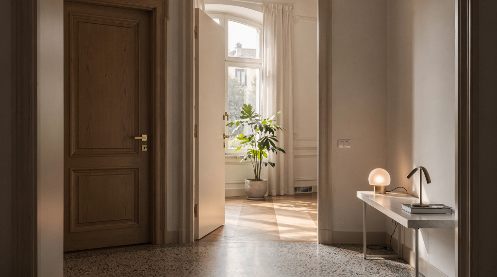
Milanese homes rarely reveal themselves all at once. In this city, the most interesting part of a house is often not the living room, but the stretch between street and interior: the doorway, the vestibule, the stair landing, the courtyard edge, the first turn of light. These thresholds set the tone for everything that follows, and in Milan they often carry an unusually strong architectural identity — from restrained street façades to richly detailed internal spaces that feel like carefully composed still lifes.
For anyone photographing, styling, renovating, or simply learning how Milanese domestic spaces work, entryways are not background details. They are the first visual sentence of a home, and like any good opening line, they deserve to be read slowly.
Why Milanese thresholds feel different
Milan has a long tradition of treating entrance spaces as more than circulation zones. Historical and modern residential buildings consistently use the entry as a controlled transition between the public street and private life, often packing a surprising amount of material richness behind an understated exterior. This is not accidental — it is a deliberate visual strategy that plays with expectation and revelation.
What makes this work compositionally is the contrast between compression and release. A narrow street portal gives way to a generous internal volume; a sober façade opens into marble, mosaic, or terrazzo-lined halls that catch light in unexpected ways. The eye registers the shift before the mind names it, and that moment of visual surprise is precisely what gives Milanese entries their character.
In practice, you may encounter:
- plain façades that open into marble, mosaic, or terrazzo-lined halls — the material shift alone can feel like walking into a different building
- narrow portals that lead to generously scaled internal atriums, where the ceiling suddenly lifts and the space breathes
- staircases, ramps, and porter’s lodges arranged with a strong sense of symmetry and order, almost neoclassical in their composure
- courtyards that act as light reservoirs and visual pauses before the apartment itself, softening the boundary between outside and in
This contrast is central to the Milanese residential language: the city likes discretion on the outside and composition on the inside. It is a form of visual politeness — no need to impress the street, but every reason to compose the experience of arriving home.
The main types of entry spaces in Milanese homes
Not every Milan home has the same threshold sequence. Understanding the typologies helps when you are reading a building, scouting photographs, or assessing an apartment renovation. Each space has a distinct visual job, and together they create a rhythm that shapes how you feel before you even touch the apartment door handle.
| Space | Typical role | Visual effect | What to look for |
|---|---|---|---|
| Street portal | Marks the public-private shift | Often sober, sometimes monumental | Door height, material, hardware, frame proportion |
| Androne / entry hall | Transition and gathering space | Can feel like a small interior room rather than a corridor | Floor pattern, wall finish, ceiling height, light direction |
| Courtyard edge | Connects the building to shared open air | Breathing space, reflection, depth | Paving, plants, railings, doors opening onto voids |
| Stair landing | Secondary threshold between levels | Repetition, rhythm, movement | Handrails, rail turns, light landings, floor continuity |
| Apartment door zone | First intimate zone of the home | More personal, softer, quieter | Color, mats, hooks, art, storage, signs of daily use |
This is why Milanese thresholds often read as composed sequences rather than a single doorway. The experience is architectural, but also emotional: compression at the street, release in the hall, a pause in the courtyard, then the quiet intimacy of the apartment door. Each step adjusts the visual register, like movements in a piece of music.
What to observe when you photograph a doorway
If the goal is a visual diary rather than a generic interior shot, the doorway deserves the same attention as any styled room. A strong threshold image usually depends on structure, not decoration. I approach doorways the way I used to approach a garment on set: looking for how light falls on surfaces, how proportions relate, and where the tension sits between materials.
1. Light
Look at where the light comes from and what it does to the surfaces. Side light reveals texture better than flat frontal light — it carves out the grain of wood, the unevenness of plaster, the patina on metal. Backlight can turn a door into a silhouette and make a threshold feel deeper, almost painterly. Mixed daylight and interior light can flatten the scene unless you control the exposure carefully; I often underexpose slightly to preserve the shadows that give a doorway its depth.
2. Proportion
A doorway reads through scale relationships. Is the opening narrow and tall, or low and broad? Does the frame feel compressed or generous? Are the stairs oversized relative to the hall, or carefully calibrated? These proportions communicate hierarchy and intention — a tall, narrow door feels ceremonial; a wide, low one feels domestic and grounded.
3. Material contrast
Milanese entry spaces often gain strength through material friction. Hard stone against painted plaster creates a dialogue between permanence and softness. Metal hardware against wood introduces a cool precision beside warmth. Glossy tile beside matte wall finish sets up a play of reflections. A patterned floor below plain walls anchors the composition without competing for attention. These contrasts are not decorative — they are structural to how the eye moves through the space.
4. Repetition
Repeated doors, arches, lights, or railings create rhythm. A row of apartment doors can tell you more about a building than one isolated detail — the repetition reveals the building’s visual logic, its sense of order. Repetition also helps establish the editorial tone of a visual diary, turning a single image into part of a larger visual argument.
5. Signs of use
A threshold becomes more interesting when it contains everyday evidence. A doormat, worn edges on a step, a plant placed for protection or welcome, a nameplate, bell, or mailbox, a curtain or half-open inner door — these details keep the image from feeling staged in a generic way. They anchor the architecture in real life, and that authenticity reads immediately in a photograph.
Milanese doors: design clues hidden in plain sight
Doors in Milan often communicate the building’s era and attitude. Even when they are not original, they can still tell you whether a home leans formal, rational, decorative, or quietly domestic. I read doors the way I read a well-cut jacket: the proportions, the material, the hardware, the way it sits in its frame — all of it speaks.
Common visual cues
- Wood paneling suggests warmth, continuity, and a more traditional reading. It absorbs light rather than reflecting it, which makes the threshold feel softer and more enveloping.
- Painted flush doors often feel more modern and minimal. They recede visually, letting the surrounding walls and light do the compositional work.
- Glass inserts bring borrowed light into darker halls — a practical move that also creates a visual connection between spaces, layering transparency over solidity.
- Metal frames and handles can shift the tone toward precision and restraint. They introduce a crisp, almost graphic line that reads beautifully against softer materials.
- Oversized portals create a stronger civic feeling, closer to an urban room than a private passage. They elevate the act of entering into something more ceremonial.
Typical mistakes when reading a door
- Focusing only on the door leaf and ignoring the frame, threshold, and surrounding wall. The door is never an isolated object — it exists in relationship to everything around it.
- Treating hardware as minor; in many homes it sets the visual register. A handle can shift the entire tone from rustic to refined.
- Ignoring height relationships between the door, ceiling, and adjacent openings. These proportions determine whether the space feels grand or intimate.
- Overstyling the area until it loses the quiet tension that makes it believable. A threshold should breathe, not shout.
How thresholds work in Milanese apartments
In many Milan homes, the threshold is not just the front door. It may begin earlier, with a sequence of shared and semi-shared spaces that prepares the eye before the apartment itself opens. This layered approach to entry is one of the most distinctive features of Milanese residential architecture — it turns arriving home into a gradual unfurling rather than an abrupt switch.
A typical sequence can be:
- street
- building portal
- entry hall
- courtyard or inner light source
- stair or lift landing
- apartment door
- small internal foyer
- main living space
This sequence matters because it affects how a home feels photographically and emotionally. A compact apartment can feel larger if the approach is well designed — each step builds anticipation and expands the perceived volume. A generous apartment can feel flat if the threshold is abrupt and unconsidered, as if the space has no manners. When I photograph interiors, I often start with this sequence because it tells me how the home wants to be read.
Styling lessons you can borrow from Milanese entryways
Even if your home is not in Milan, the logic of these spaces is useful. The principles translate because they are rooted in visual composition, not regional decoration.
Use one strong material anchor
A threshold becomes memorable when one surface leads the eye. Stone floor, timber door, painted wall, metal handle, textured plaster — choose one element to carry the composition and let the rest stay calm. This creates a clear visual hierarchy, which is what makes a space feel intentional rather than accidental.
Keep the palette disciplined
Many Milanese entrances work because the palette is limited. Two or three dominant tones, one accent material, controlled contrast rather than multiple loud gestures. A restrained palette allows the architecture to speak and gives the eye a place to rest. It also photographs better because the light can do its work without competing with color noise.
Treat the entry like a still life
This is especially useful for small apartments. One bench or console, one lamp, one tray for keys, one plant or object with vertical presence, one artwork or mirror — not a crowded wall. Each object earns its place, and the space between them is as important as the objects themselves. This is a lesson I carried directly from still-life styling on set: negative space is not empty, it is active.
Protect the visual pause
The threshold should help the eye slow down. Avoid clutter near the entrance, hide daily storage where possible, use a rug or mat that belongs to the space visually, keep lighting soft and directed. The entry is not a storage zone — it is a breathing space, and it should feel that way.
Renovating an entry hall in a Milan apartment
If you are working on a renovation, the entry should be designed as a functional transition, not leftover space. Too often, hallways become the place where square meters go to die — a corridor that connects rooms but has no identity of its own. In a well-composed home, the entry hall has a job to do, and every decision should serve that job.
Priorities
- clear circulation — movement should feel natural, not obstructed
- durable flooring — this is high-traffic territory, and materials should show their age gracefully
- good lighting at door level — light should welcome, not interrogate
- storage that does not block movement — built-in solutions almost always win over freestanding pieces in tight spaces
- a visual connection to the next room — a glimpse, a borrowed light, a sightline that pulls you forward
Questions to ask before deciding anything
- What does the entry need to do every day?
- Does it need to absorb coats, shoes, bicycles, parcels, or just movement?
- Is it naturally dark?
- Can it borrow light from another room or courtyard?
- Should it feel public, intimate, or both?
Smart renovation moves
- Continue the main floor material a short distance into the hall to create visual continuity. This subtle move can make a narrow space feel wider and more connected.
- Use built-in storage instead of freestanding furniture when space is tight. Custom joinery can disappear into the walls and keep the visual field clean.
- Add a wall light or pendant that improves the first impression without becoming decorative noise. The light should serve the space, not compete with it.
- If the hall is narrow, keep the door finishes and wall colors close in tone so the space reads wider. High contrast in a tight corridor can feel claustrophobic.
Quick checklist for evaluating a threshold
Use this when you visit or photograph a Milanese home:
- Does the entry create a clear transition from street to interior?
- Is there a change in material, light, or scale?
- Does the doorway frame the view, or merely cut it off?
- Are the proportions calm and readable?
- Is the floor doing any compositional work?
- Do the hardware and finishes feel coherent with the building?
- Is there evidence of daily life without visual clutter?
- Does the threshold prepare you for the home beyond it?
If the answer to most of these is yes, the entry is probably doing real architectural work — not just filling space, but shaping experience.
Common mistakes to avoid
- Overlooking the hall because it seems secondary. In visual terms, the hall is the opening paragraph — skip it, and the rest of the story feels unmoored.
- Photographing the doorway too close and losing context. A door without its frame, wall, and threshold is just a detail, not a composition.
- Adding too many decorative objects to “warm up” a space. Warmth comes from materials, light, and proportion, not from accessories.
- Replacing original materials without understanding their visual function. That worn terrazzo or patinated handle is doing work you may not notice until it is gone.
- Using bright lighting that erases shadow and depth. Shadows are not flaws — they are the counterpoint that gives light its meaning.
- Treating the entry as a styling problem instead of a spatial one. The bones come first; the styling only works if the structure is right.
Why this matters for a visual diary
Entryways are where architecture becomes narrative. They tell you how a building wants to behave, how privacy is negotiated, and how a home introduces itself before you ever reach the sofa or table. In a photograph, a threshold can hold an entire story: the light falling across a worn stone step, the shadow of a door handle on plaster, the glimpse of a courtyard through a half-open portal.
For a Milan-based visual journal, thresholds are especially rich subject matter because they sit exactly where the city’s identities overlap: civic and domestic, restrained and ornamental, public and private, functional and atmospheric. They are the punctuation marks of the urban home — commas, pauses, and sometimes exclamation points — and they reward anyone willing to slow down and look.
FAQ
What is an androne in Milanese architecture?
An androne is the entrance hall or shared transitional space inside a building, usually between the street portal and the internal courtyard or stairs. It functions as a buffer zone — not quite public, not yet private — and often carries some of the building’s richest material detailing.
Why are Milanese entryways often so decorative inside?
Many buildings use modest façades outside and richer interior finishes inside, creating a deliberate contrast between public restraint and private or shared domestic richness. It is a visual strategy that values discretion toward the street and generosity toward the resident.
How can I style a small entryway like a Milan apartment?
Keep the palette limited, choose one strong material or object as the anchor, and avoid visual clutter. Focus on light, storage, and clear circulation. The goal is not to replicate a Milanese palazzo in miniature, but to apply the same compositional logic: restraint, hierarchy, and a clear visual pause.
What should I photograph first in a doorway?
Start with light direction, floor pattern, door proportions, and the relationship between the opening and the surrounding wall. Those elements usually define the image more than accessories do. Accessories can be moved; structure is what gives the photograph its bones.
How do I know if an entry hall is well designed?
A good hall feels clear, balanced, and intentional. It should help you move, orient yourself, and understand the home before you reach the main rooms. If you find yourself pausing — not because you are confused, but because the space invites you to — the design is working.
Conclusion
In Milan, thresholds are never just passageways. They are compositions in their own right: practical, discreet, and often unexpectedly expressive. They teach you how to read a building, how to slow down, and how to see the visual intelligence embedded in everyday domestic architecture. Whether you are photographing, renovating, or simply observing, entryways and doors offer one of the most precise ways to read a home — and one of the most rewarding places to begin.