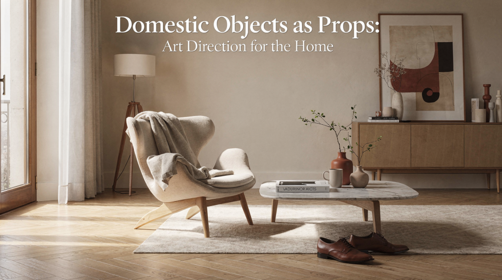
A home looks most convincing when its objects are chosen and placed with the same attention given to a photograph, a set, or a still life. In Milan, where interiors often balance history, restraint, and a strong material culture, domestic objects are never just functional: they shape atmosphere, direct the eye, and reveal how a room is meant to be lived in.
Why domestic objects matter in a room
An object can do more than «decorate» a space. It can anchor a composition, create scale, soften a hard surface, or connect old and new elements in a way that feels deliberate rather than accidental. In Milanese interiors, this approach is especially visible in homes where architecture, furniture, and daily objects are treated as one visual system rather than separate layers.
Think of the room as a set:
- the architecture is the backdrop;
- the furniture defines the main volumes;
- domestic objects act as props that give the scene rhythm, intimacy, and meaning.
This is why a ceramic bowl on a table, a stack of books on a low shelf, or a lamp near a doorway can change the entire reading of a room. The right object does not fill space; it clarifies it. When I work on a composition, I look for that moment when an object stops being just a thing and starts doing visual work — holding a corner, catching light at a specific hour, or creating a necessary pause between two heavier pieces. In fashion styling, we use accessories the same way: a single bracelet can redirect the eye across a silhouette. At home, a well-placed vessel does exactly that.
What «art direction for the home» actually means
Art direction at home is the practice of arranging objects with attention to composition, light, texture, and proportion. It is not about making a room look staged in a fake way. It is about making it read clearly.
In practical terms, this means:
- choosing objects for their shape as much as for their use;
- editing the number of visible things;
- grouping items so they relate to one another;
- using contrast between soft and hard materials;
- considering how natural light changes color and surface during the day.
Milan’s interior culture has long favored this kind of controlled but human composition, from classic apartments to more recent renovations where furniture, joinery, and objects are integrated into the spatial plan. What distinguishes a Milanese home from a merely decorated one is precisely this integration: the objects don’t sit on top of the architecture; they complete it. A travertine shelf with a single matte ceramic piece, a wooden stool next to a lacquered wall — these are not accidents. They are decisions made by someone who understands that every surface talks to another.
Start with the room’s visual job
Before selecting objects, define what the room needs to do visually. I learned this on set: you never bring props before you know what the frame demands. A room is no different. You read it first, then you respond.
Ask these questions
- Where should the eye land first?
- Which surface is too empty?
- Which area feels visually heavy?
- What material needs balancing with something softer?
- What would make the room photograph better without making it less livable?
A living room may need one strong vertical object, such as a lamp or branch arrangement, to balance a low sofa. A kitchen shelf may need a sequence of smaller objects to break up a rigid line. An entryway may only need one or two pieces to feel intentional. The key is to diagnose before you prescribe. Too often, people bring objects into a room to solve a problem they haven’t named yet. That’s how surfaces become cluttered without ever feeling composed.
The main categories of domestic props
Not every household object works as a prop. The best ones have a clear silhouette, tactile presence, and enough personality to hold attention without dominating the room. Over years of styling both garments and interiors, I’ve come to trust certain categories more than others — not because they’re trendy, but because they consistently perform well under different light conditions and in various spatial contexts.
| Category | Best use | Visual effect | Common mistake |
|---|---|---|---|
| Ceramics | Tables, shelves, consoles | Adds softness and irregularity | Too many small pieces clustered together |
| Books | Stacking, layering, height shifts | Creates structure and rhythm | Using books only as filler |
| Glass | Light-catching surfaces, reflective contrast | Opens the composition | Mixing too many finishes at once |
| Textiles | Softer corners, chairs, beds, benches | Reduces visual hardness | Choosing generic fabrics without texture |
| Trays and boxes | Containment on tables and desks | Organizes small objects | Making the grouping too neat or decorative |
| Lamps | Corners, side tables, bedside areas | Adds vertical presence and evening atmosphere | Treating lighting as an afterthought |
| Vases and vessels | Single accents or grouped compositions | Creates a focal point | Filling every empty surface with one |
What I look for in each category is not perfection but presence. A ceramic piece with a slightly irregular rim catches light differently than a machine-made one. A linen textile with visible slubs will read as warmer and more layered than a flat cotton. These micro-differences are invisible in a catalog but transformative in a room. They’re what make a composition feel authored rather than assembled.
How to build a composition like a stylist
A strong home composition usually follows a few simple rules. These are the same principles I used on fashion shoots, just translated to domestic scale. The medium changes — garments become bowls, backdrops become walls — but the visual logic remains identical.
1. Work in threes or uneven groups
Odd-number groupings often feel more natural than pairs or rows. Three objects with different heights can create a more dynamic arrangement than six similar ones. The eye moves through an odd grouping differently: it doesn’t settle too quickly, which keeps the composition alive. Even numbers tend to feel static, almost ceremonial. For a home, you want energy, not symmetry.
2. Mix heights
A composition becomes flat when everything sits at the same level. Combine:
- one low object;
- one medium object;
- one taller element.
This can be as simple as a book stack, a bowl, and a lamp. The vertical variation creates a visual rhythm that guides the eye upward and downward, making the surface feel intentional rather than accidental.
3. Balance mass and air
Too many objects create noise. Too few create emptiness. Leave space around important items so they can breathe. In styling, we call this «negative space,» and it’s often what separates a professional composition from an amateur one. The emptiness is not a void; it’s a frame that gives the object its importance.
4. Repeat a material
A room feels coherent when one material echoes another. For example:
- a walnut tray can relate to wooden chair legs;
- linen can soften stone or metal;
- opaque ceramic can calm shiny surfaces.
This repetition works like a visual thread. It doesn’t need to be obvious; in fact, the best material echoes are almost subliminal. You sense the coherence before you can name it.
5. Use contrast intentionally
Contrast makes a room interesting. Put something rough next to something smooth, something matte next to something reflective, something old next to something new. The tension between opposites is what gives a room its character. Without contrast, even the most expensive interior can feel flat and lifeless.
Domestic objects that work especially well in Milan homes
Milan interiors often combine architectural discipline with lived-in warmth. That makes certain objects especially effective:
- books in restrained stacks instead of dense library walls;
- ceramics with visible handwork;
- simple glassware that catches daylight;
- vintage pieces mixed with contemporary furniture;
- textiles with a tactile but understated presence;
- trays, bowls, and containers that organize rather than perform;
- lamps with clear geometry and a strong silhouette.
This mix reflects a Milanese way of living with design: not as display alone, but as a practical language of everyday form. In this city, a vintage glass vase on a modern concrete console doesn’t feel like a style exercise. It feels like a natural conversation between eras, materials, and sensibilities. That’s the kind of layering that can’t be faked with a shopping list — it comes from understanding how objects age, how surfaces wear, and how light moves through a room across seasons.
Room-by-room guide
Living room
Use objects to establish hierarchy.
- Place one larger anchor piece on a coffee table.
- Keep side tables lighter.
- Let one shelf or console carry a stronger composition.
Good choices:
- books;
- a sculptural vase;
- a bowl;
- a lamp;
- one framed object or photograph.
The living room is where compositions are seen from multiple angles — seated, standing, entering — so test your arrangement from different viewpoints. What reads well from the sofa may disappear from the doorway. A strong composition holds its shape from every approach.
Bedroom
The bedroom benefits from quiet, edited styling.
- Limit the number of visible objects.
- Keep bedside tables functional and spare.
- Use textiles to soften lines.
Good choices:
- a lamp;
- one book or notebook;
- a small ceramic;
- folded linen;
- a single tray for essentials.
Bedrooms should feel like an exhale. Every object here should earn its place by contributing to calm rather than visual excitement. If a piece demands attention, it probably belongs in another room.
Kitchen
Kitchen styling should feel useful first, decorative second.
- Group items by function.
- Keep visual noise off the worktop.
- Use only a few visible objects with strong form.
Good choices:
- cutting boards;
- jars with consistent proportions;
- a bowl of fruit;
- a vessel for utensils;
- one strong textile.
The kitchen is the hardest room to keep composed because it’s genuinely used. The trick is not to fight the function but to choose objects that look better with use: wooden boards that develop patina, ceramic jars that feel good to open, textiles that soften with washing.
Entryway
The entryway is a threshold, so it should introduce the house visually.
- Use one clear focal point.
- Avoid crowding small surfaces.
- Let the composition suggest the mood of the home.
Good choices:
- a mirror;
- a tray for keys;
- a vase;
- a small lamp;
- a seat or stool.
An entryway composition works like the opening shot of a film: it sets the tone for everything that follows. Keep it restrained, intentional, and personal enough to feel like a signature rather than a hotel lobby.
The role of light and shadow
Objects do not look the same in every room, or even at every hour. Milan apartments often rely on changing daylight, courtyard views, and secondary light that shifts during the day. That means a prop should be judged not only by how it looks in the store, but by how it performs in your home.
Check:
- Does it cast an interesting shadow?
- Does the color become stronger or weaker in natural light?
- Does the material look flat at noon and richer in the evening?
- Does it reflect too much if placed near a window?
A matte ceramic may be perfect in strong daylight, while a glass object may disappear unless placed where it can catch light. This is why the same object can feel elegant in one room and irrelevant in another. I’ve learned to observe objects at different times of day before committing to their placement. Morning light in Milan can be cool and sharp; afternoon light, especially in courtyard-facing rooms, becomes warmer and more diffused. An object that looks sculptural at 10 a.m. might flatten out by 3 p.m. The only way to know is to watch.
How to style rented apartments without overfitting the space
A rented apartment often needs fast, reversible changes. The goal is to improve clarity and character without depending on renovation.
Practical moves
- use removable hooks and standing furniture;
- create compositions on shelves, tables, and windowsills;
- introduce textiles to soften generic finishes;
- repeat 2–3 colors throughout the room;
- avoid buying objects before understanding the light.
What to prioritize
- one good lamp;
- one strong table surface composition;
- one textile that changes the room’s tone;
- one storage solution that also looks composed.
This is often enough to make a temporary home feel considered. Rented spaces have limitations — you can’t change the flooring, the wall color, or the kitchen cabinets — but limitations often produce the most creative compositions. When you can’t alter the backdrop, the props do all the work. That’s when choosing objects becomes not just decorative but architectural.
Checklist: before you place an object
- Does it have a clear shape?
- Does it serve the room visually or practically?
- Does it relate to the surrounding materials?
- Is it too small to read from a distance?
- Is the composition stronger with it or without it?
- Does it add contrast, repetition, or balance?
- Will it still work when the light changes?
If several answers are weak, the object probably belongs elsewhere. I use a version of this checklist on every project, whether I’m styling a room or a still life. The questions are simple, but they force you to be honest about why an object is there. Sentiment and impulse are valid reasons to keep something, but they’re not valid reasons to display it in a composition that’s meant to read clearly.
Common mistakes
Overdecorating every surface
If every table, shelf, and corner is occupied, no object can stand out. Visual meaning needs silence. A room without empty space is like a photograph without negative space: exhausting to look at and impossible to navigate visually.
Using props with no scale relation
A tiny object on a large table often disappears. A huge object on a narrow shelf overwhelms the room. Scale is relational — an object’s size only makes sense in context. Always test proportion before finalizing placement.
Choosing objects only by color
Color helps, but shape and texture matter more. A beautiful color cannot save a weak silhouette. I’ve seen rooms where every object matched chromatically but the composition still felt flat because nothing had presence. Shape is what the eye reads first; color comes second.
Copying «styled» rooms too literally
A photographed room may rely on cropped views, temporary arrangements, or objects chosen only for the image. Real homes need durability and daily logic. What looks perfect in a magazine spread might be impractical, fragile, or uncomfortable in everyday life.
Ignoring maintenance
Dusty, unstable, or fragile pieces quickly stop feeling elegant. A good prop must stay beautiful in real life, not only for one afternoon. If an object requires constant adjustment, cleaning, or protection, it will eventually become visual noise rather than visual pleasure.
A simple method for styling a table or shelf
Step 1: Clear everything
Start with an empty surface. This helps you see scale and proportion. You can’t compose on a cluttered surface any more than you can paint on a dirty canvas.
Step 2: Choose one anchor
Pick one main object: a lamp, vase, stack of books, or bowl. This is your focal point — everything else will relate to it.
Step 3: Add one counterpoint
Introduce another object with a different height, material, or density. The contrast between anchor and counterpoint creates the composition’s energy.
Step 4: Leave space
Do not fill every gap. Negative space is part of the composition. It gives each object its visual weight and prevents the arrangement from feeling crowded.
Step 5: Adjust for light
Move the objects slightly and observe them in natural light. Small changes often improve the result more than adding new items. A shift of a few centimeters can change how shadows fall and how surfaces relate.
FAQ
What makes a domestic object look like a prop?
A prop is an ordinary object that has been selected and placed with visual intention. Its shape, position, and relation to other items matter as much as its function. In a composed room, even a humble object — a wooden spoon, a folded cloth — can carry visual weight if it’s placed with purpose.
Can useful objects also be decorative?
Yes. In well-composed homes, the best objects often do both. A tray, lamp, bowl, or textile can be practical and visually strong at the same time. The distinction between «useful» and «decorative» is often false: a beautiful cutting board leaning against a backsplash is both.
How many objects should be visible in a room?
There is no fixed number. The right amount depends on room size, storage, and light. A good rule is to leave enough emptiness for each object to register clearly. If you can’t see individual pieces anymore — if they blur into a general sense of «stuff» — you have too many.
What if my home has generic finishes?
Use props to create identity without renovation: textiles, lamps, books, ceramics, and one or two materials that repeat across the room. Generic finishes are actually an advantage: they’re a neutral backdrop that lets your objects do the talking.
How do I make a room photograph well?
Reduce clutter, create one clear focal point, use variation in height, and make sure the objects look intentional from the main viewpoint in the room. Photographing a room is the ultimate test of its composition — the camera doesn’t forgive visual confusion.
Conclusion
Domestic objects become powerful when they are treated as part of the room’s composition, not as leftovers. In a Milan context, where interiors often value clarity, material intelligence, and quiet refinement, art direction at home means editing carefully, placing thoughtfully, and letting objects do their real work: organizing space, catching light, and giving domestic life a visible shape.
A well-styled home does not need many things. It needs the right ones, placed with conviction.