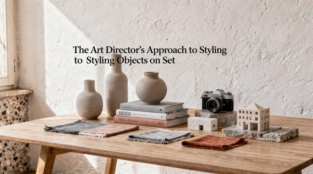
Styling objects on set is rarely about decoration. It’s a visual argument built from shape, scale, light, texture, and rhythm — one where every piece earns its place in the frame. When the set works, the objects don’t just sit there; they relate to each other, define the mood, and guide the eye through the image with a quiet authority. This way of thinking comes directly from art direction, not from interior decorating, and it’s what separates a considered composition from a random arrangement.
In Milan, where residential interiors often balance restraint, material intelligence, and a kind of understated elegance, this approach feels especially natural. Whether the set is a domestic corner, a tabletop still life, or a room photographed as a sequence of composed details, the goal remains the same: make the scene read clearly and photograph with intention.
What object styling on set actually means
Object styling is the practice of arranging things so they communicate a visual idea. In editorial work, that means thinking like an art director rather than a decorator. The difference is fundamental: a decorator fills space, an art director constructs an image.
Instead of asking, “What looks nice here?”, the questions become more precise:
- What is the image about?
- Which object is the protagonist?
- What should the viewer notice first, second, and third?
- How do light and surface change the mood?
- Does the composition feel calm, tense, dense, open, or weightless?
For an art director, the set is a constructed space where every object has a function. It can anchor scale, introduce texture, create a line or silhouette, repeat a color, interrupt symmetry, add narrative, or provide contrast. Nothing is neutral; everything either supports the visual argument or dilutes it.
This way of working is especially useful for interiors, still life, design images, fashion editorials, and any visual story where objects carry meaning. It’s a method that transforms a simple grouping of things into a deliberate composition — one that feels resolved, not merely arranged.
The core principles: composition, light, texture, tension
A strong set usually rests on four elements. They’re not separate; they work together, each influencing how the others are perceived.
1. Composition
Composition is how objects are placed in relation to each other and to the frame. Good composition gives the eye a path — an entry point, a moment of rest, a reason to move through the image. Without that path, the eye wanders and the set feels unresolved.
Useful questions to ask while building:
- Where does the eye enter?
- What stops it?
- Is there a clear focal point?
- Are the objects too evenly spaced?
- Does the arrangement feel intentional or accidental?
Simple composition strategies that work across different scales:
- Use an odd number of objects when you want a looser, more natural rhythm — even numbers often feel too symmetrical and static.
- Group objects by size to create hierarchy; the largest element anchors, the smallest adds detail.
- Leave negative space so important items can breathe. Crowding kills readability.
- Use lines from shelves, tabletops, edges, or doorframes to guide the eye. These architectural lines become part of the composition.
- Repeat a shape once or twice to create continuity without becoming predictable — a curve echoed in a vase and a bowl, for instance.
2. Light
Light determines whether an object feels soft, architectural, dramatic, or flat. In editorial styling, lighting isn’t an afterthought — it’s a compositional tool. The same set can read completely differently under soft diffused window light versus a hard directional source.
In practice:
- Soft light reduces contrast and makes a scene feel calm, muted, or intimate. It’s often the right choice for domestic still lifes where materials need to feel tactile rather than graphic.
- Directional light creates shadow, edge, and form. It sculpts objects, revealing their volume and silhouette.
- Raking light — light that skims across a surface — reveals texture. This is essential when the material itself is the story: rough plaster, grainy wood, woven linen.
- Flat light can be useful for catalog clarity, but it often removes atmosphere and flattens the spatial relationships between objects.
If the material matters, light must respect the material. Matte surfaces usually benefit from angled light that reveals grain and texture; glossy surfaces need controlled highlights or they’ll blow out and become distracting white patches. Transparent objects need separation from the background so they don’t disappear — a slight tonal shift behind them can make all the difference. Dark materials need enough local contrast to remain legible, otherwise they collapse into a black void.
3. Texture
Texture is what gives a set physical credibility. A composition with only smooth, polished objects often feels lifeless — it lacks the friction that makes an image feel real. A good art director balances surfaces deliberately, treating texture as a visual weight that can anchor or lighten a composition.
Useful combinations that create depth:
- hard + soft
- matte + reflective
- rough + refined
- heavy + light
- opaque + transparent
In Milan’s interior culture, texture is often where a room becomes memorable: worn wood next to stone, linen beside lacquer, brushed metal against plaster. The same logic works on set. A single rough ceramic piece can ground an otherwise polished arrangement, just as a sliver of reflective glass can lift a composition that feels too heavy.
4. Tension
A set becomes interesting when not everything agrees too much. Visual tension is the small friction that keeps the eye engaged — it prevents the image from feeling like a formula.
Tension can come from:
- a small object placed against a large one;
- a warm object inside a cool palette;
- an organic shape next to a strict geometry;
- an imperfect item in an otherwise controlled arrangement;
- a slight asymmetry that prevents the image from feeling staged in a mechanical way.
Too much harmony can flatten the image. A little friction makes it alive. The key is to introduce tension without breaking the overall coherence — it should feel like a deliberate choice, not a mistake.
How to style objects like an art director: a practical method
The following steps turn the principles into a repeatable process. They work whether you’re styling a single shelf or an entire room.
Step 1: Define the visual idea
Before touching anything, define the image in one sentence. This sentence becomes the filter for every decision that follows. If the concept isn’t clear, the set usually becomes generic — a collection of nice things without a point of view.
Examples of clear visual ideas:
- quiet morning domesticity
- Milanese restraint with one strong accent
- architectural still life with tactile surfaces
- collected objects on a window-side table
- a room that feels edited, not furnished
Step 2: Choose a protagonist
Every strong set has a lead object. It’s the element that carries the visual weight and anchors the composition. Without a protagonist, the eye doesn’t know where to land, and the set feels like a group of equals competing for attention.
That object may be a chair, a vase, a stack of books, a lamp, a textile, a tray, a ceramic piece, a fruit bowl, or a found object with an unusual shape. Once chosen, everything else supports it. Don’t let every item compete — hierarchy is what makes a set readable.
Step 3: Build a hierarchy
Arrange objects in layers of visual importance:
- hero object
- supporting object
- counterbalance
- quiet background element
This keeps the set readable. If everything has the same visual weight, the image loses structure and becomes a flat pattern. The counterbalance is particularly important: it’s the element that prevents the composition from feeling lopsided, often placed opposite the hero to create equilibrium without symmetry.
Step 4: Work from large to small
Start with the biggest shapes first. Establish the base line, position the anchor objects, adjust medium forms, and finish with small accents. This prevents the set from becoming overworked — small details should refine the composition, not rescue it. If you start with the tiny ceramic cup, you’ll likely end up with a set that feels bottom-heavy or disjointed.
Step 5: Edit harder than you think
One of the most common styling mistakes is overfilling the frame. The impulse to add just one more thing is strong, but restraint almost always produces a stronger image.
Remove anything that:
- repeats the same function without adding visual value;
- creates clutter near the focal point;
- interrupts the shape language;
- introduces an unwanted color;
- distracts with a label, cord, seam, or irrelevant detail.
A set usually improves when it has one object less than feels comfortable. That slight discomfort is often the sign that you’ve reached the right level of editing.
A useful object-styling checklist
Before the camera starts shooting, run through these points. They catch the issues that are easy to overlook when you’ve been staring at the set for too long.
- Is there a clear focal point?
- Do the objects have different visual weights?
- Is the color palette coherent?
- Are the surfaces varied enough?
- Does the composition feel intentional from the main angle?
- Is there enough negative space?
- Do any objects look accidental?
- Does the arrangement still work from a slightly different crop?
- Are reflections under control?
- Does the set feel believable for the story?
Common styling mistakes and how to fix them
| Mistake | What it does | Better approach |
|---|---|---|
| Too many objects | Weakens focus and makes the frame busy | Remove items until one object clearly leads |
| Matching everything too closely | Creates a flat, decorative look | Introduce contrast in size, texture, or finish |
| Ignoring scale | Makes the set feel unrealistic | Mix tall, medium, and low forms |
| Styling only from one angle | Breaks when the crop changes | Check the composition from multiple viewpoints |
| Overusing symmetry | Can feel rigid and lifeless | Keep symmetry only when it supports the concept |
| No surface variation | The image feels visually thin | Combine matte, reflective, soft, and hard materials |
| Weak handling of light | Loses shape and texture | Reposition objects to catch better light |
How to make objects photograph well
An object can look good in person and still fail on camera. The camera simplifies — it compresses depth, exaggerates highlights, and flattens subtle transitions. That’s why art-direction thinking matters: you’re styling for the lens, not just for the eye.
Pay attention to edges
The camera loves clean outlines. If an object has an unclear edge against the background, it may disappear into a soft blur or merge with a similar tone. Use contrast in tone, color, silhouette, or distance from the background to define edges clearly. A dark object against a slightly lighter wall reads; a dark object against an equally dark surface becomes a shape without definition.
Protect the highlights
On glossy objects, the brightest point can become a distraction — a blown-out spot that pulls the eye away from the composition. Move the object slightly, flag the light, or tilt the surface until the highlight becomes controlled rather than harsh. Sometimes a tiny rotation changes everything.
Use shadows deliberately
A shadow isn’t a problem to eliminate by default. It can define shape, create depth, and make a set feel grounded. Good shadows support the form, connect objects to the surface, and add dimensionality. Bad shadows cut across the hero object awkwardly, create dirty patches, or distract from the composition. Pay attention to where shadows fall and how hard their edges are — soft shadows feel natural, hard shadows feel graphic.
Keep the background useful, not passive
The background should do something: support contrast, extend the palette, echo a shape, or create calm. A blank background is only good if it reinforces the concept. Otherwise, it simply leaves the image unfinished. Even a subtle texture or a slight tonal shift can give the set a sense of place without competing with the objects.
Palette choices: how to build color without losing control
Color should feel edited, not random. A restrained palette often allows material and form to carry the image, which is especially relevant in Milan where interiors tend toward tonal discipline.
A simple palette strategy:
- Choose one base tone.
- Add one supporting tone.
- Add one accent, if needed.
For example:
- warm stone + ivory + rust
- grey + walnut + black
- cream + tobacco + muted green
- white + steel + one saturated object
In Milan interiors, restrained palettes often work well because they allow material and form to carry the image. That doesn’t mean color should be absent — it means color should be precise. A single saturated object in an otherwise neutral set can have more impact than a full spectrum.
Styling for different kinds of sets
The principles remain the same, but the emphasis shifts depending on the type of set.
For a tabletop still life
Focus on object scale, surface texture, and the line of the table edge. A useful move: create a triangle of objects so the frame feels composed without becoming rigid. The table edge itself becomes a compositional line — use it to anchor the arrangement or to create a sense of depth.
For a shelf or niche
Focus on spacing, vertical rhythm, and the balance between filled and empty areas. A useful move: combine one upright element, one low object, and one soft or irregular shape. This prevents the shelf from reading as a monotonous row of same-height items.
For a room set
Focus on broader volumes, circulation of the eye, and the relationship between furniture and architecture. A useful move: reduce styling density and let the room breathe. A room is not a tabletop — it needs larger pauses and a sense of spatial flow. Over-styling a room kills the very atmosphere you’re trying to create.
For a fashion or editorial set with objects
Focus on the relationship between body and object, how the object frames or interrupts movement, and whether the set supports the mood of the clothing. A useful move: let the set create a world, not just a backdrop. The objects should feel like they belong to the same narrative as the garments, not like props dropped in from another story.
Milan as a reference point
Milan is useful as a visual reference because its interiors often rely on precise restraint rather than excess. Even when a space is rich in material detail, the strongest rooms tend to stay disciplined. There’s a clarity of structure, a respect for proportion, and a quiet but distinctive approach to material contrasts that translates directly into set styling.
What translates well:
- clarity of structure;
- respect for proportion;
- quiet but distinctive material contrasts;
- functional objects that also read visually;
- an edited sense of domesticity.
That’s why a Milan-informed set often feels calm, resolved, and intelligent rather than overdesigned. It’s a sensibility that values the space between objects as much as the objects themselves.
Step-by-step styling process for a real shoot day
- Define the concept in one line.
- Choose the hero object.
- Select supporting objects by shape, not only by beauty.
- Build the arrangement from large to small.
- Step back and remove one object.
- Check the set in natural light if available.
- Test from the camera’s position, not just from the styling position.
- Adjust for reflections, shadows, and color imbalance.
- Shoot a test frame.
- Refine again before the final series.
This process sounds simple, but it prevents the most common problem: styling by instinct alone and discovering the composition only after the frame is already too busy. A methodical approach doesn’t kill creativity — it creates the conditions for it to work.
When to stop styling
A set is finished when each object has a reason to be there and nothing extra improves the image. Knowing when to stop is as important as knowing how to build.
A useful test:
- if removing an object makes the frame stronger, it was probably unnecessary;
- if moving an object by a few centimeters improves the balance, the set was close but not yet resolved;
- if the image can be understood at a glance, the composition is probably working.
Trust that moment of clarity. Overworking a set often comes from a lack of confidence in the initial idea.
FAQ
What is the difference between styling and art direction?
Styling arranges the objects. Art direction defines the visual logic behind the arrangement: mood, hierarchy, palette, and narrative. Styling is the hand; art direction is the eye that guides it.
How many objects should be on a set?
There is no fixed number. The right number is the smallest one that still tells the story clearly. If you can remove an object without weakening the narrative, it shouldn’t be there.
Should all objects match the same style?
No. Too much matching can make the set feel flat and catalog-like. Better results often come from controlled contrast in finish, shape, or age — a vintage ceramic next to a modern steel piece, for instance.
How do you make a set look more editorial?
Use a clear concept, stronger hierarchy, more intentional light, and less clutter. Editorial images usually feel edited, not merely arranged. There’s a sense of purpose behind every choice.
What is the biggest mistake in object styling?
Trying to make every object important. Strong sets need hierarchy. When everything shouts, nothing is heard.
Conclusion
An art director’s approach to styling objects on set is about control, restraint, and visual relationships. The goal is not to fill space, but to compose meaning through form, material, and light.
When the set is built with a clear idea, a strong protagonist, disciplined editing, and attention to texture and shadow, even the simplest object can feel considered. That’s what gives an image authority: not excess, but precision. In the end, the most memorable sets are the ones where nothing is missing and nothing is extra — where every element has earned its place in the frame.