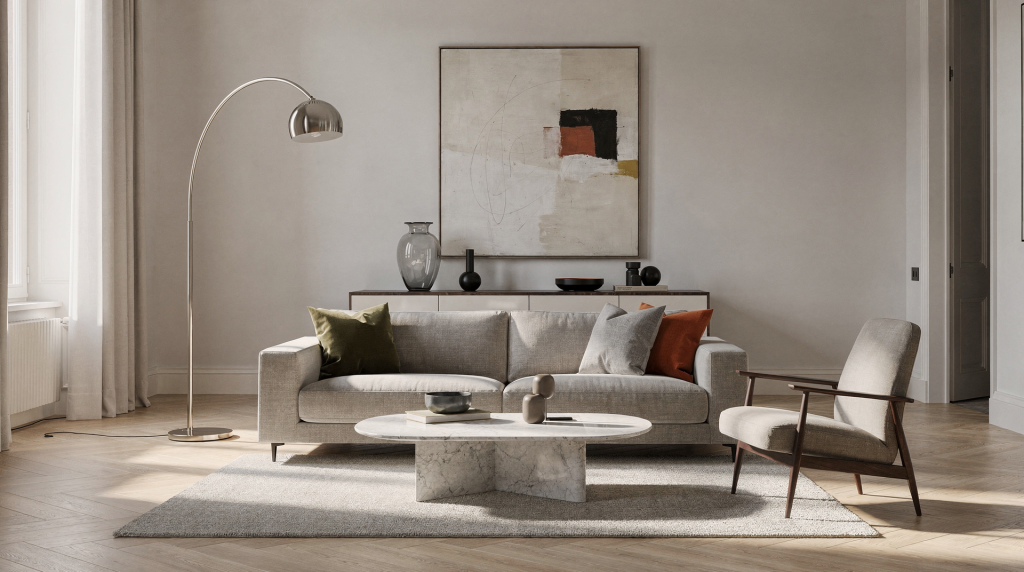
Italian design classics stay relevant for a reason that has little to do with nostalgia. They were built around proportion, comfort, material honesty, and a visual clarity that still works in Milan apartments today. When I look at a room, I read it the way I used to read a fashion image: where the weight sits, how the light falls across a surface, whether the textures are having a conversation or just occupying the same square meters. These pieces pass that test repeatedly.
In a city where homes often combine historic bones, compact footprints, and strong natural light, these objects remain useful for the same reason they became icons in the first place: they solve real domestic problems while giving a room a precise visual identity. A well-placed lamp doesn’t just illuminate — it anchors a corner compositionally. A chair with the right silhouette can hold an entire wall in balance.
Why Italian design classics still matter
The strongest Italian pieces were designed to live well in ordinary homes, not just in showrooms. That is why they continue to appear in Milan interiors, renovated apartments, and long-lived family homes. I’ve photographed enough doorways and living spaces across this city to recognize when a piece belongs to the room rather than being placed in it.
What makes them durable:
- They balance function and elegance without looking decorative for the sake of it. The visual weight is earned, not applied.
- They work with Milan’s common mix of old architecture, filtered light, and layered interiors. A Ponti chair reads differently against frescoed ceilings than it does against raw plaster, and it works with both.
- They often age well because their forms are clear rather than trendy. Patina adds depth instead of diminishing the object.
- They can anchor a room without making it feel finished in a generic “catalog” way. There’s breathing room built into the design.
A classic chair, lamp, or sofa can do more than fill space. It can set the scale of a room, sharpen the palette, and create a point of tension between contemporary and historic elements. That tension is often where the most interesting interiors happen — the friction between a 16th-century terrazzo floor and a rigorously modern aluminum base, for instance.
The design logic behind the classics
Many Italian icons share a few visual traits that explain their longevity. From a compositional standpoint, these are the qualities I look for when assessing whether a piece will hold a room together or quietly unravel it over time.
- Proportion first: they are carefully scaled, so they feel right in rooms of different sizes. The relationship between seat height, arm width, and overall footprint is never arbitrary.
- Material clarity: wood looks like wood, metal looks like metal, fabric looks like fabric. Nothing is pretending to be something it isn’t, which means the eye can rest on the surface without suspicion.
- Structural honesty: joints, frames, and supports are often visible rather than hidden. This creates a rhythm of lines that contributes to the room’s visual structure.
- Domestic intelligence: they are made for actual living, not only for display. A sofa that can’t handle a Sunday afternoon nap is a sculpture, not furniture.
- Visual lightness: even substantial pieces often avoid looking heavy. This is partly engineering and partly an understanding of how mass interacts with negative space.
In Milan, this matters because many interiors need furniture that can respect architectural details rather than compete with them. When a room already has ornate moldings, tall shutters, and patterned floors, the furniture needs to know when to step back and when to hold its ground.
Classic Italian pieces that still shape the home
Below are some of the names and objects that continue to influence how homes are furnished, styled, and photographed in Milan. I’ve encountered every one of these in real apartments, not just in archives or auction catalogs.
| Piece / designer | Why it still works at home | Best use in interiors |
|---|---|---|
| Gio Ponti furniture | Refined modernism with a human scale | Living rooms, dining areas, reading corners |
| Franco Albini pieces | Sparse, intelligent, structurally clear | Compact apartments, measured interiors |
| Vico Magistretti designs | Calm, practical, visually quiet | Everyday rooms that need ease and flexibility |
| Achille and Pier Giacomo Castiglioni lighting | Functional objects with wit and presence | Living rooms, entries, bedside lighting |
| Mario Bellini sofas | Soft architecture for sitting and gathering | Larger living rooms, open-plan spaces |
| Afra and Tobia Scarpa seating | Warm, balanced, tactile | Rooms that need softness without excess |
| Piero Portaluppi interiors influence | Strong composition, elegant contrast | Homes with historic character or bold detailing |
These names matter not only because they are famous, but because they offer repeatable solutions: a chair that does not age visually, a lamp that shapes a corner, a sofa that holds a room together. In styling terms, they’re the equivalent of a perfectly cut blazer — you can build an entire wardrobe around it, and it will never let the ensemble down.
Pieces worth knowing and what they teach
Gio Ponti: elegance with discipline
Ponti’s work remains influential because it combines refinement with restraint. His furniture often feels tailored rather than bulky — there’s an almost sartorial precision to the way a leg meets a seat or a backrest angles away from a frame. When I look at a Ponti piece in a room, I notice how it draws the eye without demanding it.
Use this lesson at home:
- Choose one visually precise piece instead of several weak ones. A single Superleggera chair in the right spot does more compositional work than three generic armchairs.
- Pair slim profiles with good materials. The contrast between a delicate silhouette and a rich wood grain creates visual interest without clutter.
- Let the room breathe around the object. Negative space is not emptiness — it’s the frame that gives the piece its presence.
Ponti is especially useful in Milan apartments where elegance comes from order, not from adding more. His furniture understands that a room with high ceilings and generous windows already has drama; the objects inside should provide structure, not competition.
Franco Albini: maximum effect with minimum material
Albini’s approach is ideal for homes that need clarity. His pieces often feel almost architectural, with a strong sense of line and structure. There’s a transparency to his thinking — you can see how the object is constructed, and that visibility becomes part of its beauty. In a small room, this openness prevents the space from closing in.
What to copy from Albini:
- Keep silhouettes clean. Every curve and angle should have a reason for being there.
- Prefer open forms when space is limited. A bookcase that you can see through keeps a wall from becoming a barrier.
- Use furniture that leaves visual air in the room. The eye needs places to rest, and Albini’s work provides them.
This is one of the best references for small Milan apartments, where excess quickly makes a room feel congested. I’ve seen a single Albini desk transform a cramped study corner into something that feels intentional and measured.
Vico Magistretti: everyday comfort without visual noise
Magistretti’s designs are loved because they are easy to live with. They usually avoid unnecessary drama and still leave a strong impression — the kind of presence that grows on you rather than announcing itself at the door. His lamps and chairs have a quiet confidence that works particularly well in rooms where the architecture is already doing the talking.
Practical takeaway:
- Use quiet, well-proportioned furniture to support the room. Not every piece needs to be a protagonist.
- Let texture and light create interest. A simple form in a tactile fabric changes throughout the day as the sun moves across it.
- Avoid over-styling when the object itself is already complete. A Magistretti lamp doesn’t need a vignette around it to feel important.
His work is useful in homes where the goal is calm, not theatricality. I often recommend this approach to clients who want their spaces to feel collected rather than decorated.
Castiglioni lighting: domestic wit with purpose
Achille and Pier Giacomo Castiglioni helped define the Italian idea that a home object can be both practical and playful. Their lamps often become focal points without feeling forced — they have a sculptural quality that reads beautifully in photographs and an intelligence that reveals itself over time. The Arco lamp, for instance, solves a real problem (overhead light without ceiling wiring) while creating an unmistakable silhouette.
Why they still matter:
- They create a visual anchor in corners and beside sofas. A well-placed Castiglioni lamp can balance an entire room’s composition.
- They add character without requiring a full redesign. One piece can shift the tone of a space from generic to considered.
- They work well in rooms photographed with natural light. The forms hold their own even when the lamp isn’t switched on.
Lighting is often the fastest way to give a Milan home a more resolved atmosphere. I’ve walked into apartments where the only thing that felt intentional was a single Parentesi lamp, and it was enough to make the whole room read differently.
Mario Bellini: the sofa as interior architecture
Bellini’s sofas show how seating can become the center of a room’s composition. They are generous, soft, and strong enough to organize other elements around them. The Camaleonda, with its modular structure and plush volumes, doesn’t just sit in a room — it defines the social geography. From a styling perspective, it’s one of the few pieces that can hold its own against a room full of hard surfaces without making the space feel upholstered to death.
Best use:
- In living rooms where the sofa defines the social zone. Everything else — side tables, lamps, rugs — orbits around it.
- In homes that mix hard architectural surfaces with softer textiles. The contrast between stone floors and deep seating creates a tactile tension that photographs beautifully.
- In spaces that need a strong but welcoming base. A Bellini sofa invites you in without making the room feel casual.
A good sofa does not just provide comfort. It creates the room’s rhythm. The placement of a Bellini piece determines where conversations happen, where light pools, and how the rest of the furniture finds its place.
How to use Italian classics in a modern Milan home
The biggest mistake is treating classic design like a museum collection. These pieces work best when they are allowed to share the room with contemporary objects, older architecture, and everyday signs of use. A Ponti chair with a stack of books on it, a Castiglioni lamp next to a child’s drawing taped to the wall — these juxtapositions are where the pieces come alive. They weren’t designed for pedestals.
A simple styling method
- Choose one lead object. This is your compositional anchor — the piece that sets the scale and material tone for everything else.
- Build the room around its scale and material. If the lead piece is walnut and brass, let those notes echo elsewhere rather than introducing five new finishes.
- Repeat one or two colors elsewhere in the space. This creates visual coherence without making the room feel matched.
- Add softer elements to prevent the room from feeling rigid. Textiles, rugs, and curtains absorb sound and soften the light.
- Leave some surfaces open. A cleared tabletop or an empty stretch of wall gives the eye a place to pause.
This keeps the room structured without becoming over-designed. The goal is a space that feels composed, not curated.
What pairs well with classic Italian design
- Limewashed or softly painted walls — they provide a matte, light-absorbing backdrop that lets furniture forms read clearly
- Natural wood floors — the grain adds warmth without competing for attention
- Linen curtains — they filter light beautifully and introduce soft movement
- Wool, bouclé, cotton, or textured upholstery — tactile contrast keeps monochromatic schemes from feeling flat
- Stone, travertine, or brushed metal accents — these materials age gracefully alongside classic pieces
- Simple ceramics and books instead of many decorative objects — real things with real weight and texture
What usually clashes
- Overly shiny finishes everywhere — high gloss reads as nervous energy in a room that should feel grounded
- Too many unrelated statement pieces — when everything shouts, nothing is heard
- Furniture that is too large for the room — proportion is the first thing the eye registers, and a piece that overwhelms the space breaks the composition immediately
- Heavy matching sets — they flatten the room’s personality and remove the tension that makes interiors interesting
- Decoration chosen only for trend value — trends fade, but a room’s bones remain
Italian classics need space to express their proportion. When a room is crowded, their strength gets diluted. I’ve seen beautiful pieces disappear in over-furnished rooms, their silhouettes swallowed by visual noise.
Milan-specific context: why these pieces feel at home here
Milan interiors often sit between restraint and character. Many apartments have tall windows, older parquet, restored plasterwork, or compact layouts that reward disciplined furnishing. The light here is particular — it enters rooms at sharp angles, carving out shadows that change dramatically from morning to afternoon. Furniture that reads well in this light tends to have strong silhouettes and honest surfaces.
Italian classics fit this environment because they:
- respect architectural detail instead of competing with it — a slim chair doesn’t fight a decorated ceiling the way an oversized sectional does;
- hold up in rooms with strong daylight — their forms stay legible even in high contrast;
- work in both historic and renovated interiors — they bridge periods without looking like compromises;
- support a layered mix of old and new — a 1950s lamp next to a contemporary painting feels natural, not forced;
- make small rooms feel more intentional — every piece earns its square meters.
In a Milan apartment, a good classic piece often does the work of several weaker objects. It gives the room a center. I’ve walked into spaces where a single Albini bookshelf or a lone Castiglioni lamp provided more visual structure than a roomful of lesser furniture.
How to choose the right classic piece for your home
If the room is small
- Choose one slim chair or open bookcase. A piece with visible legs and air underneath keeps the floor plane readable.
- Avoid bulky bases and oversized arms. Visual mass accumulates quickly in tight spaces.
- Use lighter tones or visually open structures. Transparency — whether literal or tonal — expands the perceived volume of a room.
If the room is dark
- Pick pieces with reflective or lighter materials. A brushed metal base or a pale wood frame catches whatever light is available.
- Use lighting as a sculptural element. In low-light rooms, a lamp’s form matters as much as its output.
- Avoid heavy visual density near windows. Let the light travel as far into the room as possible before it hits a solid mass.
If the room has strong architecture
- Keep furniture quieter than the room. Let the moldings, ceiling height, or floor pattern lead the composition.
- Use classics that support the existing character. A Magistretti piece can sit calmly beneath an elaborate fresco without disappearing.
- Let architectural details remain visible. Don’t push a sofa against a beautiful baseboard or block a window with an oversized headboard.
If the room feels flat
- Add a classic with a strong profile. A chair with a distinctive silhouette can create depth where none existed.
- Introduce one material contrast, such as wood against stone or fabric against metal. The eye needs friction to stay engaged.
- Use a lamp or chair to create a clear focal point. A single well-placed object can organize an entire room’s visual hierarchy.
Buying and mixing: practical checklist
Before choosing a classic piece, ask:
- Does it solve a real need in the room? A beautiful object that serves no function becomes decoration, and decoration alone rarely holds a space together.
- Is the scale right for the space? Measure carefully — a piece that looked perfect in a showroom can feel entirely different under your ceiling height.
- Will it still make sense after other furniture changes? The best classics adapt as the room evolves around them.
- Does the material suit daily use? A delicate surface in a high-traffic area will show wear in ways that may or may not add character.
- Can it coexist with the architecture already in place? The piece should feel like it belongs to the same visual language as the room’s bones.
If the answer to most of these is yes, the piece is likely a strong choice. I’ve learned to trust this checklist over impulse — the pieces I’ve bought with it are still in my home; the ones I bought without it have moved on.
Common mistakes to avoid
- Buying an icon just because it is famous. Recognition is not the same as relevance to your space.
- Using too many classics in one room. When every object is a protagonist, the room loses its narrative.
- Mixing pieces without thinking about proportion. A delicate Albini chair next to an oversized Bellini sofa can work, but only if the relationship between their volumes is intentional.
- Ignoring comfort in favor of appearance. A chair that no one wants to sit in is a failed object, no matter how beautiful.
- Choosing replicas that lose the character of the original. The proportion, material quality, and detailing are usually the first things to go in a copy.
- Styling the room so tightly that the furniture cannot breathe. Leave room for life to happen — a stack of books, a thrown blanket, a cup of coffee.
A good home is not a display of references. It is a composition with practical rhythm. The pieces should work together the way a well-edited outfit does: each element supporting the whole, nothing fighting for attention, everything earning its place.
A quick room-by-room guide
| Room | Best classic type | What it should do |
|---|---|---|
| Living room | Sofa, armchair, lamp | Create structure and comfort — define where people gather and how light shapes the space |
| Dining area | Table, chairs, pendant light | Define the social center — the table is the anchor, the light draws people in |
| Bedroom | Low chair, bedside lamp | Add calm and balance — quiet pieces that support rest without visual distraction |
| Entryway | Compact seat, light, console | Set the tone immediately — the first composition the eye encounters |
| Study corner | Desk chair, bookcase, task lamp | Support concentration without clutter — clean lines and good light are non-negotiable |
Final thought
Italian design classics endure because they are not locked in the past. In Milan especially, they still feel current because they solve the same problems homes always have: how to make a room work, how to give it character, and how to keep it visually clear. These pieces were designed by people who understood that a home is not a stage set — it’s a place where life unfolds daily, and the objects within it should support that life rather than perform for it.
Used well, a classic piece does not make a home look designed. It makes the room feel inevitable — as though it couldn’t have been arranged any other way. That’s the highest compliment I can give an interior, and it’s the quality I look for every time I walk into a Milan apartment with my camera.
FAQ
What makes an Italian design classic timeless?
A timeless Italian piece combines good proportion, practical function, and materials that age well. It stays useful even when trends change because its value is structural, not stylistic. The form is resolved enough that it doesn’t need the context of its era to make sense.
Can Italian classics work in a small Milan apartment?
Yes. Many of them were designed with compact domestic spaces in mind — Milan has always had small apartments, and its designers understood that constraint breeds clarity. Slim profiles, open structures, and calm silhouettes are especially effective. I’ve seen 40-square-meter apartments feel spacious because every piece was chosen for its visual footprint as much as its physical one.
Do I need to furnish a room only with classics?
No. The best interiors mix classics with contemporary pieces, personal objects, and architectural features. Balance matters more than collecting names. A room that’s all vintage feels like a period piece; a room that’s all new lacks depth. The friction between eras is where character lives.
How many iconic pieces should one room have?
Usually one or two is enough. If every object is a statement, the room loses clarity. Think of it as a composition: you need a focal point, supporting elements, and negative space. Too many stars and the eye doesn’t know where to land.
What is the easiest classic piece to start with?
A lamp or chair is often the easiest entry point. Both can change a room without requiring a full redesign. A single Castiglioni lamp in a corner, or one well-chosen chair against a wall, can shift the entire visual tone of a space. Start small, live with it, and let the next piece reveal itself over time.